1. Introduction
Basics
Svelte is a tool for building fast web applications.
Adding Data
<script>
    let name = 'world!'
</script>


<h1>Hello {name}!</h1>
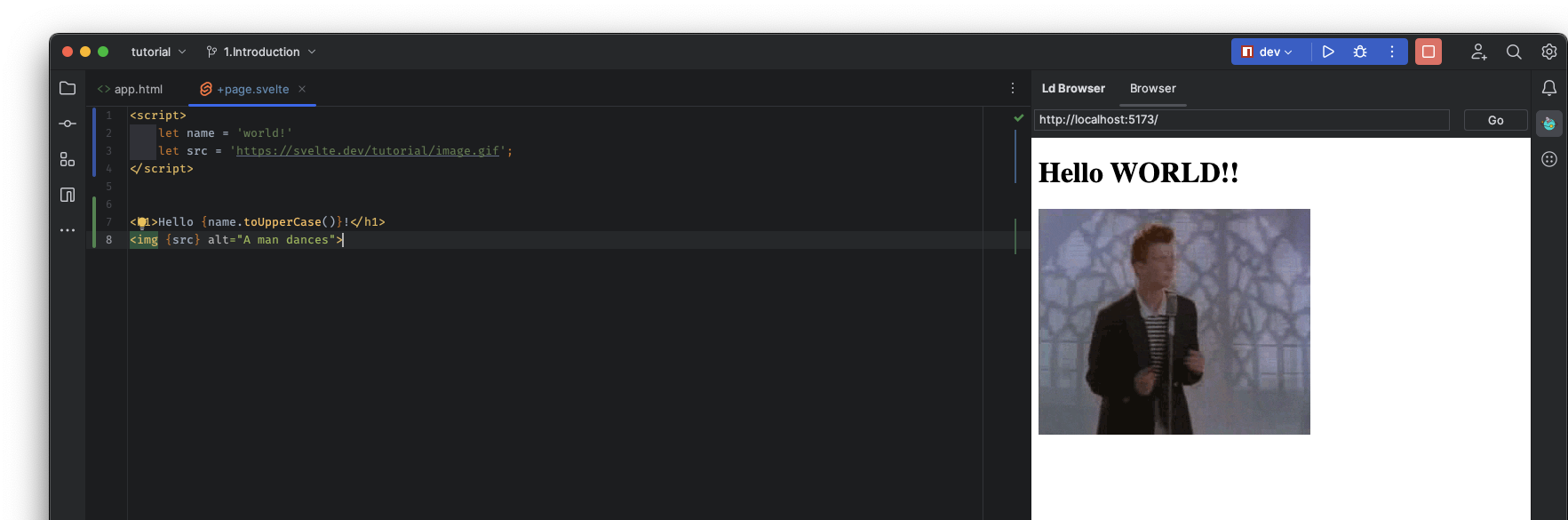
Dynamic attributes
<script>
    let name = 'world!'
    let src = 'https://svelte.dev/tutorial/image.gif';
</script>


<h1>Hello {name.toUpperCase()}!</h1>
<img src={src} alt="A man dances">
or
<script>
    let name = 'world!'
    let src = 'https://svelte.dev/tutorial/image.gif';
</script>


<h1>Hello {name.toUpperCase()}!</h1>
<img {src} alt="A man dances">
Styling
<script>
let name = 'world!'
let src = 'https://svelte.dev/tutorial/image.gif';
</script>
<h1>Hello {name.toUpperCase()}!</h1>
<img {src} alt="A man dances">
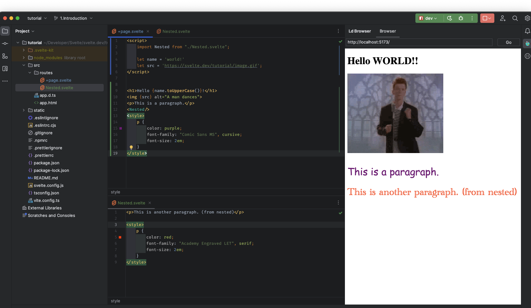
<p>This is a paragraph.</p>
<style>
p {
color: purple;
font-family: "Comic Sans MS", cursive;
font-size: 2em;
}
</style>
Nested Components
<script>
    import Nested from "./Nested.svelte";

    let name = 'world!'
    let src = 'https://svelte.dev/tutorial/image.gif';
</script>


<h1>Hello {name.toUpperCase()}!</h1>
<img {src} alt="A man dances">
<p>This is a paragraph.</p>
<Nested/>
<style>
    p {
        color: purple;
        font-family: "Comic Sans MS", cursive;
        font-size: 2em;
    }
</style>
<p>This is another paragraph. (from nested)</p>

<style>
    p {
        color: red;
        font-family: "Academy Engraved LET", serif;
        font-size: 2em;
    }
</style>
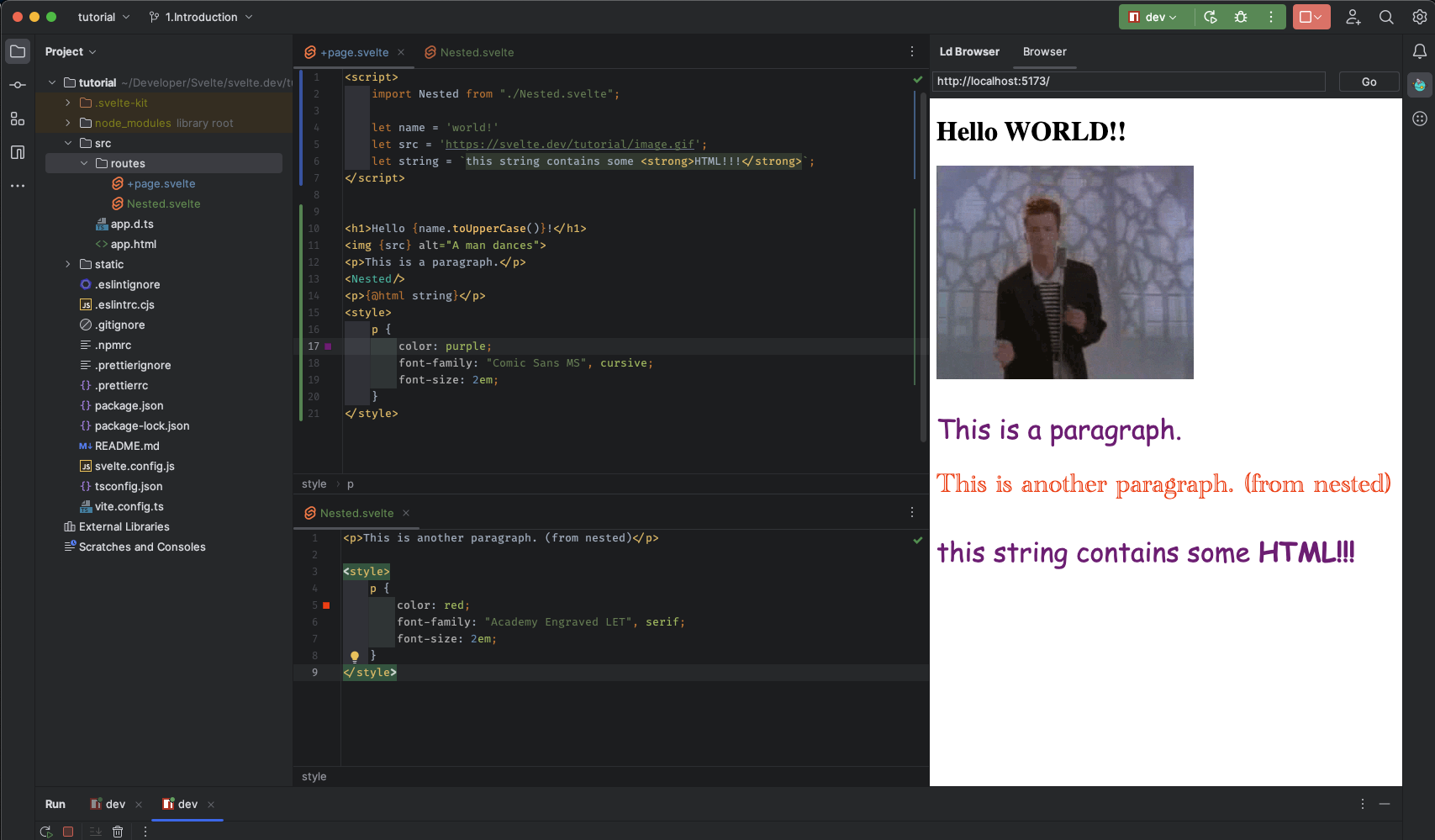
HTML tags
Ordinarily, strings are inserted as plain text, meaning that characters like < and > have no special meaning.
But sometimes you need to render HTML directly into a component.
In Svelte, you do this with the special {@html ...} tag:
<script>
    import Nested from "./Nested.svelte";

    let name = 'world!'
    let src = 'https://svelte.dev/tutorial/image.gif';
    let string = `this string contains some <strong>HTML!!!</strong>`;
</script>


<h1>Hello {name.toUpperCase()}!</h1>
<img {src} alt="A man dances">
<p>This is a paragraph.</p>
<Nested/>
<p>{@html string}</p>
<style>
    p {
        color: purple;
        font-family: "Comic Sans MS", cursive;
        font-size: 2em;
    }
</style>
Making an app
import App from './App.svelte';

const app = new App({
	target: document.body,
	props: {
		// we'll learn about props later
		answer: 42
	}
});
2. Reactivity
Assignments
<script>
    let count = 0;

    function incrementCount() {
        // event handle code goes here
        count++;
        console.log(count);
    }
</script>

<button on:click={incrementCount}>
    Clicked {count} {count === 1 ? 'time' : 'times'}
</button>
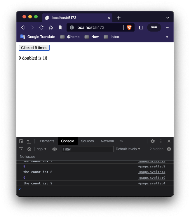
Declarations
<script>
    let count = 0;
    $: doubled = count * 2;

    function incrementCount() {
        // event handle code goes here
        count++;
        console.log(count);
    }
</script>

<button on:click={incrementCount}>
    Clicked {count} {count === 1 ? 'time' : 'times'}
</button>
<p>{count} doubled is {doubled}</p>
Don’t worry if this looks a little alien. It’s valid (if unconventional) JavaScript, which Svelte interprets to mean ‘re-run this code whenever any of the referenced values change’.
Statements
<script lang="ts">
    let count = 0;
    $: doubled = count * 2;
    $: console.log('the count is: ' + count);

    function incrementCount() {
        // event handle code goes here
        count++;
        console.log(count);
    }

</script>

<button on:click={incrementCount}>
    Clicked {count} {count === 1 ? 'time' : 'times'}
</button>
<p>{count} doubled is {doubled}</p>
We’re not limited to declaring reactive values — we can also run arbitrary statements reactively. For example, we can log the value of count whenever it changes:
<script lang="ts">
    let count = 0;
    $: doubled = count * 2;
    $: {
        console.log('the count is: ' + count);
        alert('I SAID THE COUNT IS ' + count);
    }
    $: if (count >= 10) {
        alert('count is dangerously high!');
        count = 9;
    }

    function incrementCount() {
        // event handle code goes here
        count++;
        console.log(count);
    }

</script>

<button on:click={incrementCount}>
    Clicked {count} {count === 1 ? 'time' : 'times'}
</button>
<p>{count} doubled is {doubled}</p>
<script lang="ts">
    let count = 0;
    $: doubled = count * 2;
    $: {
        console.log('the count is: ' + count);
        if (typeof window !== 'undefined') {
            alert('I SAID THE COUNT IS ' + count);
        }
    }
    $: if (count >= 10) {
        if (typeof window !== 'undefined') {
            alert('count is dangerously high!');
        }
        count = 9;
    }

    function incrementCount() {
        // event handle code goes here
        count++;
        console.log(count);
    }

</script>

<button on:click={incrementCount}>
    Clicked {count} {count === 1 ? 'time' : 'times'}
</button>
<p>{count} doubled is {doubled}</p>
Note: why we check the type of window? cause out code might be working on the client side and or on the server side, if it is not working on the client side ( browser side) then we cannot use the alet method.
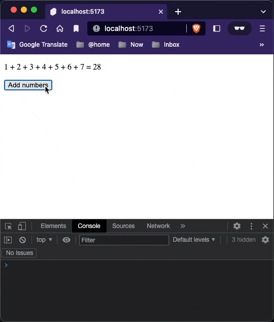
Updating arrays and Objects
Svelte’s reactivity is triggered by assignments. Methods that mutate arrays or objects will not trigger updates by themselves.
<script>
    let numbers = [1, 2, 3]

    function addNumber() {
        numbers.push(numbers.length + 1)
        numbers = numbers;
    }

    $: sum = numbers.reduce((t, n) => t + n, 0)
</script>

<p>{numbers.join(' + ')} = {sum}</p>
<button on:click={addNumber}>Add numbers</button>
One way to fix that is to assign numbers to itself to tell the compiler it has changed:
function addNumber() {
        numbers.push(numbers.length + 1)
        numbers = numbers;
    }
You could also write this more concisely using the ES6 spread syntax:
<script>
    let numbers = [1, 2, 3]

    function addNumber() {
        numbers = [...numbers, numbers.length + 1]
    }

    $: sum = numbers.reduce((t, n) => t + n, 0)
</script>

<p>{numbers.join(' + ')} = {sum}</p>
<button on:click={addNumber}>Add numbers</button>
A simple rule of thumb: the updated variable must directly appear on the left hand side of the assignment.
3. Props
Prop = properties. Properties of the current module, or let’s say the current component. a prop value can be passed from father element to the current element.
Pass data from one component down to its children. To do that, we need to declare properties, generally shortened to ‘props’.
In Svelte, we do that with the
exportkeyword.
<script>
import Nested from "./Nested.svelte";
</script>
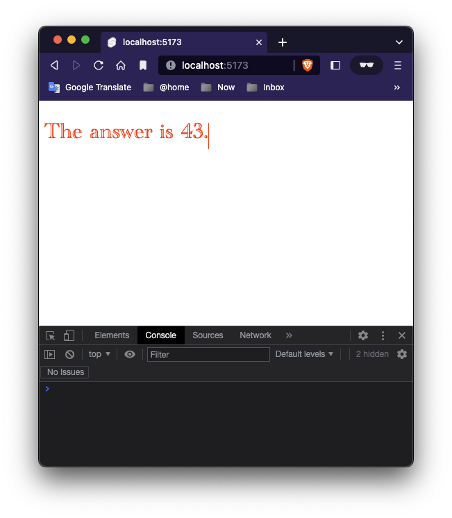
<Nested answer="43"/>
<script>
    export let answer;
</script>

<style>
    p {
        color: red;
        font-family: "Academy Engraved LET", serif;
        font-size: 2em;
    }
</style>

<p>The answer is {answer}.</p>
Default values
We can easily specify default values for props in:
<script>
    export let answer = 'this is the default answer';
</script>

<style>
    p {
        color: red;
        font-family: "Academy Engraved LET", serif;
        font-size: 2em;
    }
</style>

<p>The answer is {answer}.</p>
<script>
    import Nested from "./Nested.svelte";
</script>

<Nested />
<Nested answer="32"/>
Spread props
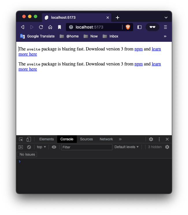
If you have an object of properties, you can ‘spread’ them onto a component instead of specifying each one:
<script>
    import Info from "./Info.svelte";

    const pkg = {
        name: 'svelte',
        version: 3,
        speed: 'blazing',
        website: 'https://svelte.dev'
    };
</script>

<Info {...pkg}/>

<Info name={pkg.name} version={pkg.version} speed={pkg.speed} website={pkg.website}/>
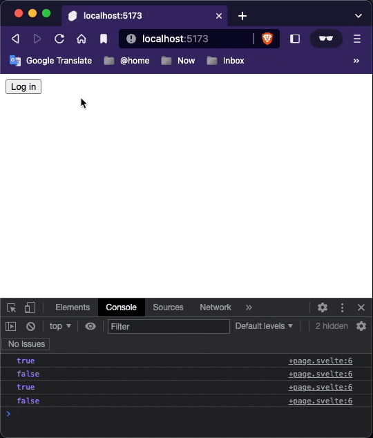
If blocks
HTML doesn’t have a way of expressing logic, like conditionals and loops. Svelte does.
<script>
    let user = {loggedIn: false}

    function toggleLogin() {
        user.loggedIn = !user.loggedIn;
        console.log(user.loggedIn);
    }
</script>


<button on:click={toggleLogin}>Log in</button>
<button on:click={toggleLogin}>Log out</button>
<script>
    let user = {loggedIn: false}

    function toggleLogin() {
        user.loggedIn = !user.loggedIn;
        console.log(user.loggedIn);
    }
</script>

{#if user.loggedIn}
    <button on:click={toggleLogin}>Log out</button>
{/if}
{#if !user.loggedIn}
    <button on:click={toggleLogin}>Log in</button>
{/if}
Else blocks
Since the two conditions — if user.loggedIn and if !user.loggedIn — are mutually exclusive, we can simplify this component slightly by using an else block:
A
#character always indicates a block opening tag. A/character always indicates a block closing tag. A:character, as in{:else}, indicates a block continuation tag.
<script>
    let user = {loggedIn: false}

    function toggleLogin() {
        user.loggedIn = !user.loggedIn;
        console.log(user.loggedIn);
    }
</script>

{#if user.loggedIn}
    <button on:click={toggleLogin}>Log out</button>
{:else}
    <button on:click={toggleLogin}>Log in</button>
{/if}
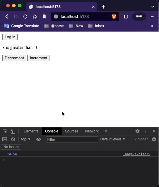
Else if blocks
<script>
    let user = {loggedIn: false}
    let x = 14.54;
    $: {
        console.log(x)
    }

    function toggleLogin() {
        user.loggedIn = !user.loggedIn;
        console.log(user.loggedIn);
    }
</script>

{#if user.loggedIn}
    <button on:click={toggleLogin}>Log out</button>
{:else}
    <button on:click={toggleLogin}>Log in</button>
{/if}

{#if x > 10}
    <p>x is greater than 10</p>
    <button on:click={() => x = x - 1}>Decrement</button>
    <button on:click={() => x = x + 1}>Increment</button>
{:else if x > 5}
    <p>x is greater than 5</p>
    <button on:click={() => x = x - 1}>Decrement</button>
    <button on:click={() => x = x + 1}>Increment</button>
{:else}
    <p>x is less than 5</p>
{/if}
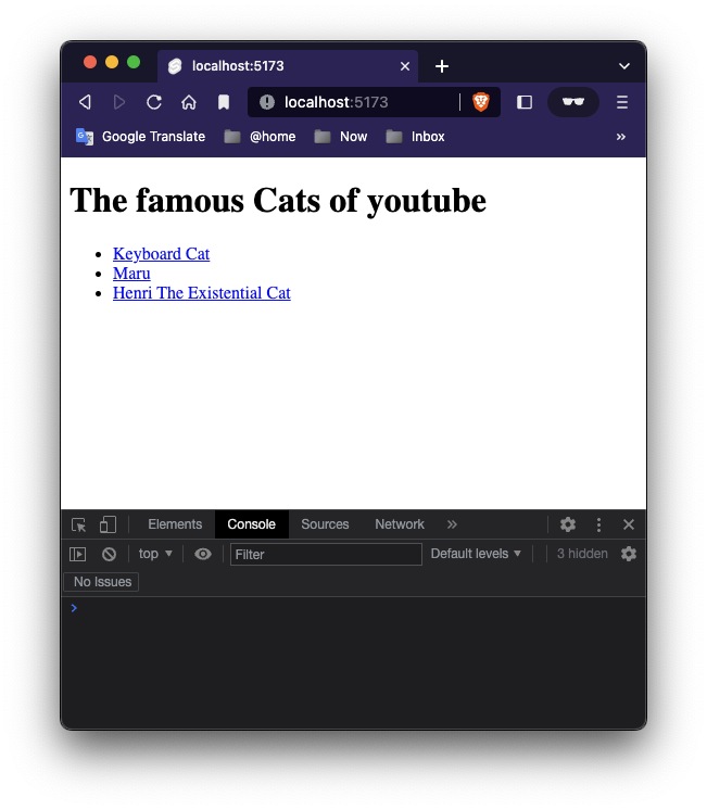
Each blocks
If you need to loop over lists of data, use an each block:
<script>
    let cats = [
        {id: 'J---aiyznGQ', name: 'Keyboard Cat'},
        {id: 'z_AbfPXTKms', name: 'Maru'},
        {id: 'OUtn3pvWmpg', name: 'Henri The Existential Cat'}
    ];
</script>

<h1>The famous Cats of youtube</h1>
<ul>
    <!--    open each block-->
    {#each cats as cat}
        <li><a target="_blank" href="https://www.youtube.com/watch?v={cat.id}" rel="noreferrer">
            {cat.name}
        </a></li>
    <!-- close each block -->
    {/each}
</ul>
You can get the current index as a second argument, like so:
<ul>
    <!--    open each block-->
    {#each cats as cat,i}
        <li><a target="_blank" href="https://www.youtube.com/watch?v={cat.id}" rel="noreferrer">
            {cat.name}
        </a></li>
        <!-- close each block -->
    {/each}
</ul>
4. Logic
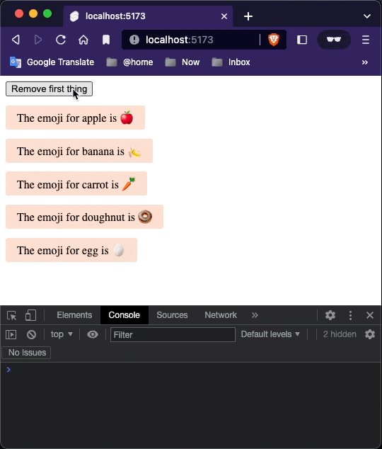
Keyed each blocks
<script>
    import Thing from './Thing.svelte';

    let things = [
        {id: 1, name: 'apple'},
        {id: 2, name: 'banana'},
        {id: 3, name: 'carrot'},
        {id: 4, name: 'doughnut'},
        {id: 5, name: 'egg'},
    ];

    function handleClick() {
        things = things.slice(1);
    }
</script>

<button on:click={handleClick}>
    Remove first thing
</button>

{#each things as thing (thing.id)}
    <Thing name={thing.name}/>
{/each}
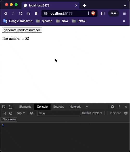
Await blocks
Svelte makes it easy to await the value of promises directly in your markup:
<script>
    async function getRandomNumber() {
        const host = 'https://svelte.dev'
        const response = await fetch(`${host}/tutorial/random-number`)
        const text = await response.text()


        if (response.ok) {
            return text
        } else {
            throw new Error(text)
        }
    }

    let promise = getRandomNumber()

    function handleClick() {
        promise = getRandomNumber()
    }
</script>


<button on:click={handleClick}>
    generate random number
</button>

{#await promise}
    <p>...waiting</p>
{:then number}
    <p>The number is {number}</p>
{:catch error}
    <p style="color: red">{error.message}</p>
{/await}
Notice: why we have to declare a variable named as promise first ?
Cause in the template, we are ‘observing’ the value of such variable.
5. Events
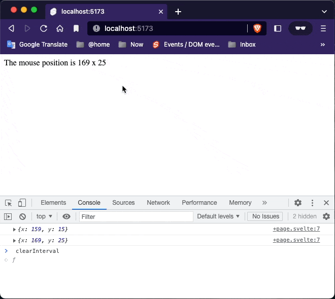
DOM Events
As we’ve briefly seen already, you can listen to any event on an element with the on: directive:
<script>
    let m = {x: 0, y: 0};

    function handleMousemove(event) {
        m.x = event.clientX;
        m.y = event.clientY;
        console.log(m)
    }
</script>

<div on:mousemove={handleMousemove}>
    The mouse position is {m.x} x {m.y}
</div>

<style>
    div {
        width: 100%;
        height: 100%;
    }
</style>
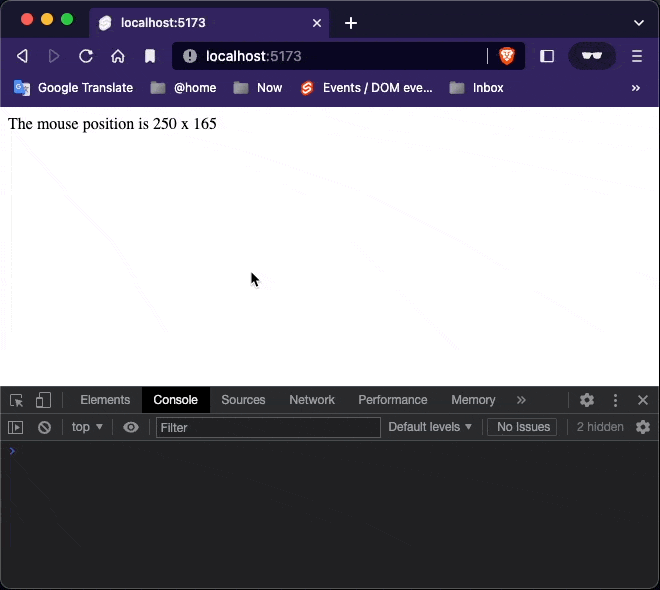
Inline Handlers
You can also declare event handlers inline:
<script>
    let m = {x: 0, y: 0};

    function handleMousemove(event) {
        m.x = event.clientX;
        m.y = event.clientY;
        console.log(m)
    }
</script>

<div on:mousemove={ e => m = {x: e.clientX, y: e.clientY} } style="position: absolute;">
    The mouse position is {m.x} x {m.y}
</div>

<style>
    div {
        width: 100%;
        height: 100%;
    }
</style>
Event modifiers
DOM event handlers can have modifiers that alter their behaviour. For example, a handler with a once modifier will only run a single time:
<script>
    function handleClick() {
        alert('clicked')
    }

</script>


<button on:click|once={handleClick}>
    click me
</button>
The full list of modifiers:
preventDefault— callsevent.preventDefault()before running the handler. Useful for client-side form handling, for example.stopPropagation— callsevent.stopPropagation(), preventing the event reaching the next elementpassive— improves scrolling performance on touch/wheel events (Svelte will add it automatically where it’s safe to do so)nonpassive— explicitly setpassive: falsecapture— fires the handler during the capture phase instead of the bubbling phase (MDN docs)once— remove the handler after the first time it runsself— only trigger handler if event.target is the element itselftrusted— only trigger handler ifevent.isTrustedistrue. I.e. if the event is triggered by a user action.
You can chain modifiers together, e.g. on:click|once|capture={...}.
Component events
Components can also dispatch events. To do so, they must create an event dispatcher. Update Inner.svelte:
createEventDispatchermust be called when the component is first instantiated — you can’t do it later inside e.g. asetTimeoutcallback. This linksdispatchto the component instance.
<script>
import { createEventDispatcher } from 'svelte';
const dispatch = createEventDispatcher();
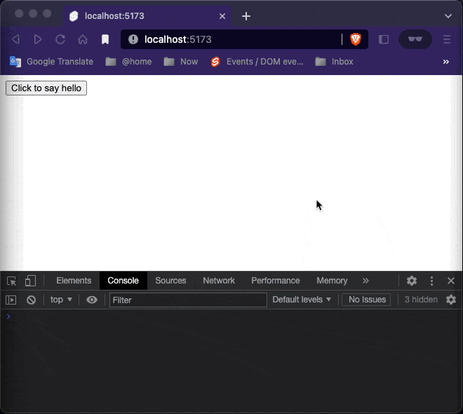
function sayHello() {
dispatch('message', {
text: 'Hello!'
});
}
</script>
<button on:click={sayHello}>
Click to say hello
</button>
<script>
    import {createEventDispatcher} from 'svelte';
    import Inner from './Inner.svelte';

    const dispatch = createEventDispatcher();

    function handleMessage(event) {
        alert(event.detail.text)
    }

</script>

<Inner on:message={handleMessage}/>
Notice that the App component is listening to the messages dispatched by Inner component thanks to the on:message directive. This directive is an attribute prefixed with on: followed by the event name that we are dispatching (in this case, message).
Event forwarding
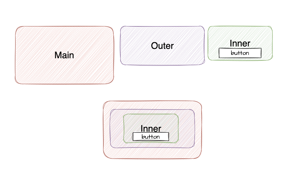
Unlike DOM events, component events don’t bubble. If you want to listen to an event on some deeply nested component, the intermediate components must forward the event.
In this case, we have the same App.svelte and Inner.svelte as in the previous chapter, but there’s now an Outer.svelte component that contains <Inner/>.
<script>
    import Inner from './Inner.svelte';
</script>

<Inner on:message/>
<script>
    import { createEventDispatcher } from 'svelte';

    const dispatch = createEventDispatcher();

    function sayHello() {
        dispatch('message', {
            text: 'Hello!'
        });
    }
</script>

<button on:click={sayHello}>
    Click to say hello
</button>
<script>
    import {createEventDispatcher} from 'svelte';
    import Outer from "./Outer.svelte";

    const dispatch = createEventDispatcher();

    function handleMessage(event) {
        alert(event.detail.text)
    }

</script>

<Outer on:message={handleMessage}/>
Svelte gives us an equivalent shorthand — an on:message event directive without a value means ‘forward all message events’.
DOM event forwarding
Event forwarding works for DOM events too.
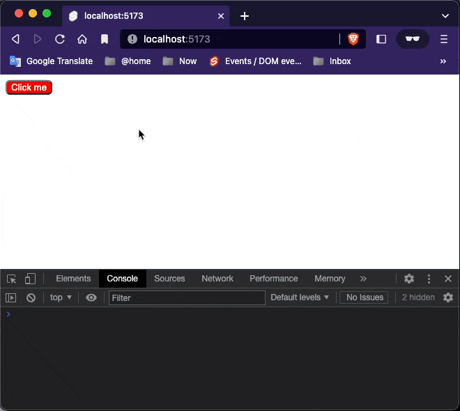
We want to get notified of clicks on our <CustomButton> — to do that, we just need to forward click events on the <button> element in CustomButton.svelte:
<script>

</script>

<button on:click>
    Click me
</button>


<style>
    button {
        background-color: red;
        color: white;
        border-radius: 6px;
    }

    button:hover {
        background-color: blue;
    }

    button:active {
        background-color: green;
    }

    button:focus {
        background-color: yellow;
    }
</style>
<script>
    import CustomButton from "./CustomButton.svelte";
    function handleClick() {
        alert('button clicked');
    }
</script>

<CustomButton on:click={handleClick} />
6. Bindings
Text Inputs
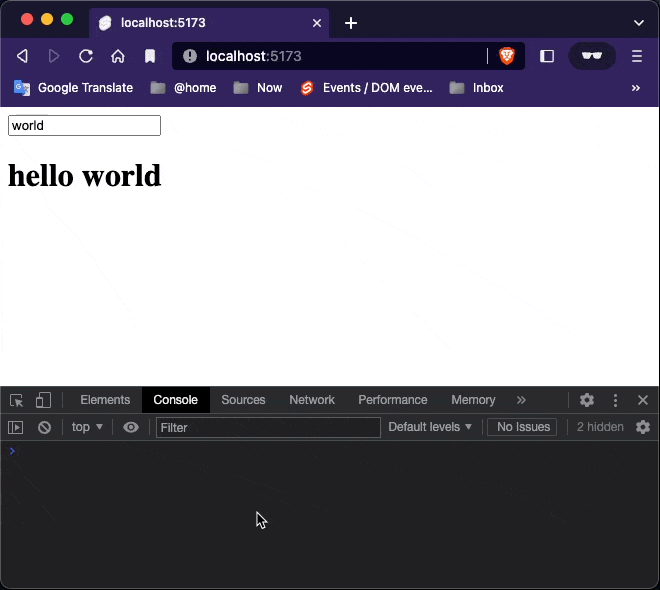
<script>
    let name = 'world';
</script>

<input type="text" bind:value={name}/>

<h1>hello {name}</h1>
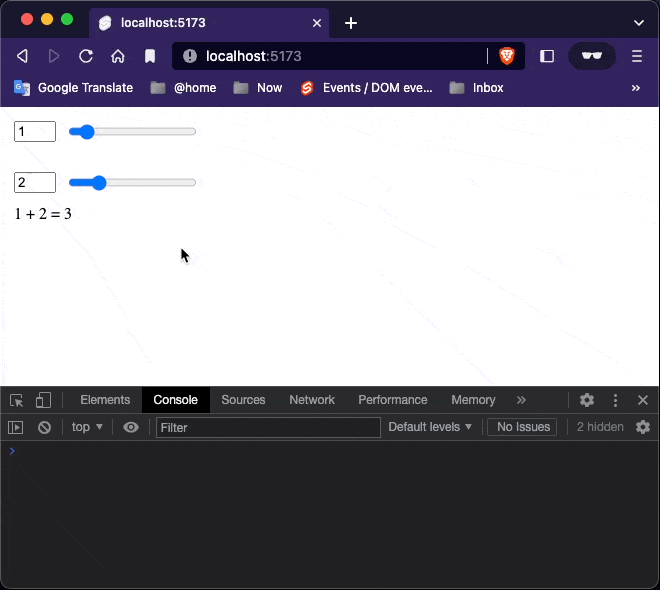
Numeric inputs
With bind:value, Svelte takes care of it for you:
<script>
    let a = 1;
    let b = 2;
</script>

<label>
    <input type="number" bind:value={a} id="a1" min=0 max=10/>
    <input type="range" bind:value={a} id="a2" min=0 max=10/>
</label>

<br>

<label>
    <input type="number" bind:value={b} id="b1" min=0 max=10/>
    <input type="range" bind:value={b} id="b2" min=0 max=10/>
</label>


<p>{a} + {b} = {a + b}</p>


<style>
    label { display: flex }
    input, p { margin: 6px }
</style>
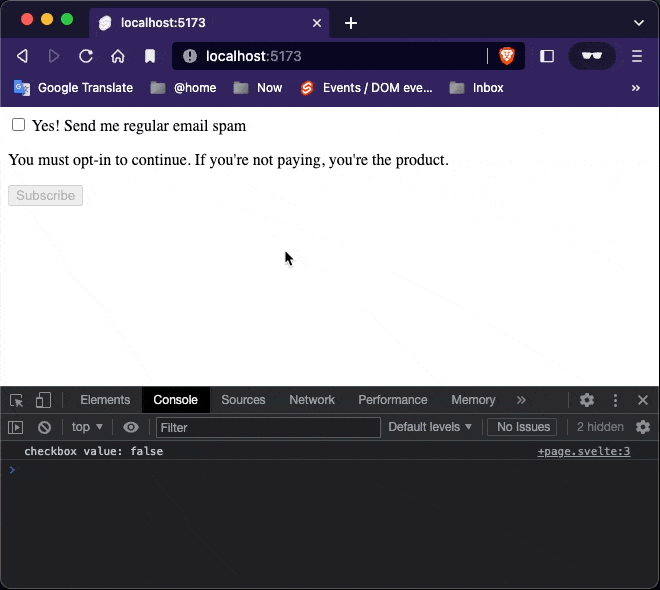
Checkbox inputs
Checkboxes are used for toggling between states. Instead of binding to input.value, we bind to input.checked:
<script>
    let yes = false;
    $: console.log("checkbox value: " + yes)
</script>

<label>
    <input type="checkbox" id="yes" name="yes" bind:checked={yes}/>
    Yes! Send me regular email spam
</label>

{#if yes}
    <p>Thank you. We will bombard your inbox and sell your personal details.</p>
{:else }
    <p>You must opt-in to continue. If you're not paying, you're the product.</p>
{/if}

<button disabled={!yes} on:click={()=> alert("A spam email will be send.")}>
    Subscribe
</button>
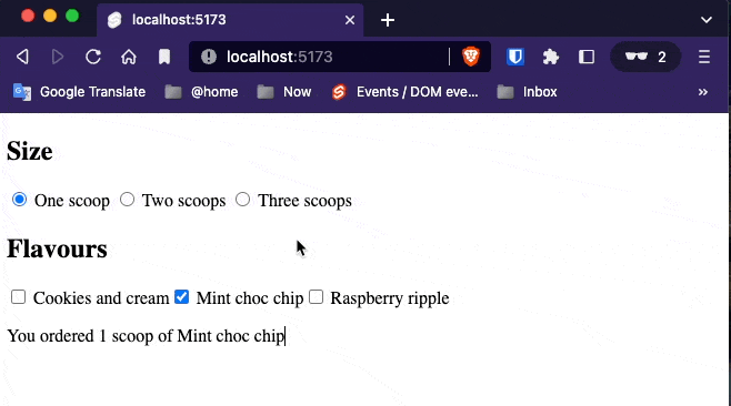
Group inputs
If you have multiple inputs relating to the same value, you can use bind:group along with the value attribute. Radio inputs in the same group are mutually exclusive; checkbox inputs in the same group form an array of selected values.
<script>
    let scoops = 1;

    let menu = [
        'Cookies and cream',
        'Mint choc chip',
        'Raspberry ripple'
    ];
    let flavours = ['Mint choc chip'];

    function join(flavours) {
        if (flavours.length === 1) return flavours[0];
        return `${flavours.slice(0, -1).join(', ')} and ${flavours[flavours.length - 1]}`;
    }
</script>

<h2>Size</h2>

<label>
    <input type=radio bind:group={scoops} name="scoops" value={1}>
    One scoop
</label>

<label>
    <input type=radio bind:group={scoops} name="scoops" value={2}>
    Two scoops
</label>

<label>
    <input type=radio bind:group={scoops} name="scoops" value={3}>
    Three scoops
</label>


<h2>Flavours</h2>

{#each menu as flavour}
    <label>
        <input type=checkbox bind:group={flavours} name="flavours" value={flavour}>
        {flavour}
    </label>
{/each}

{#if flavours.length === 0}
    <p>Please select at least one flavour</p>
{:else if flavours.length > scoops}
    <p>Can't order more flavours than scoops!</p>
{:else}
    <p>
        You ordered {scoops} {scoops === 1 ? 'scoop' : 'scoops'}
        of {join(flavours)}
    </p>
{/if}
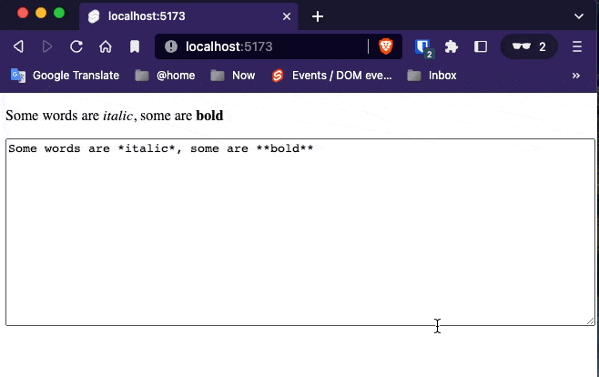
Textarea inputs
The <textarea> element behaves similarly to a text input in Svelte — use bind:value:
$ pnpm install -D @magidoc/plugin-svelte-marked marked @types/marked
<script>
    import {marked} from 'marked'

    let content = `Some words are *italic*, some are **bold**`
</script>


{@html marked(content)}

<textarea bind:value={content}></textarea>

<style>
    textarea { width: 100%; height: 200px; }
</style>
Select bindings
We can also use bind:value with <select> elements.
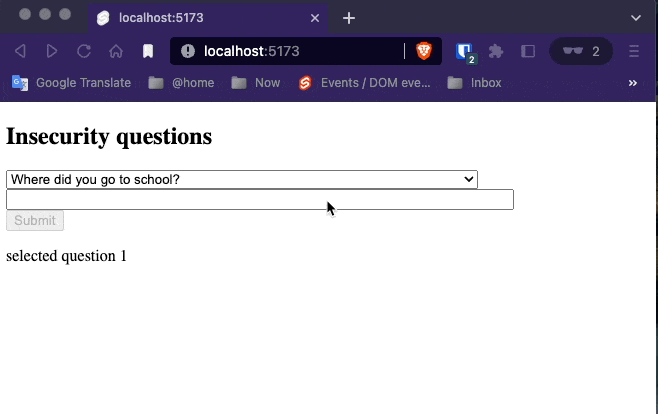
<script>
    let questions = [
        { id: 1, text: `Where did you go to school?` },
        { id: 2, text: `What is your mother's name?` },
        { id: 3, text: `What is another personal fact that an attacker could easily find with Google?` }
    ];

    let selected;
    let answer = '';
    function handleSubmit() {
        alert(`answered question ${selected.id} (${selected.text}) with "${answer}"`);
    }
</script>

<h2>Insecurity questions</h2>
<form on:submit|preventDefault={handleSubmit}>
    <select bind:value={selected} on:change="{() => answer = ''}">
        {#each questions as question}
            <option value={question}>
                {question.text}
            </option>
        {/each}
    </select>

    <input bind:value={answer}>

    <button disabled={!answer} type=submit>
        Submit
    </button>
</form>
<p>selected question {selected ? selected.id : '[waiting...]'}</p>

<style>
    input {
        display: block;
        width: 500px;
        max-width: 100%;
    }
</style>
Select Multiple
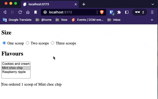
A select can have a multiple attribute, in which case it will populate an array rather than selecting a single value.
Returning to our earlier ice cream example, we can replace the checkboxes with a <select multiple>:
<script>
    let scoops = 1;
    let flavours = ['Mint choc chip'];

    let menu = [
        'Cookies and cream',
        'Mint choc chip',
        'Raspberry ripple'
    ];

    function join(flavours) {
        if (flavours.length === 1) return flavours[0];
        return `${flavours.slice(0, -1).join(', ')} and ${flavours[flavours.length - 1]}`;
    }
</script>

<h2>Size</h2>

<label>
    <input type=radio bind:group={scoops} value={1}>
    One scoop
</label>

<label>
    <input type=radio bind:group={scoops} value={2}>
    Two scoops
</label>

<label>
    <input type=radio bind:group={scoops} value={3}>
    Three scoops
</label>

<h2>Flavours</h2>

<select multiple bind:value={flavours}>
    {#each menu as flavour}
        <option value={flavour}>
            {flavour}
        </option>
    {/each}
</select>

{#if flavours.length === 0}
    <p>Please select at least one flavour</p>
{:else if flavours.length > scoops}
    <p>Can't order more flavours than scoops!</p>
{:else}
    <p>
        You ordered {scoops} {scoops === 1 ? 'scoop' : 'scoops'}
        of {join(flavours)}
    </p>
{/if}
Press and hold the
controlkey (or thecommandkey on MacOS) for selecting multiple options.
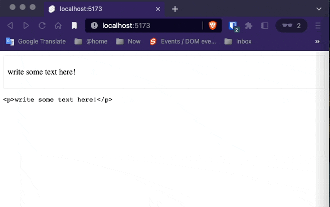
Contenteditable bindings
<script>
    let html = '<p>write some text here!</p>'

</script>

<div contenteditable="true" bind:innerHTML={html}></div>

<pre>{html}</pre>


<style>
    [contenteditable] {
        padding: 0.5em;
        border: 1px solid #eee;
        border-radius: 4px;
    }
</style>
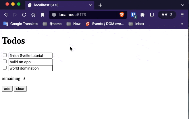
Each block bindings
You can even bind to properties inside an each block.
<script>
    let todos = [
        {done: false, text: 'finish Svelte tutorial'},
        {done: false, text: 'build an app'},
        {done: false, text: 'world domination'}
    ]

    function add() {
        todos = todos.concat({ done: false, text: '' });
    }

    function clear() {
        todos = todos.filter(todo => !todo.done)
    }

    $: remaining = todos.filter(todo => !todo.done).length
</script>

<h1>Todos</h1>
{#each todos as todo}
    <div class:done={todo.done}>
        <input
                type="checkbox"
                bind:checked={todo.done}
        >
        <input
                placeholder="What needs to be done?"
                bind:value={todo.text}
        >
    </div>
{/each}

<p>remaining: {remaining}</p>

<button on:click={add}>add</button>
<button on:click={clear}>clear</button>

<style>
    .done {
        opacity: 0.4;
    }
</style>
Media elements
The <audio> and <video> elements have several properties that you can bind to. This example demonstrates a few of them.
<script>
// These values are bound to properties of the video
let time = 0;
let duration;
let paused = true;
let showControls = true;
let showControlsTimeout;
// Used to track time of last mouse down event
let lastMouseDown;
function handleMove(e) {
// Make the controls visible, but fade out after
// 2.5 seconds of inactivity
clearTimeout(showControlsTimeout);
showControlsTimeout = setTimeout(() => showControls = false, 2500);
showControls = true;
if (!duration) return; // video not loaded yet
if (e.type !== 'touchmove' && !(e.buttons & 1)) return; // mouse not down
const clientX = e.type === 'touchmove' ? e.touches[0].clientX : e.clientX;
const { left, right } = this.getBoundingClientRect();
time = duration * (clientX - left) / (right - left);
}
// we can't rely on the built-in click event, because it fires
// after a drag — we have to listen for clicks ourselves
function handleMousedown(e) {
lastMouseDown = new Date();
}
function handleMouseup(e) {
if (new Date() - lastMouseDown < 300) {
if (paused) e.target.play();
else e.target.pause();
}
}
function format(seconds) {
if (isNaN(seconds)) return '...';
const minutes = Math.floor(seconds / 60);
seconds = Math.floor(seconds % 60);
if (seconds < 10) seconds = '0' + seconds;
return `${minutes}:${seconds}`;
}
</script>
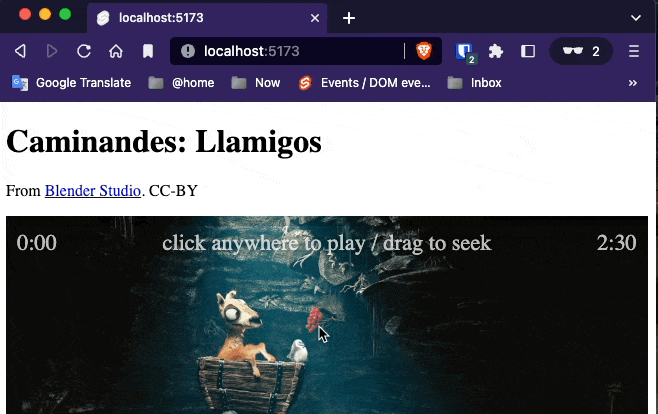
<h1>Caminandes: Llamigos</h1>
<p>From <a href="https://studio.blender.org/films">Blender Studio</a>. CC-BY</p>
<div>
<video
poster="https://sveltejs.github.io/assets/caminandes-llamigos.jpg"
src="https://sveltejs.github.io/assets/caminandes-llamigos.mp4"
on:mousemove={handleMove}
on:touchmove|preventDefault={handleMove}
on:mousedown={handleMousedown}
on:mouseup={handleMouseup}
bind:currentTime={time}
bind:duration
bind:paused>
<track kind="captions">
</video>
<div class="controls" style="opacity: {duration && showControls ? 1 : 0}">
<progress value="{(time / duration) || 0}"/>
<div class="info">
<span class="time">{format(time)}</span>
<span>click anywhere to {paused ? 'play' : 'pause'} / drag to seek</span>
<span class="time">{format(duration)}</span>
</div>
</div>
</div>
<style>
div {
position: relative;
}
.controls {
position: absolute;
top: 0;
width: 100%;
transition: opacity 1s;
}
.info {
display: flex;
width: 100%;
justify-content: space-between;
}
span {
padding: 0.2em 0.5em;
color: white;
text-shadow: 0 0 8px black;
font-size: 1.4em;
opacity: 0.7;
}
.time {
width: 3em;
}
.time:last-child { text-align: right }
progress {
display: block;
width: 100%;
height: 10px;
-webkit-appearance: none;
appearance: none;
}
progress::-webkit-progress-bar {
background-color: rgba(0,0,0,0.2);
}
progress::-webkit-progress-value {
background-color: rgba(255,255,255,0.6);
}
video {
width: 100%;
}
</style>
bind:duration` is equivalent to `bind:duration={duration}
Now, when you click on the video, it will update time, duration and paused as appropriate. This means we can use them to build custom controls.
Ordinarily on the web, you would track
currentTimeby listening fortimeupdateevents. But these events fire too infrequently, resulting in choppy UI. Svelte does better — it checkscurrentTimeusingrequestAnimationFrame.
The complete set of bindings for <audio> and <video> is as follows — six readonly bindings…
duration(readonly) — the total duration of the video, in secondsbuffered(readonly) — an array of{start, end}objectsseekable(readonly) — dittoplayed(readonly) — dittoseeking(readonly) — booleanended(readonly) — boolean
…and five two-way bindings:
currentTime— the current point in the video, in secondsplaybackRate— how fast to play the video, where1is ‘normal’paused— this one should be self-explanatoryvolume— a value between 0 and 1muted— a boolean value where true is muted
Videos additionally have readonly videoWidth and videoHeight bindings.
Dimensions
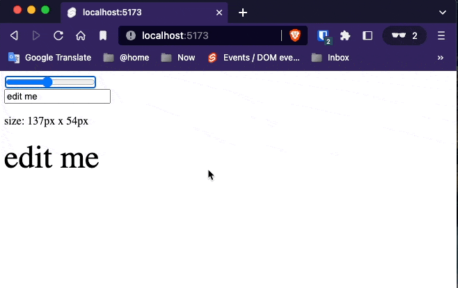
Every block-level element has clientWidth, clientHeight, offsetWidth and offsetHeight bindings:
<script>
    let w;
    let h;
    let size = 42;
    let text = 'edit me';
</script>

<input type=range bind:value={size}>
<input bind:value={text}>
<p>size: {w}px x {h}px</p>
<div bind:clientWidth={w} bind:clientHeight={h}>
    <span style="font-size: {size}px">{text}</span>
</div>

<style>
    input { display: block; }
    div { display: inline-block; }
    span { word-break: break-all; }
</style>
This
The readonly this binding applies to every element (and component) and allows you to obtain a reference to rendered elements.
<script>
    import {onMount} from 'svelte';

    let canvas;

    onMount(() => {
        const ctx = canvas.getContext('2d');
        let frame = requestAnimationFrame(loop);

        function loop(t) {
            frame = requestAnimationFrame(loop);

            const imageData = ctx.getImageData(0, 0, canvas.width, canvas.height);

            for (let p = 0; p < imageData.data.length; p += 4) {
                const i = p / 4;
                const x = i % canvas.width;
                const y = i / canvas.width >>> 0;

                const r = 64 + (128 * x / canvas.width) + (64 * Math.sin(t / 1000));
                const g = 64 + (128 * y / canvas.height) + (64 * Math.cos(t / 1000));
                const b = 128;

                imageData.data[p + 0] = r;
                imageData.data[p + 1] = g;
                imageData.data[p + 2] = b;
                imageData.data[p + 3] = 255;
            }

            ctx.putImageData(imageData, 0, 0);
        }

        return () => {
            cancelAnimationFrame(frame);
        };
    });
</script>

<canvas
        bind:this={canvas}
        width={32}
        height={32}
></canvas>

<style>
    canvas {
        width: 100%;
        height: 100%;
        background-color: #666;
        -webkit-mask: url(https://svelte.dev/svelte-logo-mask.svg) 50% 50% no-repeat;
        mask: url(https://svelte.dev/svelte-logo-mask.svg) 50% 50% no-repeat;
    }
</style>

Component bindings
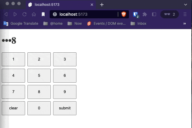
Just as you can bind to properties of DOM elements, you can bind to component props. For example, we can bind to the value prop of this <Keypad> component as though it were a form element:
<script>
    import Keypad from './Keypad.svelte';

    let pin;
    $: view = pin ? pin.replace(/\d(?!$)/g, '•') : 'enter your pin';

    function handleSubmit() {
        alert(`submitted ${pin}`);
    }

</script>

<h1 style="color: {pin ? '#333' : '#ccc'}">{view}</h1>

<Keypad on:submit={handleSubmit} bind:value={pin}/>
<script>
    import { createEventDispatcher } from 'svelte';
    export let value = '';
    const dispatch = createEventDispatcher();
    const select = num => () => value += num;
    const clear  = () => value = '';
    const submit = () => dispatch('submit');
</script>

<div class="keypad" >
    <button on:click={select(1)}>1</button>
    <button on:click={select(2)}>2</button>
    <button on:click={select(3)}>3</button>
    <button on:click={select(4)}>4</button>
    <button on:click={select(5)}>5</button>
    <button on:click={select(6)}>6</button>
    <button on:click={select(7)}>7</button>
    <button on:click={select(8)}>8</button>
    <button on:click={select(9)}>9</button>

    <button disabled={!value} on:click={clear}>clear</button>
    <button on:click={select(0)}>0</button>
    <button disabled={!value} on:click={submit}>submit</button>
</div>

<style>
    .keypad {
        display: grid;
        grid-template-columns: repeat(3, 5em);
        grid-template-rows: repeat(4, 3em);
        grid-gap: 0.5em
    }

    button {
        margin: 0
    }
</style>
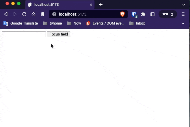
Binding to component instances
Just as you can bind to DOM elements, you can bind to component instances themselves. For example, we can bind the instance of <InputField> to a variable named field in the same way we did when binding DOM Elements
<script>
    import InputField from './InputField.svelte';
    let field;
</script>

<InputField bind:this={field} />
<script>
	let input;

	export function focus() {
		input.focus();
	}
</script>

<input bind:this={input} />
<button on:click="{() => field.focus()}">
	Focus field
</button>
7. Lifecycle
onMount
Every component has a lifecycle that starts when it is created, and ends when it is destroyed. There are a handful of functions that allow you to run code at key moments during that lifecycle.
The one you’ll use most frequently is onMount, which runs after the component is first rendered to the DOM.
We’ll add an onMount handler that loads some data over the network:
<script lang="ts">
import {onMount} from 'svelte';
interface Photo {
title: string,
thumbnailUrl: string,
}
let photos: Photo[] = [];
onMount(
async () => {
photos = [
{
"title":"accusamus beatae ad facilis cum similique qui sunt",
"thumbnailUrl":"https://via.placeholder.com/150/92c952"
},
{
"title":"reprehenderit est deserunt velit ipsam",
"thumbnailUrl":"https://via.placeholder.com/150/771796"
},
{
"title":"officia porro iure quia iusto qui ipsa ut modi",
"thumbnailUrl":"https://via.placeholder.com/150/24f355"
},
{"title":"culpa odio esse rerum omnis laboriosam voluptate repudiandae","thumbnailUrl":"https://via.placeholder.com/150/d32776"},{"title":"natus nisi omnis corporis facere molestiae rerum in","thumbnailUrl":"https://via.placeholder.com/150/f66b97"},{"title":"accusamus ea aliquid et amet sequi nemo","thumbnailUrl":"https://via.placeholder.com/150/56a8c2"},{"title":"officia delectus consequatur vero aut veniam explicabo molestias","thumbnailUrl":"https://via.placeholder.com/150/b0f7cc"},{"title":"aut porro officiis laborum odit ea laudantium corporis","thumbnailUrl":"https://via.placeholder.com/150/54176f"},{"title":"qui eius qui autem sed","thumbnailUrl":"https://via.placeholder.com/150/51aa97"},{"title":"beatae et provident et ut vel","thumbnailUrl":"https://via.placeholder.com/150/810b14"},{"title":"nihil at amet non hic quia qui","thumbnailUrl":"https://via.placeholder.com/150/1ee8a4"},{"title":"mollitia soluta ut rerum eos aliquam consequatur perspiciatis maiores","thumbnailUrl":"https://via.placeholder.com/150/66b7d2"},{"title":"repudiandae iusto deleniti rerum","thumbnailUrl":"https://via.placeholder.com/150/197d29"},{"title":"est necessitatibus architecto ut laborum","thumbnailUrl":"https://via.placeholder.com/150/61a65"},{"title":"harum dicta similique quis dolore earum ex qui","thumbnailUrl":"https://via.placeholder.com/150/f9cee5"},{"title":"iusto sunt nobis quasi veritatis quas expedita voluptatum deserunt","thumbnailUrl":"https://via.placeholder.com/150/fdf73e"},{"title":"natus doloribus necessitatibus ipsa","thumbnailUrl":"https://via.placeholder.com/150/9c184f"},{"title":"laboriosam odit nam necessitatibus et illum dolores reiciendis","thumbnailUrl":"https://via.placeholder.com/150/1fe46f"},{"title":"perferendis nesciunt eveniet et optio a","thumbnailUrl":"https://via.placeholder.com/150/56acb2"},{"title":"assumenda voluptatem laboriosam enim consequatur veniam placeat reiciendis error","thumbnailUrl":"https://via.placeholder.com/150/8985dc"},]
}
)
</script>
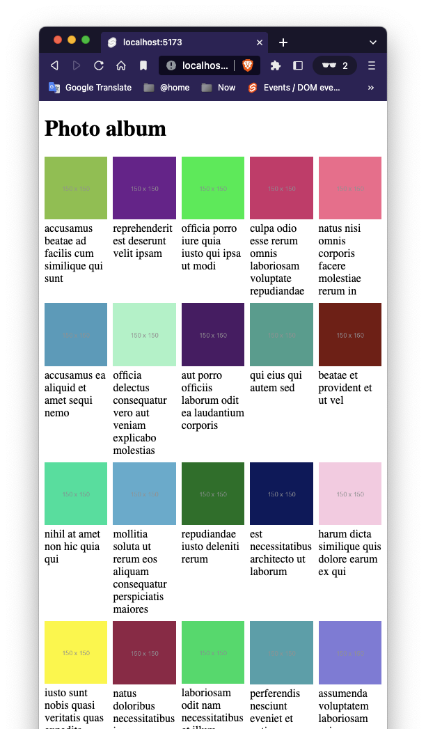
<h1>Photo album</h1>
<div class="photos">
{#each photos as photo}
<figure>
<img src={photo.thumbnailUrl} alt={photo.title}>
<figcaption>{photo.title}</figcaption>
</figure>
{:else}
<!-- this block renders when photos.length === 0 -->
<p>loading...</p>
{/each}
</div>
<style>
.photos {
width: 100%;
display: grid;
grid-template-columns: repeat(5, 1fr);
grid-gap: 8px;
}
figure, img {
width: 100%;
margin: 0;
}
</style>
onDestroy
import {onDestroy} from "svelte";


let counter = 0;
const interval = setInterval(() => {counter++;}, 1000);
export function onInterval(callback: () => void, milliseconds: number | undefined) {
    const interval = setInterval(callback, milliseconds)

    onDestroy(
        () => {
            //     fix the memory leak here
            clearInterval(interval)
        }
    )
}
<script>
    import {onInterval} from "./utils.ts";

    export let callback;
    export let interval = 1000;

    onInterval(callback, interval);
</script>


<p>
    This component executes call back every {interval} millisecond {interval === 1 ? "" : "s"}
</p>

<style>
    p {
        border: 1px solid blue;
        padding: 5px;
    }
</style>
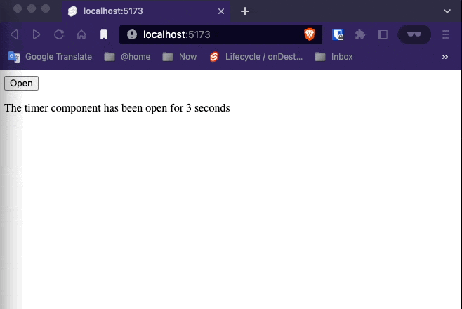
While it’s important to call lifecycle functions during the component’s initialisation, it doesn’t matter where you call them from. So if we wanted, we could abstract the interval logic into a helper function in utils.js…
Open and close the timer a few times and make sure the counter keeps ticking and the CPU load increases. This is due to a memory leak as the previous timers are not deleted. Don’t forget to refresh the page before solving the example.
beforeUpdate and afterUpdate
The beforeUpdate function schedules work to happen immediately before the DOM is updated. afterUpdate is its counterpart, used for running code once the DOM is in sync with your data.
Together, they’re useful for doing things imperatively that are difficult to achieve in a purely state-driven way, like updating the scroll position of an element.
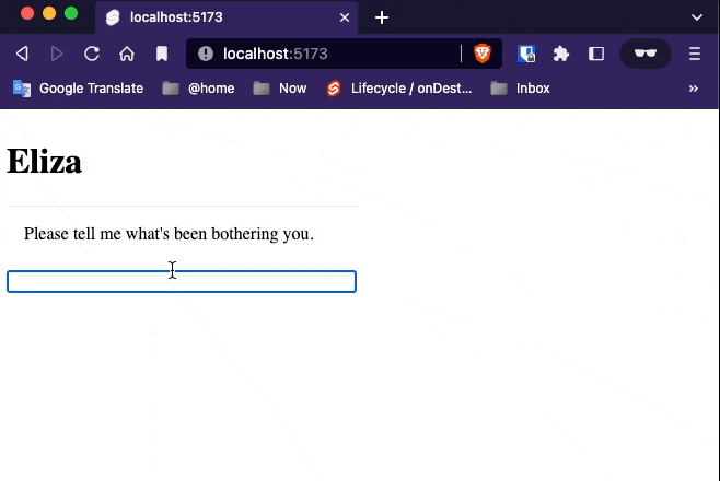
This Eliza chatbot is annoying to use, because you have to keep scrolling the chat window. Let’s fix that.
<script>
    import Eliza from 'elizabot';
    import {beforeUpdate, afterUpdate} from 'svelte';

    let div;
    let autoscroll;

    beforeUpdate(() => {
        // determine whether we should auto-scroll
        // once the DOM is updated...
        autoscroll = div && (div.offsetHeight + div.scrollTop) > (div.scrollHeight - 20);
    })

    afterUpdate(() => {
        // ...the DOM is now in sync with the data
        if (autoscroll) div.scrollTo(0, div.scrollHeight);
    })

    const eliza = new Eliza();

    let comments = [
        {author: 'Eliza', text: eliza.getInitial()}
    ]

    function handleKeydown(event) {
        if (event.key === 'Enter') {
            const text = event.target.value;
            if (!text) return;

            comments = comments.concat({
                author: 'user',
                text
            });

            event.target.value = '';

            const reply = eliza.transform(text);

            setTimeout(() => {
                comments = comments.concat({
                    author: 'eliza',
                    text: '...',
                    placeholder: true
                });

                setTimeout(() => {
                    comments = comments.filter(comment => !comment.placeholder).concat({
                        author: 'eliza',
                        text: reply
                    });
                }, 500 + Math.random() * 500);
            }, 200 + Math.random() * 200);
        }
    }
</script>


<style>
    .chat {
        display: flex;
        flex-direction: column;
        height: 100%;
        max-width: 320px;
    }

    .scrollable {
        flex: 1 1 auto;
        border-top: 1px solid #eee;
        margin: 0 0 0.5em 0;
        overflow-y: auto;
    }

    article {
        margin: 0.5em 0;
    }

    .user {
        text-align: right;
    }

    span {
        padding: 0.5em 1em;
        display: inline-block;
    }

    .eliza span {
        background-color: #eee;
        border-radius: 1em 1em 1em 0;
    }

    .user span {
        background-color: #0074D9;
        color: white;
        border-radius: 1em 1em 0 1em;
        word-break: break-all;
    }
</style>

<div class="chat">
    <h1>Eliza</h1>

    <div class="scrollable" bind:this={div}>
        {#each comments as comment}
            <article class={comment.author}>
                <span>{comment.text}</span>
            </article>
        {/each}
    </div>

    <input on:keydown={handleKeydown}>
</div>
Tick
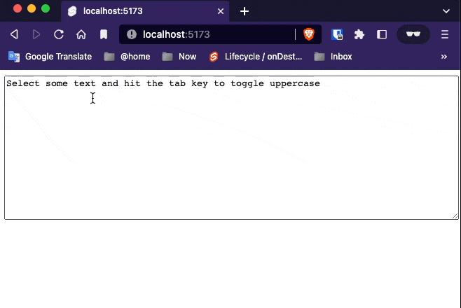
The tick function is unlike other lifecycle functions in that you can call it any time, not just when the component first initialises. It returns a promise that resolves as soon as any pending state changes have been applied to the DOM (or immediately, if there are no pending state changes).
When you update component state in Svelte, it doesn’t update the DOM immediately. Instead, it waits until the next microtask to see if there are any other changes that need to be applied, including in other components. Doing so avoids unnecessary work and allows the browser to batch things more effectively.
<script lang="ts">
    import {tick} from "svelte";

    let text = `Select some text and hit the tab key to toggle uppercase`;
    async function handleKeydown(event) {
        if (event.key !== 'Tab') return;

        event.preventDefault();

        const { selectionStart, selectionEnd, value } = this;
        const selection = value.slice(selectionStart, selectionEnd);

        const replacement = /[a-z]/.test(selection)
            ? selection.toUpperCase()
            : selection.toLowerCase();

        text = (
            value.slice(0, selectionStart) +
            replacement +
            value.slice(selectionEnd)
        );

        // this has no effect, because the DOM hasn't updated yet
        await tick();
        this.selectionStart = selectionStart;
        this.selectionEnd = selectionEnd;
    }


</script>

<textarea value={text} on:keydown={handleKeydown}></textarea>

<style>
    textarea {
        width: 100%;
        height: 200px;
    }
</style>
8. Stores
Writeable stores
Not all application state belongs inside your application’s component hierarchy. Sometimes, you’ll have values that need to be accessed by multiple unrelated components, or by a regular JavaScript module.
In Svelte, we do this with stores. A store is simply an object with a subscribe method that allows interested parties to be notified whenever the store value changes.
import { writable } from "svelte/store";

export const count = writable(0);
<script lang="ts">
    import {count} from "./stores";

    function increment() {
        count.update(n => n + 1)
    }
</script>

<button on:click={increment}>
    Increment
</button>


<style>
</style>
<script lang="ts">
    import {count} from "./stores";

    function reset() {
        // TODO reset the count
        count.set(0);
    }
</script>

<button on:click={reset}>
    reset
</button>


<style>
</style>
<script lang="ts">
// your script goes here
import {count} from "./stores";
import Increment from "./Increment.svelte";
import Decrement from "./Decrement.svelte";
import Resetter from "./Resetter.svelte";
let countValue;
count.subscribe(value => {
countValue = value;
})
</script>
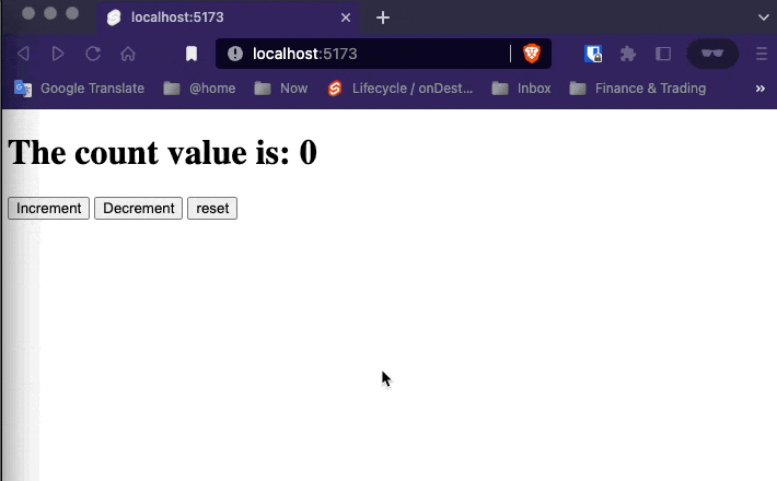
<h1>The count value is: {countValue}</h1>
<Increment/>
<Decrement/>
<Resetter/>
Auto-subscriptions
The app in the previous example works, but there’s a subtle bug — the store is subscribed to, but never unsubscribed. If the component was instantiated and destroyed many times, this would result in a memory leak.
const unsubscribe = count.subscribe(value => {
	countValue = value;
});
Calling a
subscribemethod returns anunsubscribefunction.
You now declared unsubscribe, but it still needs to be called, for example through the onDestroy lifecycle hook:
<script>
	import { onDestroy } from 'svelte';
	import { count } from './stores.js';
	import Incrementer from './Incrementer.svelte';
	import Decrementer from './Decrementer.svelte';
	import Resetter from './Resetter.svelte';

	let countValue;

	const unsubscribe = count.subscribe(value => {
		countValue = value;
	});

	onDestroy(unsubscribe);
</script>

<h1>The count is {countValue}</h1>
It starts to get a bit boilerplatey though, especially if your component subscribes to multiple stores. Instead, Svelte has a trick up its sleeve — you can reference a store value by prefixing the store name with $:
Final version
<script lang="ts">
    import {count} from "./stores";
    import Increment from "./Increment.svelte";
    import Decrement from "./Decrement.svelte";
    import Resetter from "./Resetter.svelte";
</script>


<h1>The count is {$count}</h1>

<Increment/>
<Decrement/>
<Resetter/>
Auto-subscription only works with store variables that are declared (or imported) at the top-level scope of a component.
You’re not limited to using $count inside the markup, either — you can use it anywhere in the <script> as well, such as in event handlers or reactive declarations.
Any name beginning with
$is assumed to refer to a store value. It’s effectively a reserved character — Svelte will prevent you from declaring your own variables with a$prefix.
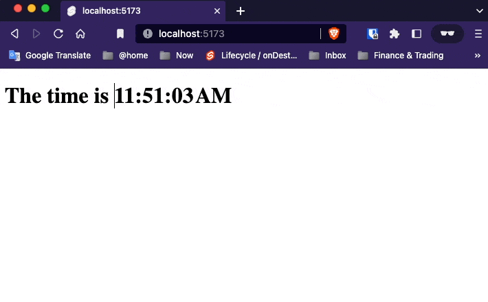
Readable Stores
Not all stores should be writable by whoever has a reference to them. For example, you might have a store representing the mouse position or the user’s geolocation, and it doesn’t make sense to be able to set those values from ‘outside’. For those cases, we have readable stores.
import {readable, writable} from "svelte/store";

export const count = writable(0);


export const time = readable(new Date(), function start(set) {
    const interval = setInterval(() => {
        set(new Date());
    }, 1000)

    return function stop() {
        clearInterval(interval);
    };
});
<script>
    import {time} from "./stores.ts";

    const formatter = new Intl.DateTimeFormat (
        'en', {
            hour12:true,
            hour: 'numeric',
            minute: '2-digit',
            second: '2-digit'
        }
    )
</script>
<h1>The time is {formatter.format($time)}</h1>
<style>
</style>
Derived Stores
You can create a store whose value is based on the value of one or more other stores with derived.
import {derived, readable, writable} from "svelte/store";

export const count = writable(0);


export const time = readable(new Date(), function start(set) {
    const interval = setInterval(() => {
        set(new Date());
    }, 1000)

    return function stop() {
        clearInterval(interval);
    };
});

const start = new Date();
export const elapsed = derived(
    time,
    $time => Math.round(($time - start) / 1000)
);
<script>
    import {time} from "./stores.ts";
    import {elapsed} from "./stores.ts";

    const formatter = new Intl.DateTimeFormat (
        'en', {
            hour12:true,
            hour: 'numeric',
            minute: '2-digit',
            second: '2-digit'
        }
    )
</script>
<h1>The time is {formatter.format($time)}</h1>


<p>
    This page has been open for
    {$elapsed} {$elapsed === 1 ? 'second' : 'seconds'}
</p>

<style>
</style>

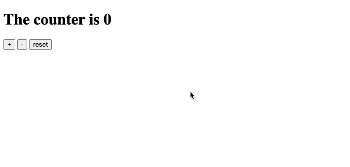
Custom stores
As long as an object correctly implements the subscribe method, it’s a store. Beyond that, anything goes. It’s very easy, therefore, to create custom stores with domain-specific logic.
For example, the count store from our earlier example could include increment, decrement and reset methods and avoid exposing set and update:
<script>
    import CustomStore from "./Store/CustomStore.svelte";
</script>

<CustomStore />
<script>
    import {counter} from "./stores.ts";

</script>

<h1>The counter is {$counter}</h1>

<button on:click={counter.increment}>+</button>
<button on:click={counter.decrement}>-</button>
<button on:click={counter.reset}>reset</button>
import {derived, readable, writable} from "svelte/store";

export const count = writable(0);


export const time = readable(new Date(), function start(set) {
    const interval = setInterval(() => {
        set(new Date());
    }, 1000)

    return function stop() {
        clearInterval(interval);
    };
});

const start = new Date();
export const elapsed = derived(
    time,
    $time => Math.round(($time - start) / 1000)
);

function createCounter() {
    const {subscribe, set, update} = writable(0);
    return {
        subscribe,
        increment: () => update(v => v + 1),
        decrement: () => update(v => v - 1),
        reset: () => set(0)
    };
}

export const counter = createCounter();
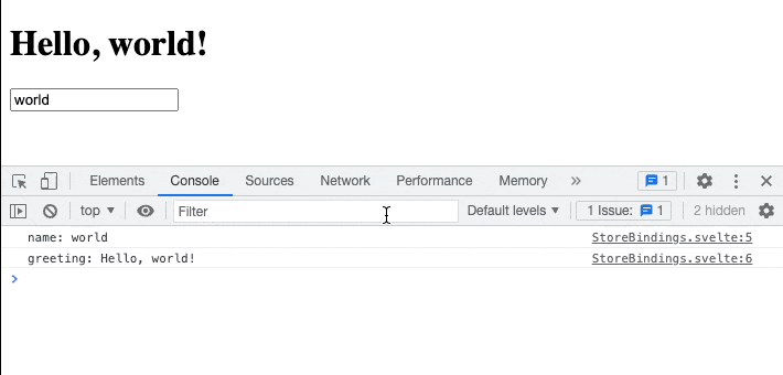
Store bindings
If a store is writable — i.e. it has a set method — you can bind to its value, just as you can bind to local component state.
In this example we have a writable store name and a derived store greeting.
// store bindings
export const name = writable('world');

export const greeting = derived(
    name,
    $name => `Hello, ${$name}!`
);
Changing the input value will now update name and all its dependents.
<script>
    // logic goes here
    import {greeting, name} from "./stores.ts";

    $: console.log('name: ' + $name);
    $: console.log('greeting: ' + $greeting);
</script>

<!-- markup (zero or more items) goes here -->
<h1>{$greeting}</h1>
<input bind:value={$name}>

<style>
    /* styles go here */
</style>
We can also assign directly to store values inside a component. Add a <button> element:
<button on:click="{() => $name += '!'}">
    Add exclamation mark!
</button>
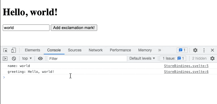
The
$name += '!'assignment is equivalent toname.set($name + '!').
9. Motion
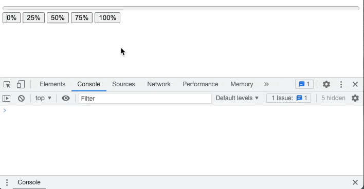
Tweened
Setting values and watching the DOM update automatically is cool. Know what’s even cooler? Tweening those values. Svelte includes tools to help you build slick user interfaces that use animation to communicate changes.
<script lang="ts">
    import {writable} from "svelte/store";
    import {tweened} from "svelte/motion";

    const progress = tweened(0);
</script>


<progress value={$progress} />
<button on:click="{() => progress.set(0)}">
    0%
</button>

<button on:click="{() => progress.set(0.25)}">
    25%
</button>

<button on:click="{() => progress.set(0.5)}">
    50%
</button>

<button on:click="{() => progress.set(0.75)}">
    75%
</button>

<button on:click="{() => progress.set(1)}">
    100%
</button>
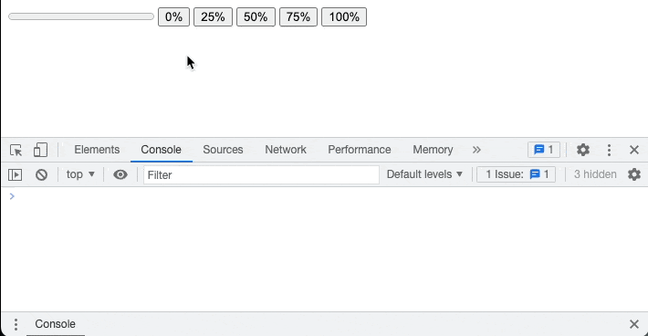
Clicking the buttons causes the progress bar to animate to its new value. It’s a bit robotic and unsatisfying though. We need to add an easing function:
<script lang="ts">
    import {writable} from "svelte/store";
    import {tweened} from "svelte/motion";
    import {cubicOut} from "svelte/easing";

    const progress = tweened(0, {
        duration: 400,
        easing: cubicOut
    });
</script>


<progress value={$progress}/>
<button on:click="{() => progress.set(0)}">
    0%
</button>

<button on:click="{() => progress.set(0.25)}">
    25%
</button>

<button on:click="{() => progress.set(0.5)}">
    50%
</button>

<button on:click="{() => progress.set(0.75)}">
    75%
</button>

<button on:click="{() => progress.set(1)}">
    100%
</button>

<style>
    progress {
        display: block;
        width: 100%;
    }
</style>
The
svelte/easingmodule contains the Penner easing equations, or you can supply your ownp => tfunction wherepandtare both values between 0 and 1.
The full set of options available to tweened:
delay— milliseconds before the tween startsduration— either the duration of the tween in milliseconds, or a(from, to) => millisecondsfunction allowing you to (e.g.) specify longer tweens for larger changes in valueeasing— ap => tfunctioninterpolate— a custom(from, to) => t => valuefunction for interpolating between arbitrary values. By default, Svelte will interpolate between numbers, dates, and identically-shaped arrays and objects (as long as they only contain numbers and dates or other valid arrays and objects). If you want to interpolate (for example) colour strings or transformation matrices, supply a custom interpolator
You can also pass these options to progress.set and progress.update as a second argument, in which case they will override the defaults. The set and update methods both return a promise that resolves when the tween completes.
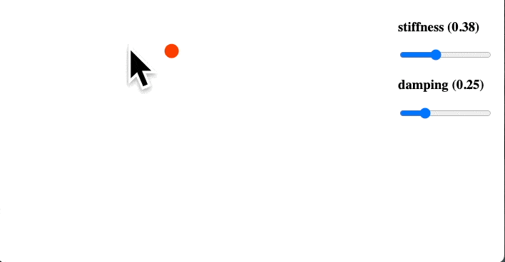
Spring
The spring function is an alternative to tweened that often works better for values that are frequently changing.
In this example we have two stores — one representing the circle’s coordinates, and one representing its size. Let’s convert them to springs:
<script>
	import { spring } from 'svelte/motion';

	let coords = spring({ x: 50, y: 50 });
	let size = spring(10);
</script>
Both springs have default stiffness and damping values, which control the spring’s, well… springiness. We can specify our own initial values:
<script>
    import { spring } from 'svelte/motion';

    let coords = spring({ x: 50, y: 50 }, {
        stiffness: 0.1,
        damping: 0.25
    });

    let size = spring(10);

</script>
<script>
    import { spring } from 'svelte/motion';

    let coords = spring({ x: 50, y: 50 }, {
        stiffness: 0.1,
        damping: 0.25
    });

    let size = spring(10);
</script>

<div style="position: absolute; right: 1em;">
    <label>
        <h3>stiffness ({coords.stiffness})</h3>
        <input bind:value={coords.stiffness} type="range" min="0" max="1" step="0.01">
    </label>

    <label>
        <h3>damping ({coords.damping})</h3>
        <input bind:value={coords.damping} type="range" min="0" max="1" step="0.01">
    </label>
</div>

<svg
        on:mousemove="{e => coords.set({ x: e.clientX, y: e.clientY })}"
        on:mousedown="{() => size.set(30)}"
        on:mouseup="{() => size.set(10)}"
>
    <circle cx={$coords.x} cy={$coords.y} r={$size}/>
</svg>

<style>
    svg {
        width: 100%;
        height: 100%;
        margin: -8px;
    }
    circle {
        fill: #ff3e00;
    }
</style>
10. Transactions
The transaction directive
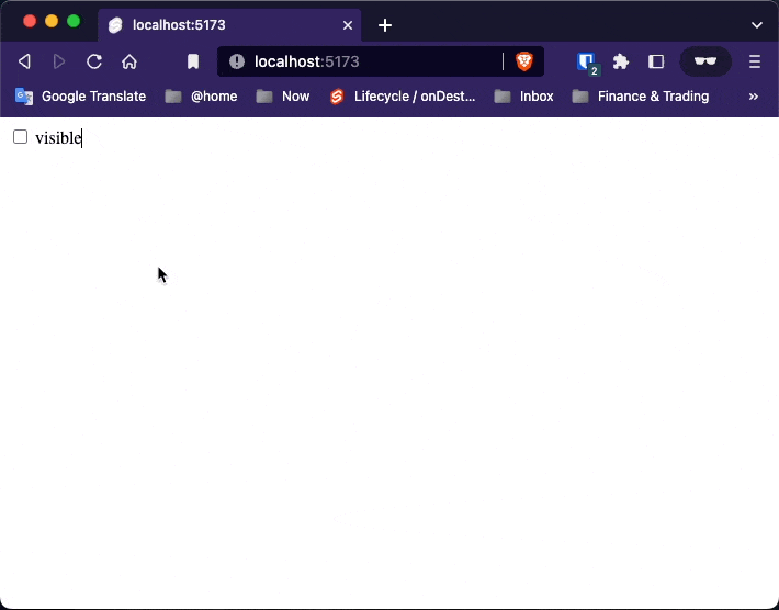
We can make more appealing user interfaces by gracefully transitioning elements into and out of the DOM. Svelte makes this very easy with the transition directive.
<script>
    import {fade} from "svelte/transition";

    let visible = true;
</script>


<label>
    <input type="checkbox" bind:checked={visible}/>
    visible
</label>


{#if visible}
    <p transition:fade>
        Fades in and out
    </p>
{/if}
Adding parameters
Transition functions can accept parameters. Replace the fade transition with fly…
<script>
    import {fade, fly} from "svelte/transition";

    let visible = true;
</script>


<label>
    <input type="checkbox" bind:checked={visible}/>
    visible
</label>


{#if visible}
    <p transition:fly=>
        Fades in and out
    </p>
{/if}
In and Out
Instead of the transition directive, an element can have an in or an out directive, or both together. Import fade alongside fly…
<script>
    import {fade, fly} from "svelte/transition";

    let visible = true;
</script>


<label>
    <input type="checkbox" bind:checked={visible}/>
    visible
</label>


{#if visible}
    <p in:fly= out:fade>
        Fades in and out
    </p>
{/if}
Custom CSS transactions
The svelte/transition module has a handful of built-in transitions, but it’s very easy to create your own. By way of example, this is the source of the fade transition:
function fade(node, {
	delay = 0,
	duration = 400
}) {
	const o = +getComputedStyle(node).opacity;

	return {
		delay,
		duration,
		css: t => `opacity: ${t * o}`
	};
}
The function takes two arguments — the node to which the transition is applied, and any parameters that were passed in — and returns a transition object which can have the following properties:
delay— milliseconds before the transition beginsduration— length of the transition in millisecondseasing— ap => teasing function (see the chapter on tweening)css— a(t, u) => cssfunction, whereu === 1 - ttick— a(t, u) => {...}function that has some effect on the node
The t value is 0 at the beginning of an intro or the end of an outro, and 1 at the end of an intro or beginning of an outro.
Most of the time you should return the css property and not the tick property, as CSS animations run off the main thread to prevent jank where possible. Svelte ‘simulates’ the transition and constructs a CSS animation, then lets it run.
For example, the fade transition generates a CSS animation somewhat like this:
0% { opacity: 0 }
10% { opacity: 0.1 }
20% { opacity: 0.2 }
/* ... */
100% { opacity: 1 }
<script lang="ts">
    import {fade} from 'svelte/transition';

    let visible = true;

    function spin(node, {duration}) {
        return {
            duration,
            css: t => ``
        };
    }
</script>


<label>
    <input type="checkbox" value="checkbox1" bind:checked={visible}/> visible
</label>

{#if visible}
    <div class="centered" in:spin= out:fade>
        <span>transitions!</span>
    </div>
{/if}


<style>
    .centered {
        position: absolute;
        left: 50%;
        top: 50%;
        transform: translate(-50%,-50%);
    }

    span {
        color: red;
        position: absolute;
        transform: translate(-50%,-50%);
        font-size: 4em;
    }
</style>
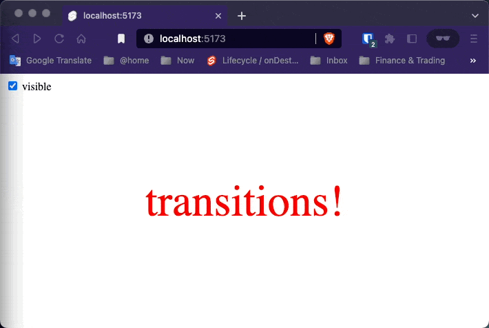
We can get a lot more creative though. Let’s make something truly gratuitous:
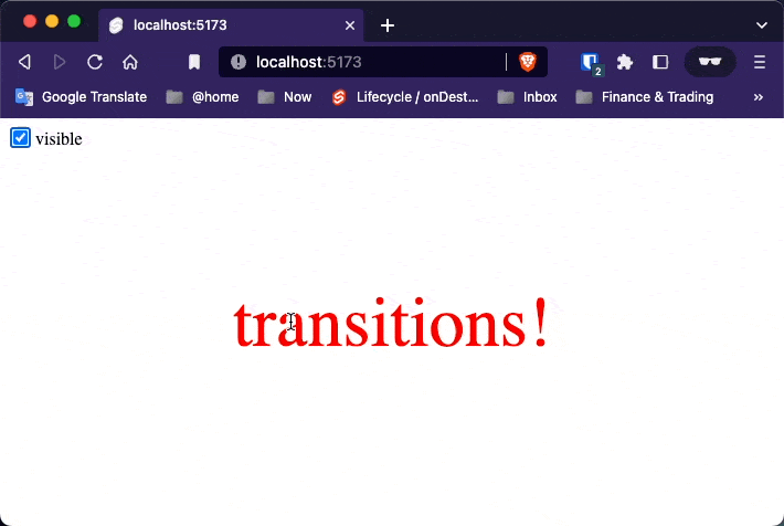
<script lang="ts">
    import {fade} from 'svelte/transition';
    import {elasticOut} from "svelte/easing";

    let visible = true;

    function spin(node, {duration}) {
        return {
            duration,
            css: t => {
                const eased = elasticOut(t);
                return `
                transform: scale(${eased}) rotate(${eased * 1080}deg);
                color:hsl(
                ${Math.trunc(t * 360)},
                ${Math.min(100, 1000 - 1000 * t)}%,
                ${Math.min(50, 500 - 500 * t)}%
                )
                `
            }
        };
    }
</script>


<label>
    <input type="checkbox" value="checkbox1" bind:checked={visible}/> visible
</label>

{#if visible}
    <div class="centered" in:spin= out:fade>
        <span>transitions!</span>
    </div>
{/if}


<style>
    .centered {
        position: absolute;
        left: 50%;
        top: 50%;
        transform: translate(-50%, -50%);
    }

    span {
        color: red;
        position: absolute;
        transform: translate(-50%, -50%);
        font-size: 4em;
    }
</style>
Custom JS transitions
While you should generally use CSS for transitions as much as possible, there are some effects that can’t be achieved without JavaScript, such as a typewriter effect:
<script>
    let visible = false;


    function typewriter(node, {speed = 1}) {
        // implementation goes here
        const valid = (
            node.childNodes.length === 1 &&
            node.childNodes[0].nodeType === Node.TEXT_NODE
        );

        if (!valid) {
            throw new Error('Typewriter can only be applied to a single text node');
        }

        const text = node.textContent;
        const duration = text.length / (speed * 0.01);

        return {
            duration,
            tick: t => {
                const i = Math.trunc(text.length * t);
                node.textContent = text.slice(0, i);
            }
        };
    }
</script>


<label>
    <input type="checkbox" bind:checked={visible}>
    visible
</label>


{#if visible}
    <p transition:typewriter>
        The quick brown fox jumps over the lazy dog
    </p>
{/if}
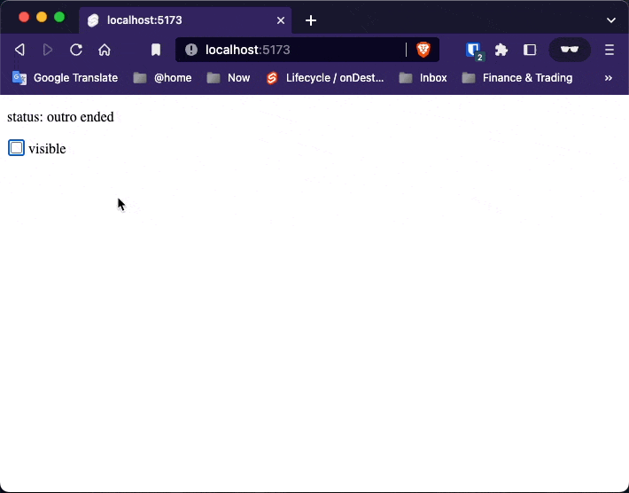
Transition event
It can be useful to know when transitions are beginning and ending. Svelte dispatches events that you can listen to like any other DOM event:
<script lang="ts">
    import {fly} from "svelte/transition";

    let visible = false;
    let status = 'waiting ...';
</script>

<p>status: {status}</p>

<label>
    <input type="checkbox" bind:checked={visible}/>
    visible
</label>


{#if visible}
    <p transition:fly=>
        Flies in and out.
    </p>

    <p
            transition:fly=""
            on:introstart="{() => status = 'intro started'}"
            on:outrostart="{() => status = 'outro started'}"
            on:introend="{() => status = 'intro ended'}"
            on:outroend="{() => status = 'outro ended'}"
    >
        Flies in and out
    </p>

{/if}
Local transitions
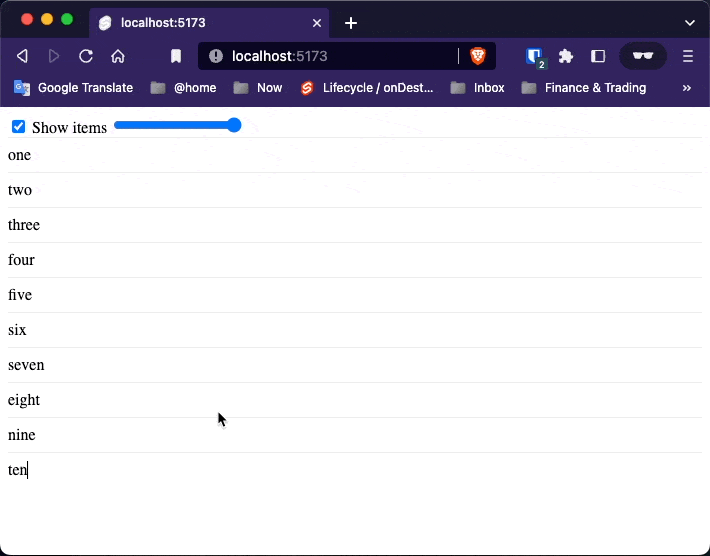
Ordinarily, transitions will play on elements when any container block is added or destroyed.
<script>
    import {slide} from "svelte/transition";

    let showItems = true;
    let i = 5;
    let items = ['one', 'two', 'three', 'four', 'five', 'six', 'seven', 'eight', 'nine', 'ten'];
</script>


<label>
    <input type="checkbox" bind:checked={showItems}>
    Show items
</label>


<label>
    <input type="range" bind:value={i} max=10>
</label>


{#if showItems}
    {#each items as item, j}
        {#if j < i}
            <div transition:slide>{item}</div>
        {/if}
    {/each}
{/if}

<style>
    div {
        padding: 0.5em 0;
        border-top: 1px solid #eee;
    }
</style>
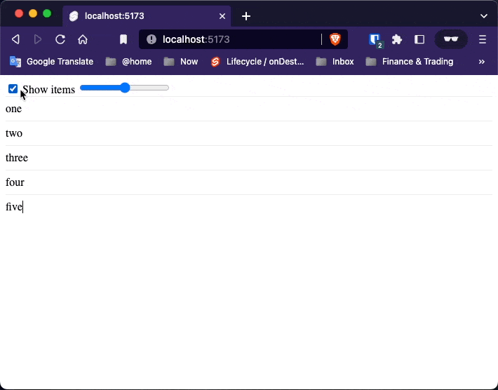
In the example here, toggling the visibility of the entire list also applies transitions to individual list elements.
Instead, we’d like transitions to play only when individual items are added and removed — in other words, when the user drags the slider.
{#if showItems}
    {#each items as item, j}
        {#if j < i}
            <div transition:slide|local>{item}</div>
        {/if}
    {/each}
{/if}
Differend transitions
A particularly powerful feature of Svelte’s transition engine is the ability to defer transitions, so that they can be coordinated between multiple elements.
A particularly powerful feature of Svelte’s transition engine is the ability to defer transitions, so that they can be coordinated between multiple elements.
Take this pair of todo lists, in which toggling a todo sends it to the opposite list. In the real world, objects don’t behave like that — instead of disappearing and reappearing in another place, they move through a series of intermediate positions. Using motion can go a long way towards helping users understand what’s happening in your app.
We can achieve this effect using the crossfade function, which creates a pair of transitions called send and receive. When an element is ‘sent’, it looks for a corresponding element being ‘received’, and generates a transition that transforms the element to its counterpart’s position and fades it out. When an element is ‘received’, the reverse happens. If there is no counterpart, the fallback transition is used.
<script>
    import {quintOut} from 'svelte/easing';
    import {crossfade} from 'svelte/transition';

    const [send, receive] = crossfade({
        duration: d => Math.sqrt(d * 200),

        fallback(node, params) {
            const style = getComputedStyle(node);
            const transform = style.transform === 'none' ? '' : style.transform;

            return {
                duration: 600,
                easing: quintOut,
                css: t => `
					transform: ${transform} scale(${t});
					opacity: ${t}
				`
            };
        }
    });

    let uid = 1;

    let todos = [
        {id: uid++, done: false, description: 'write some docs'},
        {id: uid++, done: false, description: 'start writing blog post'},
        {id: uid++, done: true, description: 'buy some milk'},
        {id: uid++, done: false, description: 'mow the lawn'},
        {id: uid++, done: false, description: 'feed the turtle'},
        {id: uid++, done: false, description: 'fix some bugs'},
    ];

    function add(input) {
        const todo = {
            id: uid++,
            done: false,
            description: input.value
        };

        todos = [todo, ...todos];
        input.value = '';
    }

    function remove(todo) {
        todos = todos.filter(t => t !== todo);
    }

    function mark(todo, done) {
        todo.done = done;
        remove(todo);
        todos = todos.concat(todo);
    }
</script>

<div className='board'>
    <input
            placeholder="what needs to be done?"
            on:keydown={e => e.key === 'Enter' && add(e.target)}
    >

    <div className='left'>
        <h2>todo</h2>
        {#each todos.filter(t => !t.done) as todo (todo.id)}
            <label
                    in:receive=""
                    out:send=""
            >
                <input type=checkbox on:change={() => mark(todo, true)}>
                {todo.description}
                <button on:click="{() => remove(todo)}">remove</button>
            </label>
        {/each}
    </div>

    <div class='right'>
        <h2>done</h2>
        {#each todos.filter(t => t.done) as todo (todo.id)}
            <label
                    class="done"
                    in:receive=""
                    out:send=""
            >
                <input type=checkbox checked on:change={() => mark(todo, false)}>
                {todo.description}
                <button on:click="{() => remove(todo)}">remove</button>
            </label>
        {/each}
    </div>
</div>

<style>
    .board {
        display: grid;
        grid-template-columns: 1fr 1fr;
        grid-gap: 1em;
        max-width: 36em;
        margin: 0 auto;
    }

    .board > input {
        font-size: 1.4em;
        grid-column: 1/3;
    }

    h2 {
        font-size: 2em;
        font-weight: 200;
        user-select: none;
        margin: 0 0 0.5em 0;
    }

    label {
        position: relative;
        line-height: 1.2;
        padding: 0.5em 2.5em 0.5em 2em;
        margin: 0 0 0.5em 0;
        border-radius: 2px;
        user-select: none;
        border: 1px solid hsl(240, 8%, 70%);
        background-color: hsl(240, 8%, 93%);
        color: #333;
    }

    input[type="checkbox"] {
        position: absolute;
        left: 0.5em;
        top: 0.6em;
        margin: 0;
    }

    .done {
        border: 1px solid hsl(240, 8%, 90%);
        background-color: hsl(240, 8%, 98%);
    }

    button {
        position: absolute;
        top: 0;
        right: 0.2em;
        width: 2em;
        height: 100%;
        background: no-repeat 50% 50% url("data:image/svg+xml,%3Csvg xmlns='http://www.w3.org/2000/svg' viewBox='0 0 24 24'%3E%3Cpath fill='%23676778' d='M12,2C17.53,2 22,6.47 22,12C22,17.53 17.53,22 12,22C6.47,22 2,17.53 2,12C2,6.47 6.47,2 12,2M17,7H14.5L13.5,6H10.5L9.5,7H7V9H17V7M9,18H15A1,1 0 0,0 16,17V10H8V17A1,1 0 0,0 9,18Z'%3E%3C/path%3E%3C/svg%3E");
        background-size: 1.4em 1.4em;
        border: none;
        opacity: 0;
        transition: opacity 0.2s;
        text-indent: -9999px;
        cursor: pointer;
    }

    label:hover button {
        opacity: 1;
    }
</style>
Key blocks
Key blocks destroy and recreate their contents when the value of an expression changes.
<script>
    import {fly} from "svelte/transition";

    let number = 0;
</script>

<div>
    The number is:
    {#key number}
		<span style="display: inline-block" in:fly=>
			{number}
		</span>
    {/key}
</div>
<br/>
<button on:click={() => number+=1}>Increment</button>