CSS - Cascading Style Sheets
credit: css-tricks.com
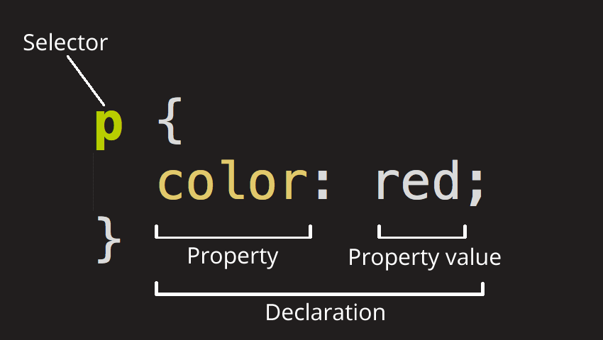
CSS Syntax
Syntax:
selector {
properties : values
}
Using CSS in HTML
-
Inline , in
divorspan -
Embedded style sheet in
<head> -
External
<head>
  <link rel="stylesheet" type="text/css" href="styles.css" />
</head>
<span> and <div>
- span : span
- div : division
<div style="background-color: lightblue;">
    <p>This is a paragraph. <span style="color: red;">These words are red.</span></p>
</div>
Images
There are several common ways to style images using CSS:
-
Width and Height: You can control the size of an image using the
widthandheightproperties:img { width: 200px; height: 100px; }Be aware that setting both width and height can distort the image if the aspect ratio isn’t the same as the original image. To avoid this, you can set just one dimension (width or height) and the other will automatically adjust to maintain the original aspect ratio.
-
Border: You can add a border around an image:
img { border: 2px solid black; } -
Border Radius: You can make an image circular or add rounded corners:
img { border-radius: 50%; } -
Box Shadow: You can add a shadow effect to an image:
img { box-shadow: 5px 5px 5px grey; } -
Margin and Padding: You can control the space around the image using
margin(outside the border) andpadding(inside the border):img { margin: 10px; padding: 10px; } -
Display: If you want to center an image or apply margin/padding on top and bottom, you might want to turn it into a block element:
img { display: block; margin: auto; } -
Opacity: You can make an image transparent by setting its opacity (0 is fully transparent, 1 is fully opaque):
 img {
     opacity: 0.5;
 }
Colors
In CSS, you can specify colors in several ways:
-
Named Colors: There are 140 named colors, which you can use directly in your CSS. For example:
p { color: red; } -
Hexadecimal Colors: Colors can be specified using hexadecimal (hex) values. A hex color begins with a hash character (#) followed by six digits. The two first digits represent the red color, the two middle ones represent the green color, and the last two represent the blue color. For example:
p { color: #FF0000; /* This is red */ } -
RGB: Stands for Red, Green, Blue. Colors can be defined by the intensity of red, green, and blue between 0 and 255. For example:
p { color: rgb(255, 0, 0); /* This is also red */ } -
RGBA: Just like RGB but with an additional Alpha channel which represents opacity. The alpha value is a number between 0.0 (completely transparent) and 1.0 (completely opaque). For example:
p { color: rgba(255, 0, 0, 0.5); /* This is half-transparent red */ } -
HSL: Stands for Hue, Saturation, Lightness. Hue is a degree on the color wheel from 0 to 360. 0 is red, 120 is green, and 240 is blue. Saturation is a percentage value, 0% means a shade of gray and 100% is the full color. Lightness is also a percentage, 0% is black, 50% is neither light or dark, 100% is white. For example:
p { color: hsl(0, 100%, 50%); /* This is red */ } -
HSLA: Just like HSL but with an additional Alpha channel for opacity. For example:
p {
    color: hsla(0, 100%, 50%, 0.5);  /* This is half-transparent red */
}
Fonts
In CSS, you can control the look of your text with various font properties. Here are some of the most common ones:
-
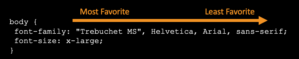
font-family: This property is used to specify the typeface that will be used for the text. You can specify multiple font families as a “fallback” system, in case the browser does not support the first font. For example:
 p {
     font-family: Arial, sans-serif;
 }
In this example, the browser will try to display the text in Arial. If Arial is not available, it will use the next available sans-serif font.
-
font-size: This property is used to specify the size of the text. The value can be defined in different units, such as pixels (px), points (pt), ems (em), or percentage (%). For example:
p { font-size: 14px; } -
font-weight: This property is used to specify the weight (or boldness) of the text. The values could be normal, bold, bolder, lighter, or numerical values 100, 200, …, 900. For example:
p { font-weight: bold; } -
font-style: This property is used to specify whether the text should be rendered as italic or not. The values could be normal, italic, or oblique. For example:
p { font-style: italic; } -
line-height: This property is used to specify the space between lines of text. It is often used to set the distance between lines of text. For example:
p { line-height: 1.6; } -
color: This property is used to set the color of the text. For example:
p { color: blue; } -
text-decoration: This property is used to set or remove decorations from text. The value can be none, underline, overline, line-through, or blink. For example:
p { text-decoration: underline; } -
text-align: This property is used to set the horizontal alignment of text. The value can be left, right, center, or justify. For example:
 p {
     text-align: center;
 }
Links
In CSS, links are styled using different states. Each state has a specific CSS styling associated with it. Here are the different states:
-
a:link: This is the default state for a hyperlink that has not yet been clicked.
a:link { color: blue; text-decoration: underline; } -
a:visited: This state gets triggered once a link has been clicked or visited.
a:visited { color: purple; } -
a:hover: This state gets triggered when the mouse pointer is over the link.
a:hover { color: red; } -
a:active: This state gets triggered when a link is being clicked.
 a:active {
     color: yellow;
 }
All these states can be combined together to style a link for various user interactions. The order in which these states are defined in your CSS is important because of how CSS rules work. A good rule of thumb is to follow the “LoVe/HAte” rule: Link - Visited / Hover - Active.
Units
CSS has several units of measurement that can be used to specify the size of various elements. Here’s a summary of the most common ones:
- Absolute Units:
px: Pixels. One of the most common units in web design.pt: Points. Traditionally used in print media (1pt = 1/72 of an inch).pc: Picas. Rarely used in web design (1pc = 12pt).in: Inches. Rarely used in web design.cm,mm: Centimeters and millimeters. Rarely used in web design.
- Relative Units:
em: Relative to the font-size of the parent element. For example, if an element has a font-size of 20px,1emin that element would be equal to 20px.rem: Relative to the font-size of the root element (usually the<html>element). If the root element has a font-size of 16px,1remwould be equal to 16px.%: Percentage. The size is relative to the parent element. For example, if an element has a width of 500px, a child element with a width of50%would be 250px.vw,vh: Viewport width and height. These units are relative to the size of the user’s viewport.1vwis equal to 1% of the viewport width, and1vhis equal to 1% of the viewport height.vmin,vmax: Viewport minimum and maximum. These units are relative to the smaller (vmin) or larger (vmax) dimension of the viewport.
- Font-relative lengths:
ex: This is the x-height of the current font (rarely used).ch: Represents the width of the “0” (zero) character of the element’s font.
- Viewport-percentage lengths:
vi,vb: Represents 1% of the viewport size, even when zoomed in or out.viis 1% of the viewport size in the inline axis, andvbis 1% of the viewport size in the block axis.
In most cases, you’ll find yourself using px, em, rem, %, vw, and vh most frequently. The use of these units can also make your design responsive, as they can adjust in size based on the parent element or the viewport size.