Design System in Figma
Complete guide to designing a site using a collaborative and powerful design system

Complete guide to designing a site using a collaborative and powerful design system
What is a Design System?
 A design system is a living style guide that’s collaborative and code-connected. It’s not just a style guide where designers are the only contributors. It’s shared across the whole team, including designers, developers, product managers, etc. As a result, the design system should be cohesive, dynamic, reusable and maintainable both in design and code.
It starts with the styles and components in Figma, then move its way into the team library to finally become code components that exist in a place that’s easy to reference, contribute and version controlled, like a git repository.
This Course
 In this course, we’ll learn how to create this design system from scratch, using reusable styles, texts, colors, icons and components that can be shared across your team. We’ll start with the basics of design and work our way through advanced workflows and techniques to achieve powerful lasting results. We’ll design icons using the Vector Network, apply constraints for maximum adaptiveness and prototype quickly using the built-in tools. We’ll learn how to communicate our designs to developers so that everyone is in sync.
Anatomy of a Design System
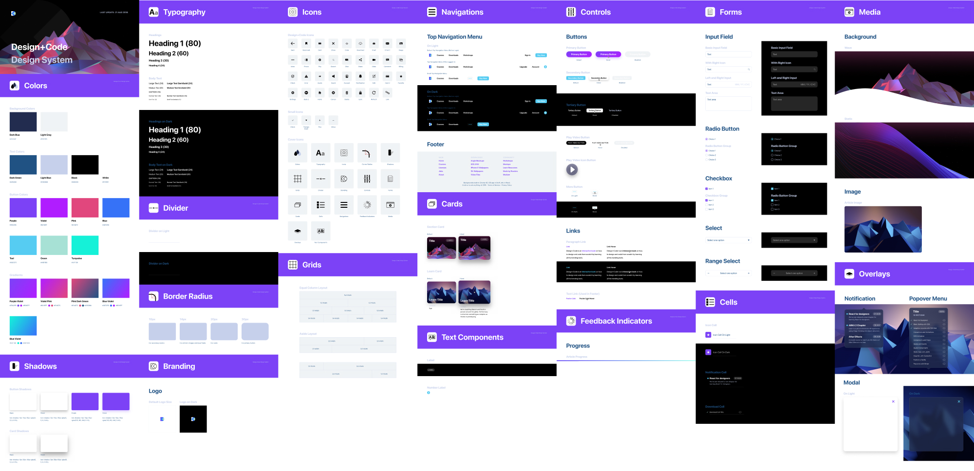 A design system is composed of all the elements in your final app. These elements should be cleanly organized into styles and components that are referenced in a single source of truth inside a separate document. This document should be easy to maintain by anyone in your team.
If your developers are involved in Figma, you can share your Design System file as a Web URL. If you build a site as well, you can use Live Embeds to reflect all the changes perfectly to your site.
As a final step, as you empower your designers to contribute code, it’s best to recreate all the components in code and show the code samples. A good example is the Zendesk Garden design system.
Foundation
The foundation of your design system set the tone of your design language. It’s important to formulate the context for the branding, clearly indicating how your logo should be used appropriately. Also, you should set the main colors, typography and grids.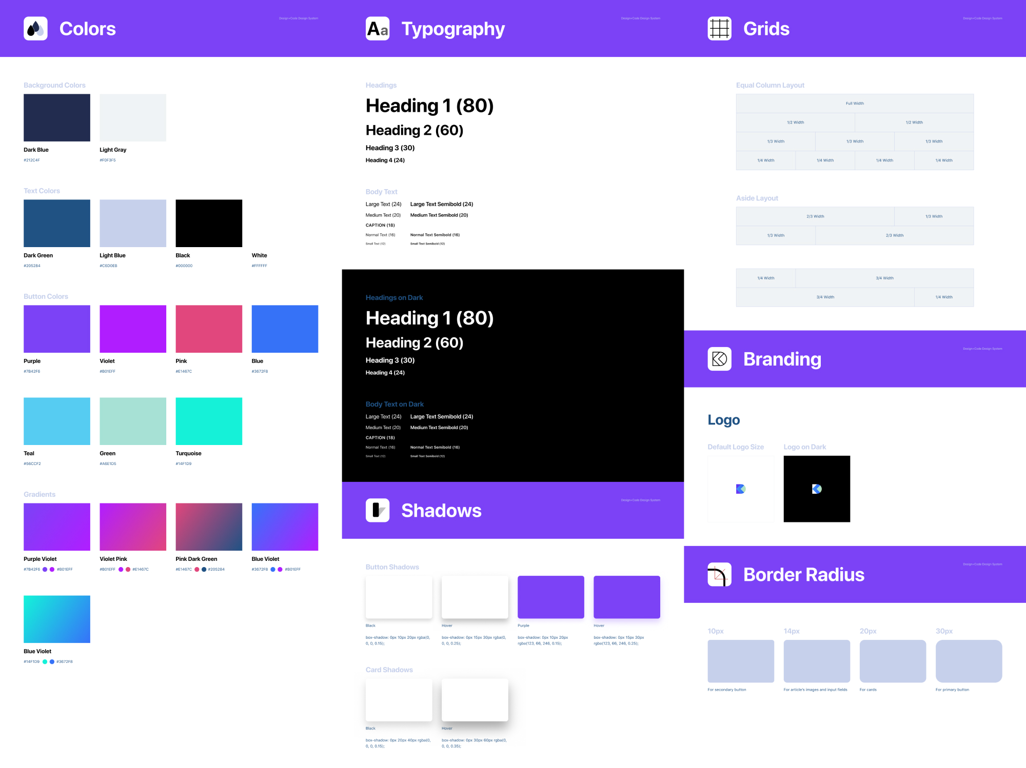
Figma Styles
In Figma, most of the foundation element are set in the Styles, which contains Colors (including gradients and images), Text and even Effects. You can make them readily available as a Library. As you design, you can set these styles in your Inspector, for things like Text, Fill, Stroke and Effects.
Rules
Another important piece of the foundation is setting the rules for negative spacing, page division and elements placement using grids. You can demonstrate how to harmonize elements using different sets of elements together, or use the drop shadows in order to be consistent with your design language.
Components
Components are building blocks for your design system. They’re generally collections of elements put together in a reusable way, such as for buttons, forms, navigations, cards, cells and overlays. Component elements like text content, colors and images can be customized in the Inspector. A button component can be duplicated many times, with different content and styles.
Additionally, you can have Components within Components, allowing you to customize even the most complex groups of elements, like icons, states and complex themes.
For example, a Table Cell can be a Component containing a toggle, which itself is another Component. That toggle can be switched between ON and OFF.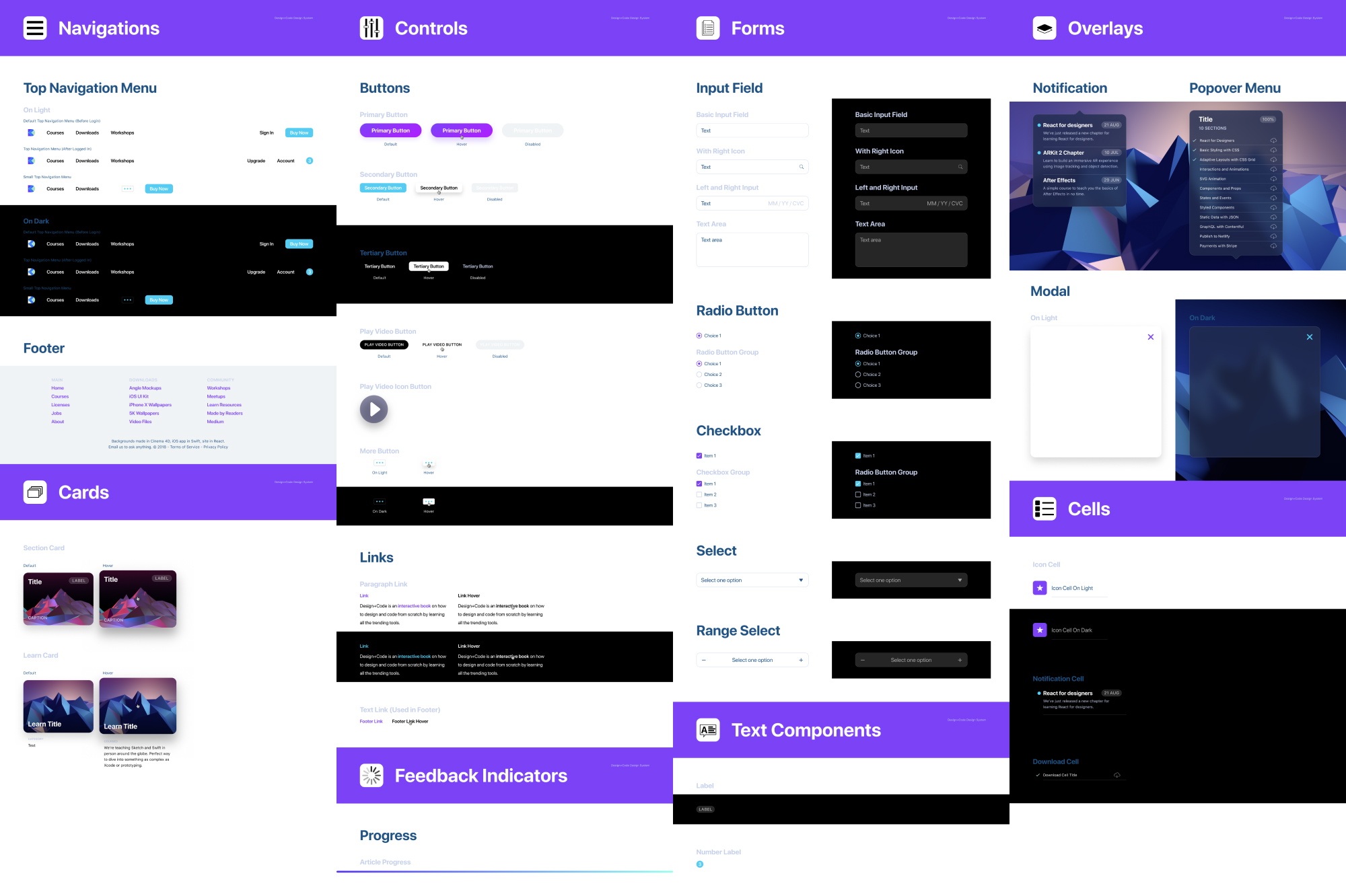
Assets
Assets can be icons, backgrounds, avatars and other images used to fill the content of your app. In general, you can use Unsplash, UINames, UIFaces and even our own 3D backgrounds (requires Pro account) to gather some presets for your user interface. Since these images can be set as Styles, it’s quick to create a list and use them in your design system.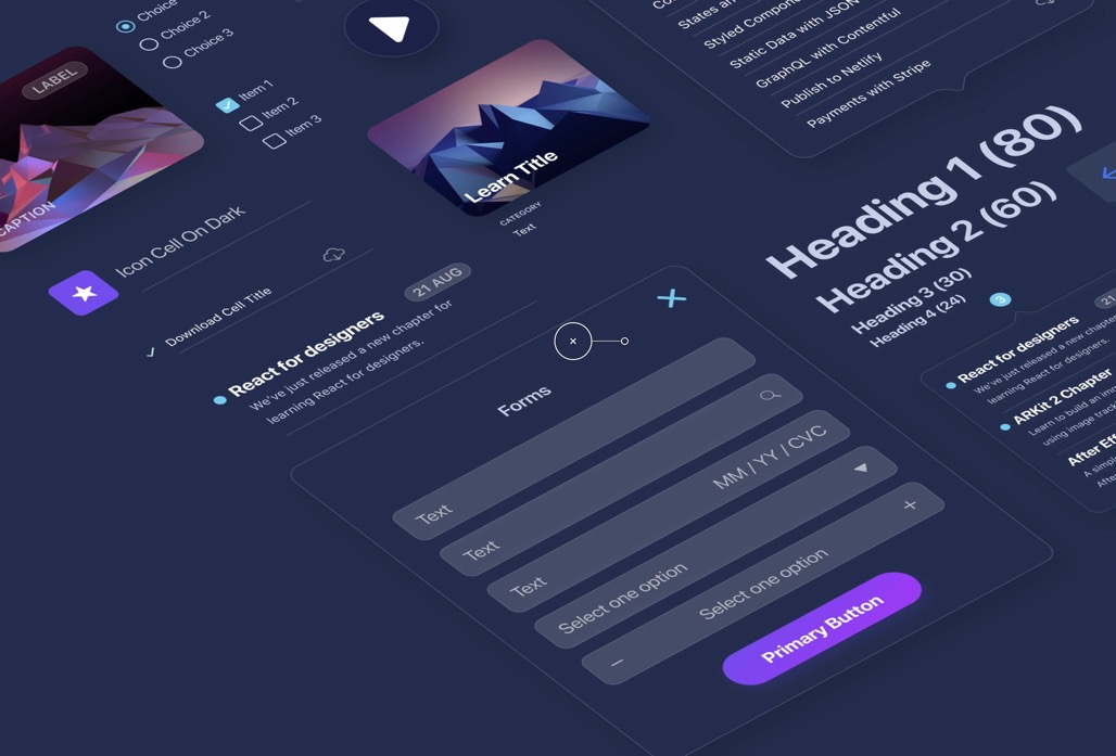
Figma VS Sketch
Let’s start from the beginning and highlight what makes Figma special. Nowadays, design tools are not vastly different from each other. The layout is similar and you’ll find the same essential features such as components, libraries and developer handoff.
While Sketch is rich in plugins like Craft, Abstract and Zeplin, Figma has all those tools embedded into it at the start. On top of that, Figma has real-time collaboration, has all its content exist on the Web and works on Windows.
Import from Sketch
Figma treats your Sketch files as first-class citizens. It is so good at importing that even an intricate and massive Library file like Angle can be imported to 95% accuracy. All the layers and symbols are kept intact.
Mac and Windows
What sets Figma apart is its collaborative and always accessible nature. Barriers such as requiring a Mac or downloading a large app is a thing of the past. Thanks to this, anyone can design and anyone can view your design, while you design. As someone who has used this daily, I cannot overstate how game-changer this is. No longer is your team over-relying on a third party tool, or an increasingly complex and fragmented set of plugins, Figma simply has everything from the start. Because a lot of developers work on Windows machines, this is truly essential to keeping your team in sync. Any developer can receive a link from you, inspect the design and get the colors, fonts and even CSS, Swift and SVG Code.
Real-Time Collaboration
Figma truly is the Google docs of design tools. Once you start collaborating with fellow designers, developers and clients in real-time on a design project, you’ll never want to go back. You can share your design with anyone and they can watch your progress, comment and even participate as you bring your pixels to life.
Version Control
In Figma, everything you do is automatically saved in the history for free. You can also manually commit (Command + Option + S) a version to keep things in a neat timeline. You don’t have to think about branches because the real-time collaboration allows you to ensure that nobody is stepping on each other’s toes. It’s actually a relief to not compare this too much to Git because a lot of designers struggle with the more advanced concepts of Git.
Vector Network
Figma introduced a powerful new way to design vectors. Instead of connecting paths one to one, you can create web-like connections, making the whole process of creating icons more flexible.
Performance
While most tools today focus on the hype train of new features, Figma simply focuses on a solid workflow with a performance that is unmatched by its peers. This is one of the main reasons why I switched from Photoshop in the first place. And for me, Figma is as fast you can get in a design tool.
When you work 8 hours a day on a tool, every second you save counts.
Every drag of a button and every text edit feels buttery smooth at 60 frames per second. Zooming in and out is without lag.
Team Library
Imagine Abstract, Google Docs and Sketch in a single tool. Imagine a more cohesive and smoother experience. That’s Figma. Team Libraries allow you to share your components, styles and assets across your whole team. You can enable and disable these in the Team Library icon at the top right. This is absolutely essential for your design system.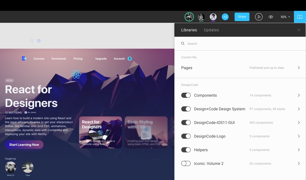
Live Embeds
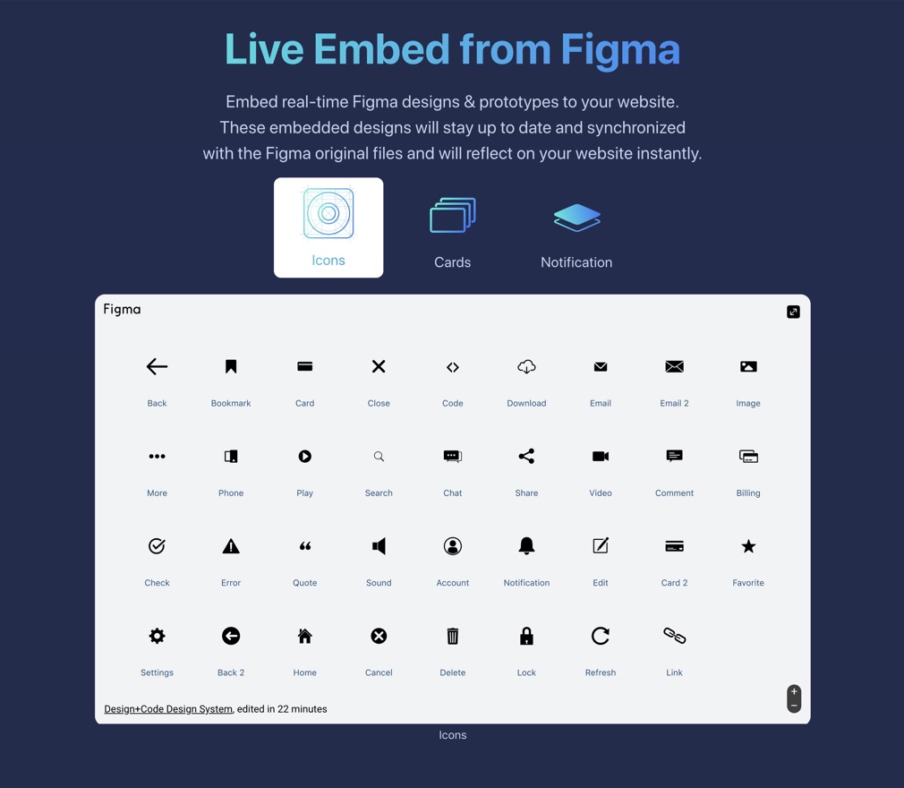 You can embed your Figma Frames in your Website by getting the iFrames HTML code. This allows you to get live access to your designs.
Text and Color Styles
In Figma, you set styles differently. They not only work for texts but also for colors and gradients and even effects like blur and drop shadows.
Components
Components are effortless in Figma. Unlike Sketch Symbols, you don’t need to go to another Page to edit the master components. Overrides can be edited directly in their respective layers inside the component.
Keyboard Shortcuts
The shortcuts in Figma are very similar to Sketch. Some key differences that are quite important to know:
- Command + Option + G creates a Frame for selected elements. A Frame is like an Artboard.
- Control + G to enable / disable Grid.
- K for Scale, which allows you to scale elements on the fly.
- C for Commenting. Comments are embedded in Figma directly instead of having to go through a different space.

You can find more Keyboard shortcuts organized in a friendly format at shortcuts.design.
Constraints
Constraints in Figma are the same as Sketch. They allow you to set distances from the parent container, scale or align.
Prototyping
Figma makes it super simple to create prototypes using transitions without downloading a single third-party app. The prototype tool is in its own Tab in the Inspector. You set a Home screen, then connect to new screens using a string. Transition animations can be set between Instant, Dissolve, Move, Slide and Push.
Inspect
Any document in Figma can be shared with anyone. Most importantly, developers can come in and inspect design elements to get the color properties, sizes and distances. They can select any asset and decide to export to PNG, SVG or in code using Swift, Java or CSS.
More generally, invited people can be given the permission to view or to edit. This means that you can include virtually anyone in your team, including product managers, clients and any person via a link.
Commenting
The feedback loop in a team environment is extremely important. You can press C to add a targeted comment. A bubble will appear and you can @mention anyone in your team to send them notifications. Comments can be marked as resolved, just like in issue trackers.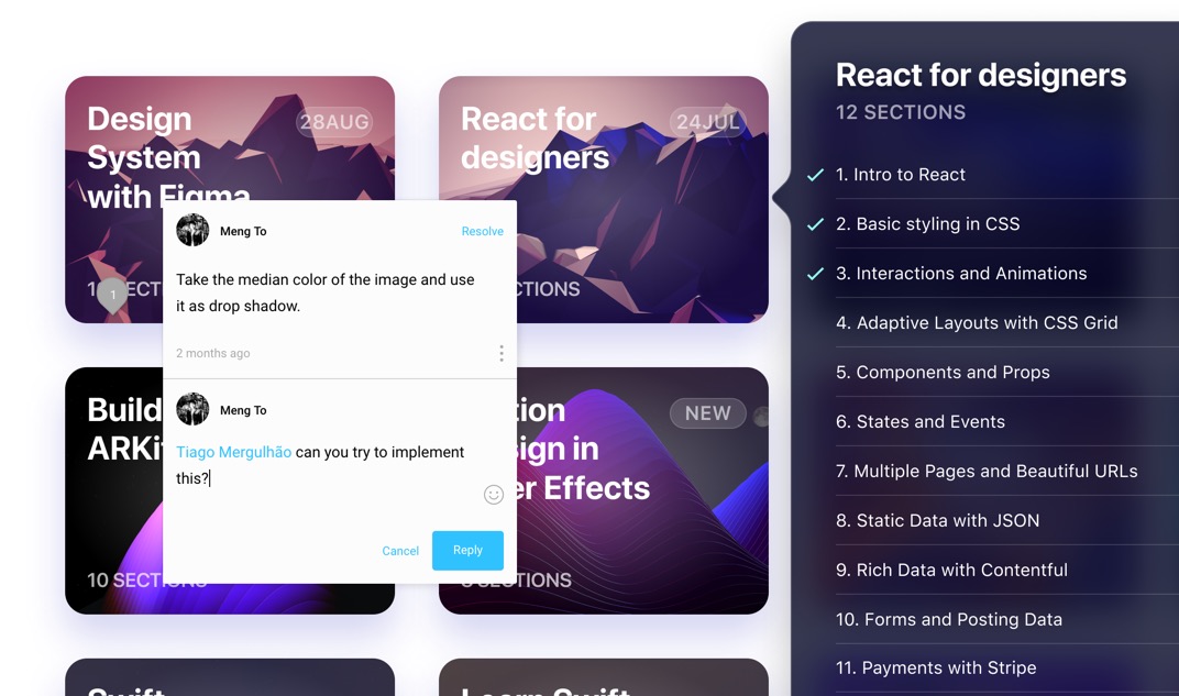
Download Figma
To get a superior Figma experience, you can download the desktop for Mac or PC. This will allow you to get access to local fonts and have a dedicated app for designing, without the large browser bars. The navigation is slightly improved where you have an additional Projects button and no more back / forward mechanisms, which can be slightly annoying if you have enabled gestures on the Mac.
Installing Local Fonts
In order to access fonts from your local computer, you’ll need to install a helper in your Account settings (if designing in the browser), or simply get the Figma desktop app.
Create Team
Either you’re alone or with dozens of people in your team, you should create a Starter Team, which is free until you have more than 3 projects and 2 editors. For most designers, this is plenty to get to 100% of the work that they need to do.
Figma Files and Projects
When you create a new Figma file, it will land in the Recent/Drafts. If you have a team set up, you can put your files inside a project. A project can be shared across your team. A file contains Frames (like Artboards) and Pages.
Pages
Typically, you use Pages to separate iOS from Android or Web. But since Files are so easy to access in projects, you can decide not use Pages. However, Pages can be powerful for sharing an entire project without having to select multiple files.
Starting Templates
You can visit Figma Resources to get some starting templates like Material and iOS UI Kits in addition to the default ones can are provided on your first Figma experience. That can be insanely useful for using elements like the status bar, tab bar, buttons without having to create them from scratch.
Additionally, you’ll find free icon sets like Iconic: Volume 1 and 2. As you click on these resources, they’ll simply be copied to your Drafts until you put them in a project.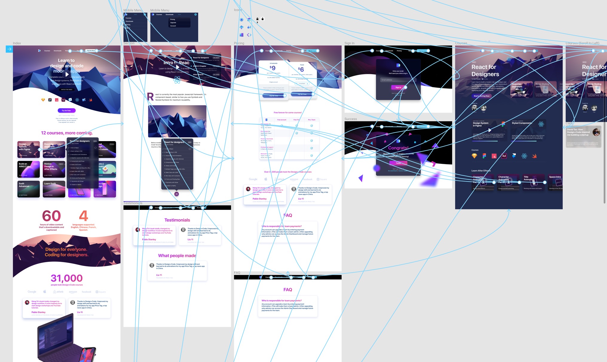
iOS 11 UI Kit by Design+Code
At Design+Code, we’ve been creating free iOS UI Kits for the past 3 years. We love giving back to the community. We’ve adapted this one to work with Figma components. It’s made to work with Team Library so that you can just drop the elements you need and they’re fully adaptive!
Basic Layout and Techniques
Start with the styles and design system foundation in Figma

Start with the styles and design system foundation in Figma
Download Assets
To follow this course, you’ll need to download the assets. You can also get the Figma source files to compare your progress against mine.
Foundation
A design system is put in place to create an entire product. Let’s start with the foundation and the end results we’re hoping to achieve.
Basic Layout
Let’s create a new Figma file. In this we’ll create a simple layout that utilizes some of the basic elements from our Design System.
Insert Frame
A Frame is like an Artboard in Sketch. That’s why you can reach it by pressing Aor F on your keyboard. When you create it, you are given the option to choose one of the Phones, Tablet, Desktop, Watch, Paper or Social Media templates.
Let’s select the MacBook Pro, which has a size of 1440x900.
Grids
Grids are essential to understanding the negative spacing when for designing for iOS, Android and Web. ==For mobile, it’s common to use an 8-point grid.== For ==Web==, it’s a little less about spacing and more about division, like the ==960 grid== for example. Still, I like having some grid in place, like the default 10-point grid. This ensures that all my elements fall on clean pixels, avoiding half pixels as much as possible.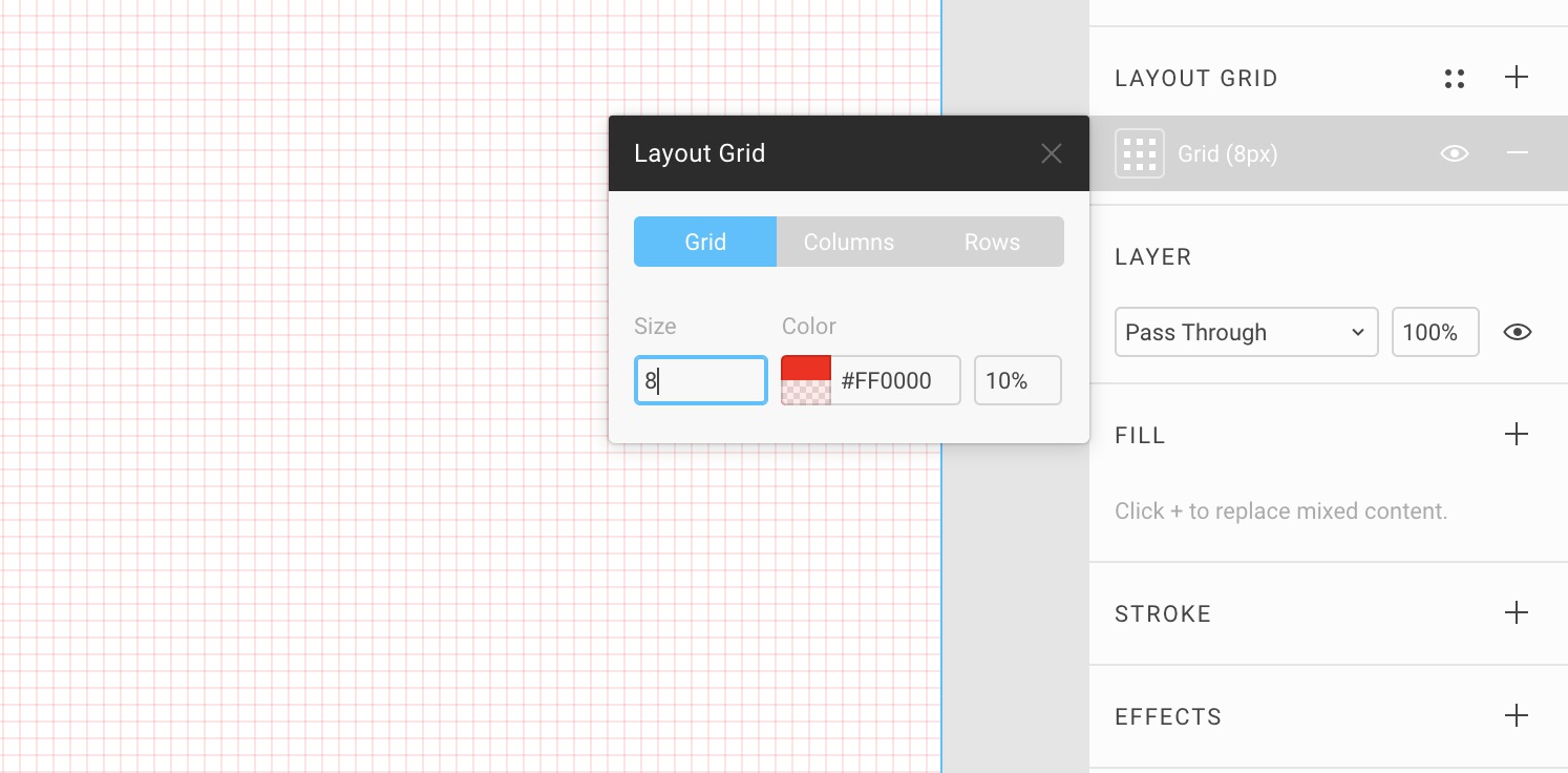
To set up a grid, select the Frame and click on Plus button next to Layout Grid. Grids are used for aligning your elements and to space them against each other.
Insert Rectangle
Most pages start with a cover image. Set cover to 920 px.
Smart Guides
As you move your elements, you’ll notice red lines that appear. These are guides that allows you to align and distance elements on the fly.
Math in Fields
You can use percentage values, like 100%. You can also do math, like add (+), subtract (-), multiply (*) and divide (/).
Scrubbing
You can mouse drag any property in your inspector to increase/decrease the number quickly based on drag distance.
Color Picker
Click on the Fill to start customizing the background. As with most design tools, you can change the color by clicking the on the wheel, the Eyedropper tool, HEX or preset colors.
Preset Colors
By default, you’ll see that you have both Document and Personal colors. The latter comes from a Library, which we’ll learn how to set up a bit later.
Gradients
You can switch to Linear, Radial, Angular and Diamond.
Image
In Figma, images can be edited on the fly after importing. You can control settings like Exposure, Contrast and Saturation without having to leave the design tool.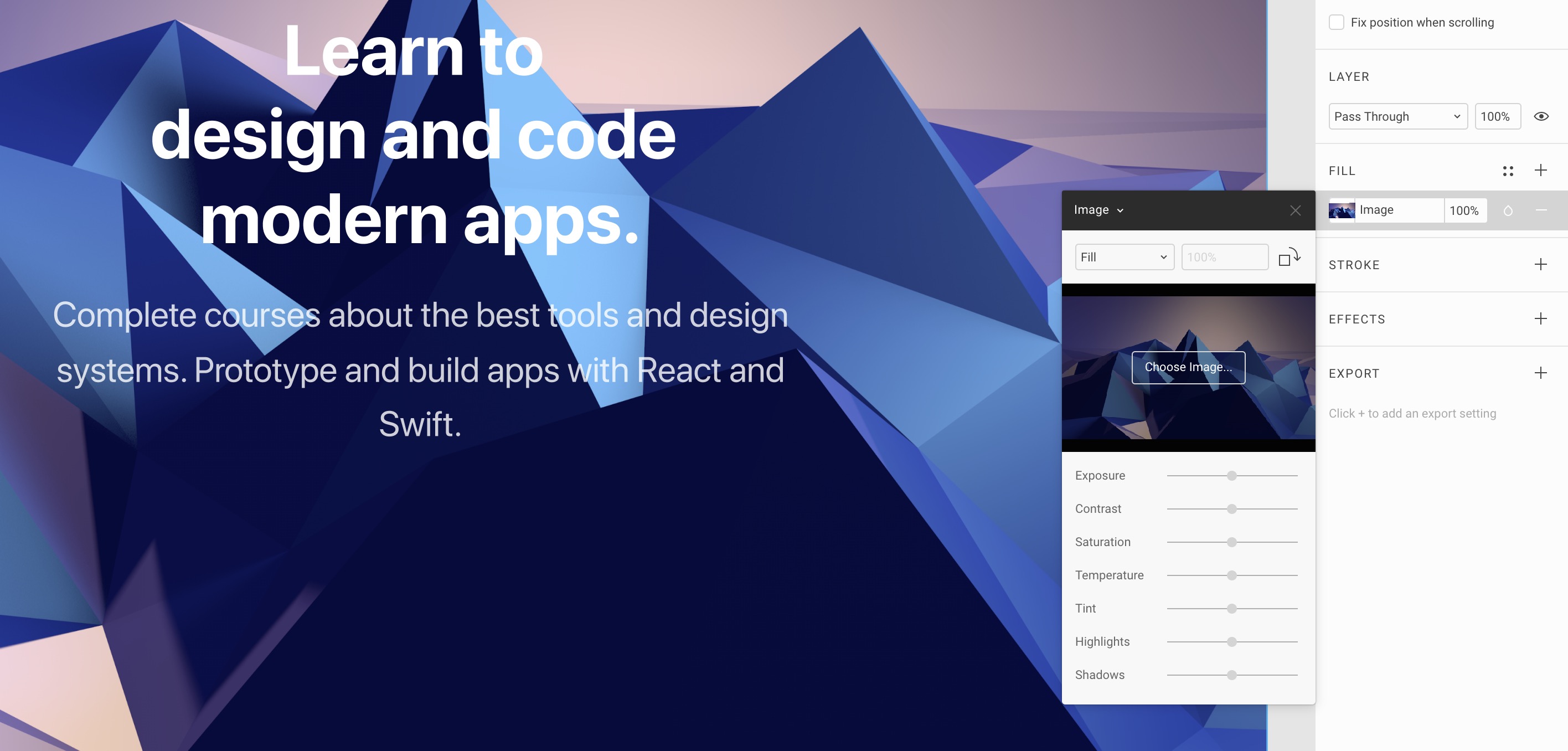
Text Layer
60pt, bold. 500px.
Styles in Text Layer
In Figma, you can actually customize the Text layer to have multiple colors, fonts and other type options.
Align Tools
You can align elements against the container or against each other by using the align tools in the top right.
Resize
Just with any layer, you can resize the bounding box by just dragging the corners. Hold Shift to keep the same aspect ratio and hold Option to resize from center in order to keep the same alignment.
Text Gradient
Text layers in Figma can have a nice Gradient. On top of that, they work with Gradient styles.
Text Vertical Align
Having multi-lines text layers can mess your vertical alignment, so a solution is to create a Fixed size and set the vertical alignment to center.
Duplicate
Command + D 30pt, Regular, 130%. 500px. Distance 40px. Set the opacity to 80% by pressing 8.
Distances
At any point, you can show the distances by pressing the Option key. You have to mouse over the element you’re measuring against.
Oval
Draw an Oval by pressing O. #161648, 50%. 120x120. Background Blur. Stroke white 20% opacity.
Ratio and Center
Hold Shift to have a perfect 1:1 ratio. Also, you can hold Option to draw from the center instead.
Polygon
Triangle 80x70 px. The Polygon can have a corner radius and count, so you can create any polygon counts you want, from the triangle to the hexagon and more.
Rotate
You can rotate the triangle by mouse overing the corners, but only slightly outside the squares.
Grouping
It’s important to group elements to keep things organized into modules. As a result, you can easily drag these groups around without having to move each item one by one.
Command Click
When you group layers, only entire groups are selectable by default when you mouse over. If you want to select specific elements inside a group, you have to hold the Command key and click.
Effects
Some text may not be legible against some background, so adding a drop shadow can help.
Drop Shadow
Drop shadows are typically black and should not exceed 25% opacity, unless on a dark background. Just like in real life, they should be subtle and set a sense of depth and hierarchy for your design.
Blur
For the play button, we can add some background blur. This is good to make the play icon stand out more. Please note that background blur will only work in Safari and iOS.
Import logo from Sketch
You can easily bring design elements directly from Sketch by going to File, New From Sketch. Let’s do that for the logo.
Scale Tool
The scale tool allows you to scale not only the width, but all its properties such as corner radius, drop shadow, etc. This is especially useful when your logos are not merged and still depend on these properties.
Menu Text Layer
20px Bold left align, 50px from logo.
Multiple Duplicates
Options + Drag to duplicate, then do Command + D to duplicate multiple times using the same spacing.
Select All with Same Properties
Figma has a nice way for you to select a bunch of elements together that share the same properties such as Fill, Stroke, Affect, Text and Font. Set Distribute Horizontal Spacing. This will ensure that the spacing between the elements are consistent.
I’ll do some adjustments to keep a consistent 50px distance.
Paste Over Selection
Create a Button 150 x 40px, 10px corner radius, #56CCF2. Copy and paste one of the menu text elements using Command + Shift + V. This will paste the element to the top left position of the selected box. Change the text color to black, align to center and the content to Try for free.
Then, select both the text and button and set them to align horizontally and vertically.
Header
Group the text, logo and button layers and center it, with a distance of 50px from the top.
Watch button
Create a button 220 x 40px, 20px corner radius, Fill black 70%, Stroke 1px white 25%.
Advanced Type
The tripe dot icon next to the Text alignment will give you the Advanced Type options. Text 80% white, Transform to uppercase, Watch the video.
Image Fit
Let’s create a Rectangle and change the Image to one of the logos provided, by setting it to Fit. This makes sure that the image doesn’t exceed the bounding box.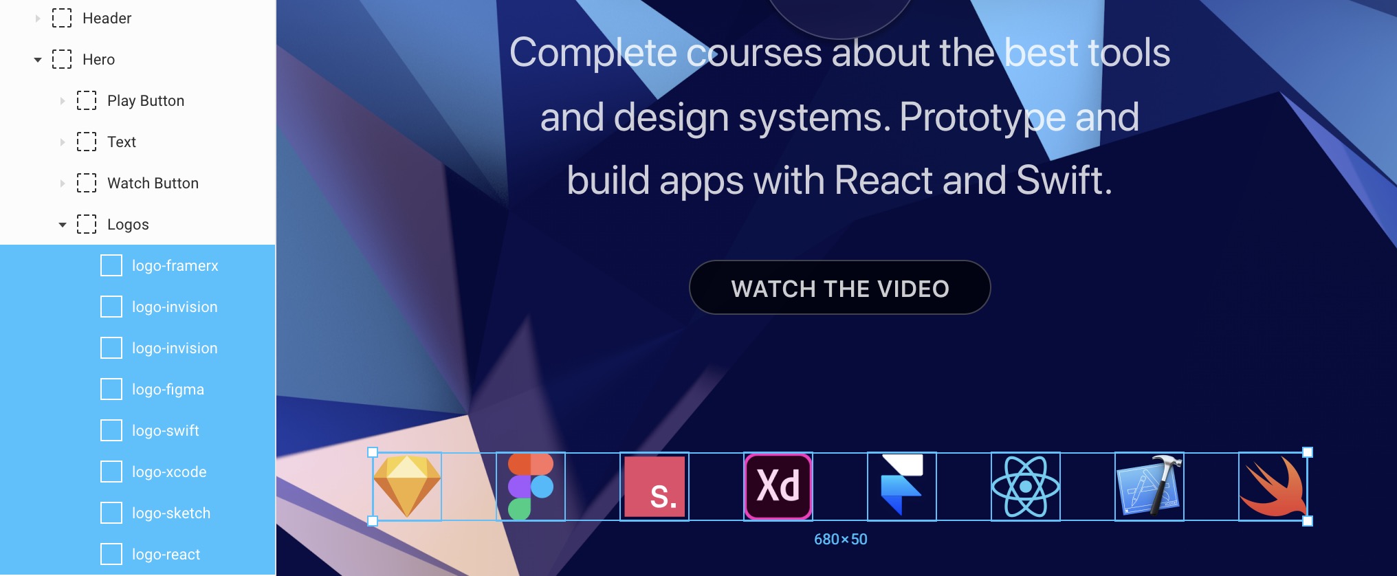
Option drag to duplicate and do it multiple times using Command + D. Once you’ve done it for 8 logos, you can change the Image for each of them. Finally, Group them together and center it horizontally, with a distance of 100px from the Watch Button.
Organizing your Layers
It’s important to name your layers and Group them based on their container and what they’ll be positioned against. For example, the Header will be positioned against the entire window since it’ll be floating. Same with the Hero. But, the Play Button, Text, Watch Button and Logos depends on the Hero container. They don’t work independently.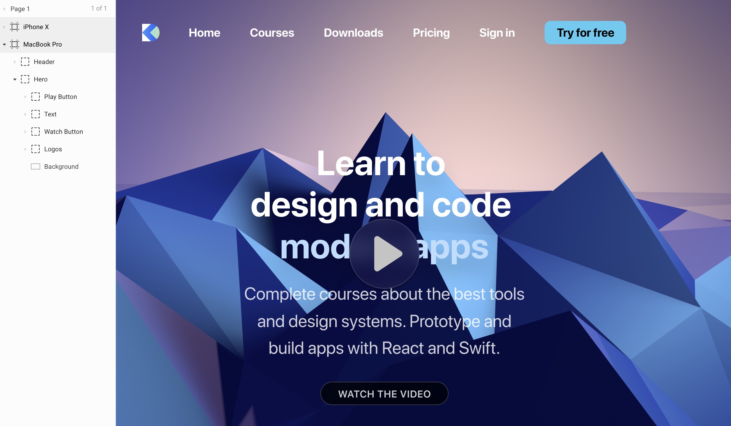
Saving as Figma file
If you wish to save your Figma design as a .fig file, you can go to the Menu - File - Save as .fig.
Constraints and Adaptive Layout
Make your design adapt to any screen

Make your design adapt to any screen
Download Assets
To follow this course, you’ll need to download the assets. You can also get the Figma source files to compare your progress against mine.
Switching Between Devices
When you select the Frame, you can switch between Portrait and Landscape. You can also change the device entirely. But as you do that, you’ll notice that the layout doesn’t respond at all to the change. That’s because we haven’t set the constraints yet.
Organizing
Organize your Groups as you would build your site in code. For example, if you’re planning to use CSS Grid or Stack, the Title and Text should be grouped together with a spacing of 40px. Moreover, they should be contained in a root Hero group to allow contextual positioning. Root containers should take the whole width because they often have a background.
Since constraints depend on their parent container, it is essential for them to be organized properly.
Left or Right, Top or Bottom, Center
By default, the constraint is set to a fixed distance from top and left. You can also choose to set a fixed distance from any of the other borders, or from center. This ensures that your element keeps its size while aligning itself against the borders.
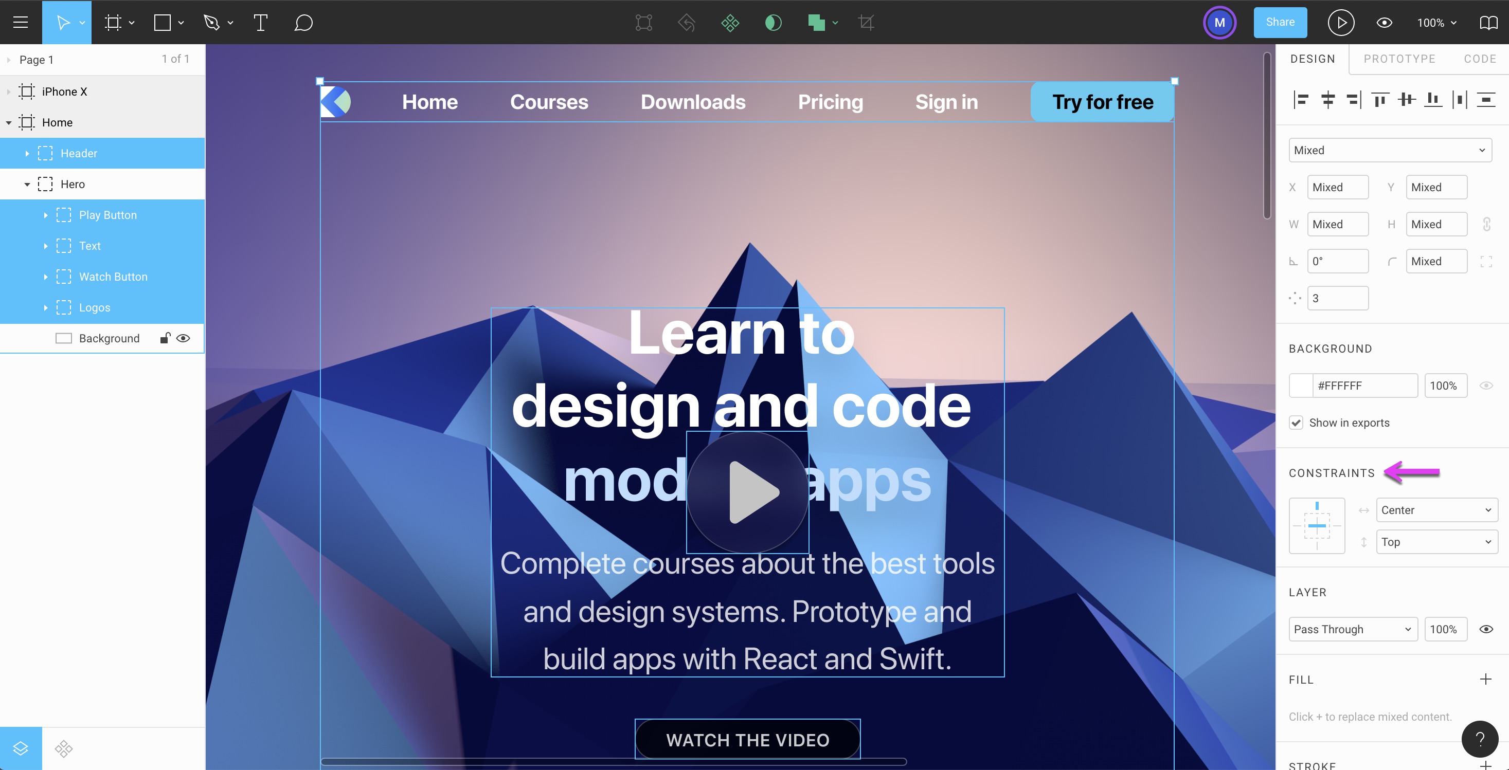
Let’s set the Header, Play Button, Text, Watch Button and Logos to Top, Center.
Left and Right, Top and Bottom
Additionally, you can decide that the distance is fixed from Left & Right or Top & Bottom. This means that your element will resize itself while keeping a consistent distance against the borders. This is especially useful for Groups that contains flexible content, like text layers. It’ll be handy when we’ll start designing Cards and Modals that need to resize.
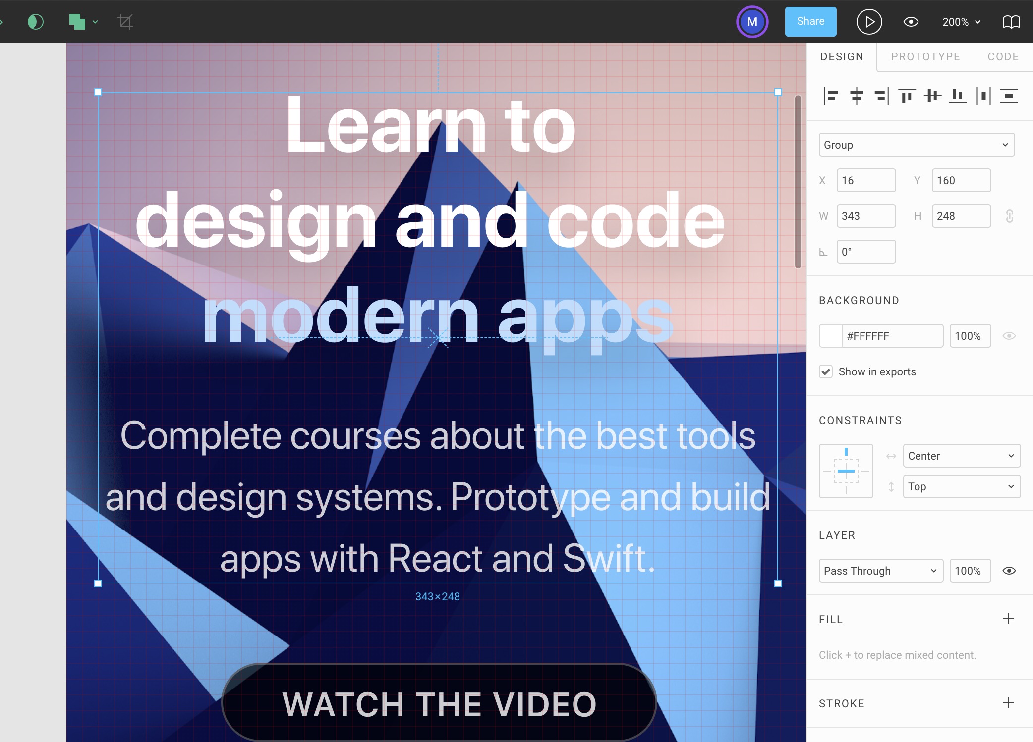
Let’s set the Background to Left & Right, Top. Notice that we didn’t need to set the constraints for the Hero group because the constraints are already set for the inner elements.
Scale
While it’s not a popular use case, Scale can be useful for elements that resize based on the percentage of the container. It may be useful for assets like images or icons.
Resize Artboard
Often times, when you don’t set the constraints properly, your content can scale strangely when you increase the height of your Artboard. Fortunately, it’s been fixed.
Let’s set the Home Frame’s height to 1440px.
Design for Mobile
As you build your site, it’s important to think how it will look like on a phone. Currently, it’s impossible to set constraints that scale the font sizes or completely change the look of a menu. So we’ll design the mobile experience separately.
We’ll do a lot of copy and paste from our Home frame since they share almost the exact same properties.
8-point Grid
For mobile design, the 8-point grid is generally recommended and is consistent with Apple’s Human Interface Guidelines, which promotes 8 points between elements and 16 points from the borders. Since we design at 1x, 1pt is equal to 1px. To learn more about pixel density, I suggest reading this.
Background
Copy and paste the Background and set to 375 x 752px.
Text Group
Copy and paste the Text group, 160px from the top. Turn on the Scale tool by pressing K. Resize the left and right side so that it’s 16px from the sides. Scaling usually create half pixels, so I suggest manually set Title to a font size of 40px and the Text to 20px. Finally, you can change their heights to 128px and 88px respectively. Don’t forget to press V to turn off Scale afterward.
Watch Button
Copy and paste the Button and set to center, 40px from the Text.
Logos
Copy and paste the Logos and divide them into 2 Groups, while keeping a consistent 40px distance between each. Group them again and set to a distance of 40px from the bottom.
Constraints
If they’re not set, make sure that Text Group, Watch Button and Logos are set to Top and Center. For the Background, set Top, Left & Right.
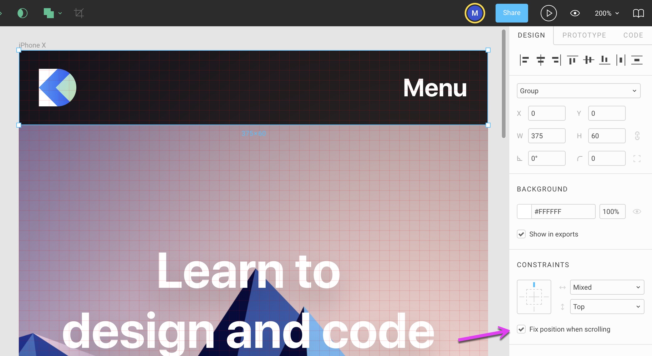
Menu
We’ll create a Rectangle for 375 x 60px, black 70% with a constraint of Top, Left & Right. Let’s copy and paste the Logo and set it to 16px from the left, with constraint of Top, Left.
Fix position when scrolling
This option is useful for prototyping. Thanks to this, you’ll be able to create a Tab bar or Navigation bar that sticks to the top or bottom of your interface.
Let’s enable this for the Menu.
Play Prototype
You can preview your prototype by clicking the Play button in the top right, next to the Share button. Make sure to set your iPhone X frame’s height to 1500px or more to allow for scrolling. Once in Present mode, you’ll be able to see a fixed Menu with blur. Pretty cool! We’ll go much deeper into prototyping later.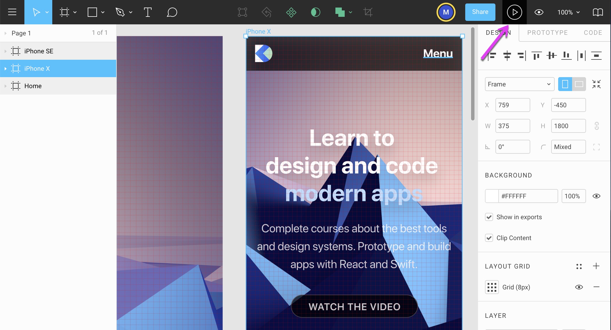
Smallest Device
When you design for mobile, it’s best to go as far as the 320px width, which covers still popular devices such as the iPhone SE. Duplicate the iPhone XFrame by pressing Command + D. If everything was set up properly, you just need to adjust the Text group and the Logos group.
For the Text, press K to enable Scale, and resize the box to be 16px from the left and right sides. Press V to disable Scale and back to Move.
For the Logos, do the same resizing: 16px from left and right.
In the end, you should have something that looks like this.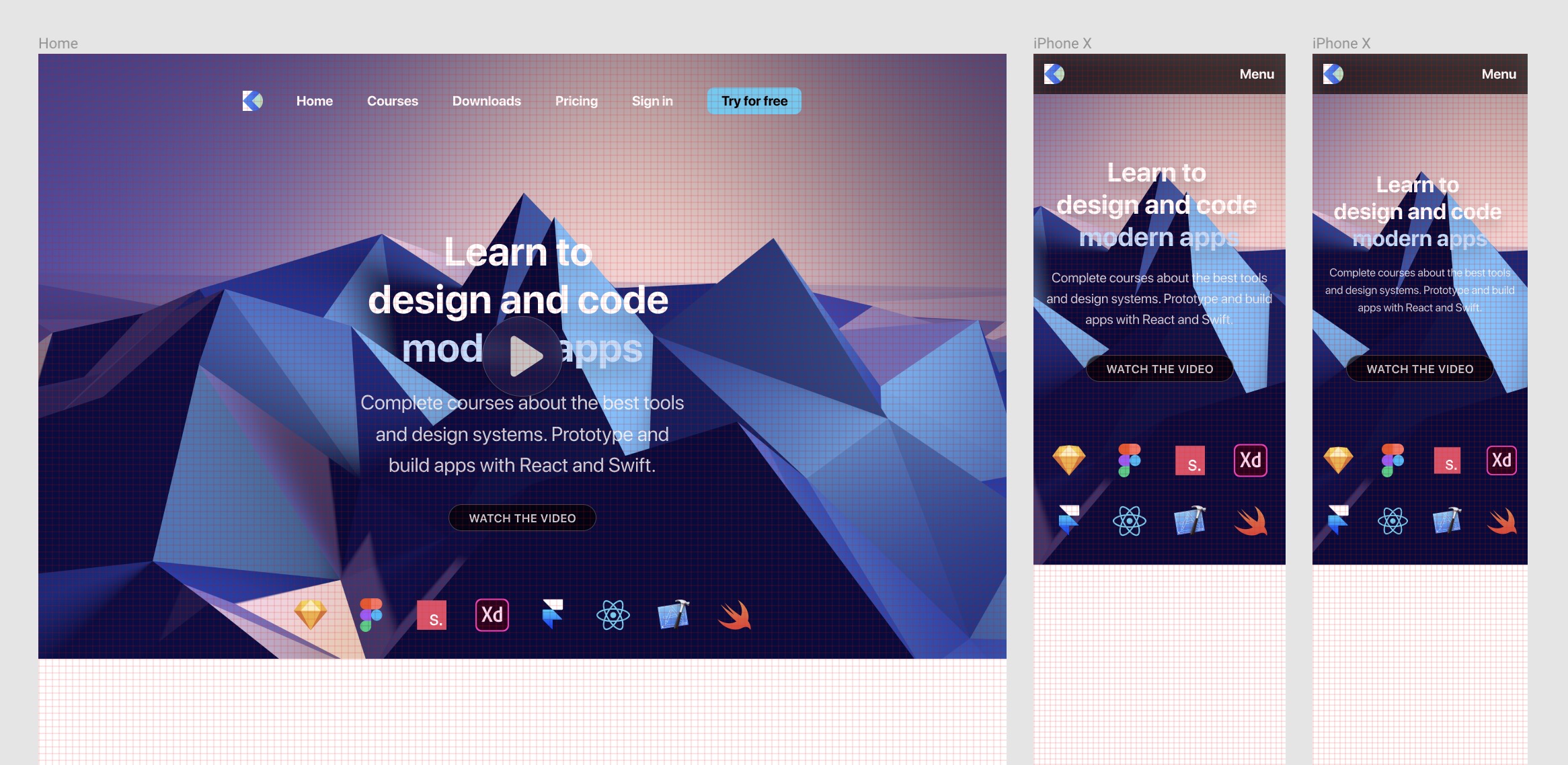
Styles and Team Library
Rules for typography, colors and gradients in Figma

Rules for typography, colors and gradients in Figma
Download Assets
To follow this course, you’ll need to download the assets. You can also get the Figma source files to compare your progress against mine.
Create the Design System File
Let’s create a new Figma file and call it Design System. We’ll create super quick styles to help with the consistency in our main design.
Colors
Create a new MacBook Pro Frame. Rename it to Colors.
Grid Styles
The first thing to add to our Styles is the Grids. Let’s select the Colors frame and click on the Plus icon next to the Layout Grid. To save this as a new Style, click on the 4-dot icon and click on Create Style. Name it Grid 10pt. That’s it! We just created our first Style, which can be reused elsewhere.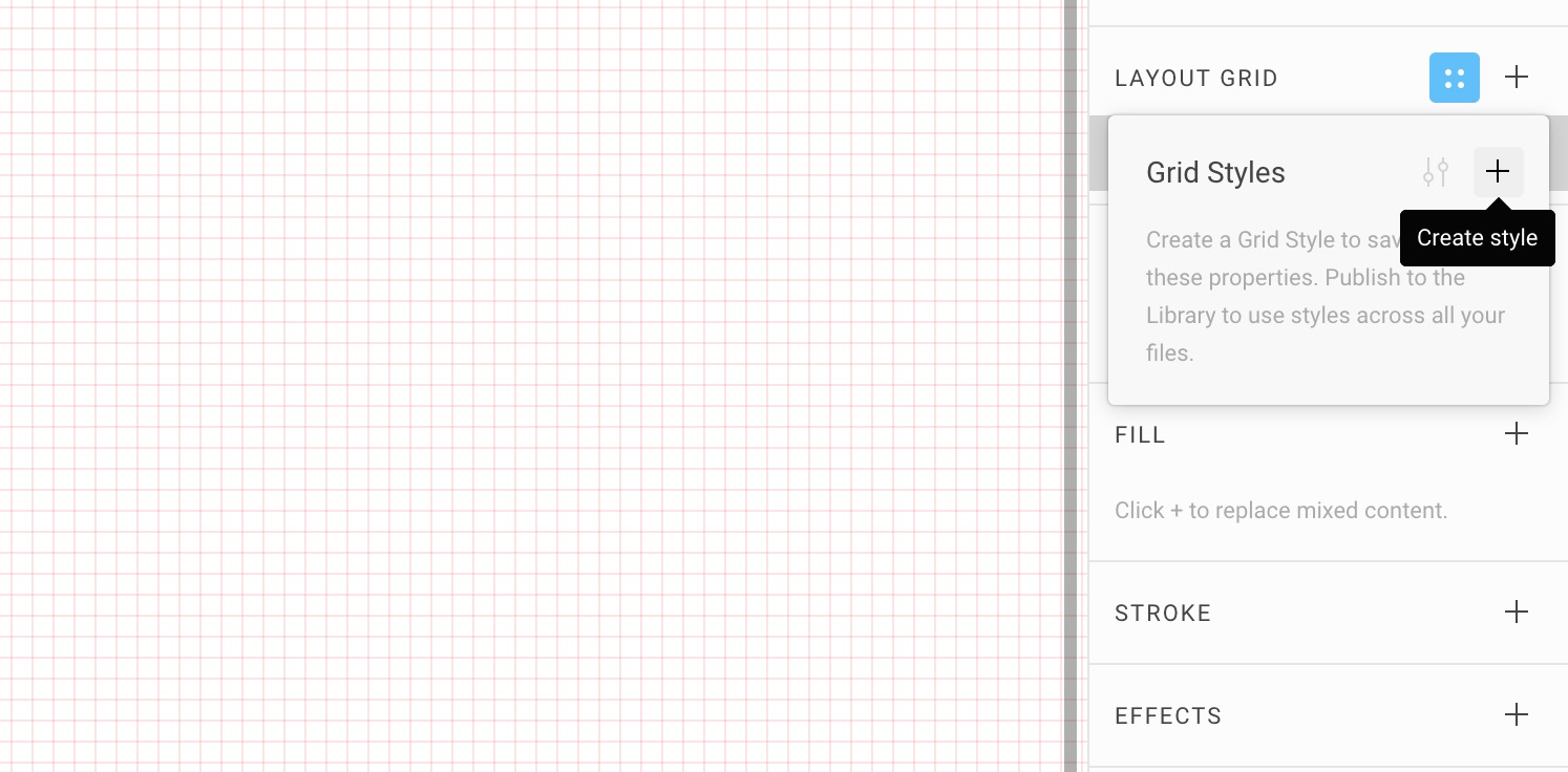
Second Grid Style
Let’s do the same for an 8pt grid. First, remove the newly created Grid 10pt by clicking on the Minus icon. Click on the Plus icon, then the Grid icon to change the size to 8. Finally, create another Style and name it Grid 8pt.
Now you can switch between the two grids on the fly! Additionally, this can be reused on any other Frame.
Color Styles
Let’s create a bunch of Rectangles (280x200) and fill them with multiple colors to use for your project. Most designs will need 4 different types of colors: Background, Text, Buttons and Gradients.
Just like Grids, Colors and Gradients can be saved as styles. You first need to create a Fill of your choice and click on the 4-dot icon. In that window, click on the Plus sign to enter a name for your Color style. Please note that colors shown in the Fill menu are different from the Styles menu.
Background Colors
Good design needs good contrast to be legible and to command attention. To achieve this, you’d use two opposite colors, like black versus white, dark gray versus off-white, dark blue versus light blue. In our case, we used Dark Blue #212C4F and Light Gray #F0F3F5.
Text Colors
Text colors can be used to structure your typographic content. For the body text, you’d start with black on white, and white on black. For extra texts such as captions and titles, you’d need a couple of other colors. In this case, we’ll have Black, White, Dark Green #205284 and Light Blue #C6D0EB.
Button Colors
These colors need to draw attention. They’re used for actionable items, such as buttons, links and clickable areas. They can also be used to express your branding. The color that we use are: Purple #7B42F6, Violet #B01EFF, Pink #E1467C, Blue #3672F8
Gradient Styles
For those who are used to Sketch, you need to know that Figma has a different way to store Gradients. It’s not in the Fill menu but in the Styles menu. Unlike colors, there are no general presets. They’re Library-specific.
Gradients are used for buttons and backgrounds. You can even use them for text layers since Figma has this unique capability. To create a Gradient, go to Fill, and select the dropdown next to Solid. Move the endpoints from Top Left *to *Bottom Right. Make sure to set both ends to 100% opacity.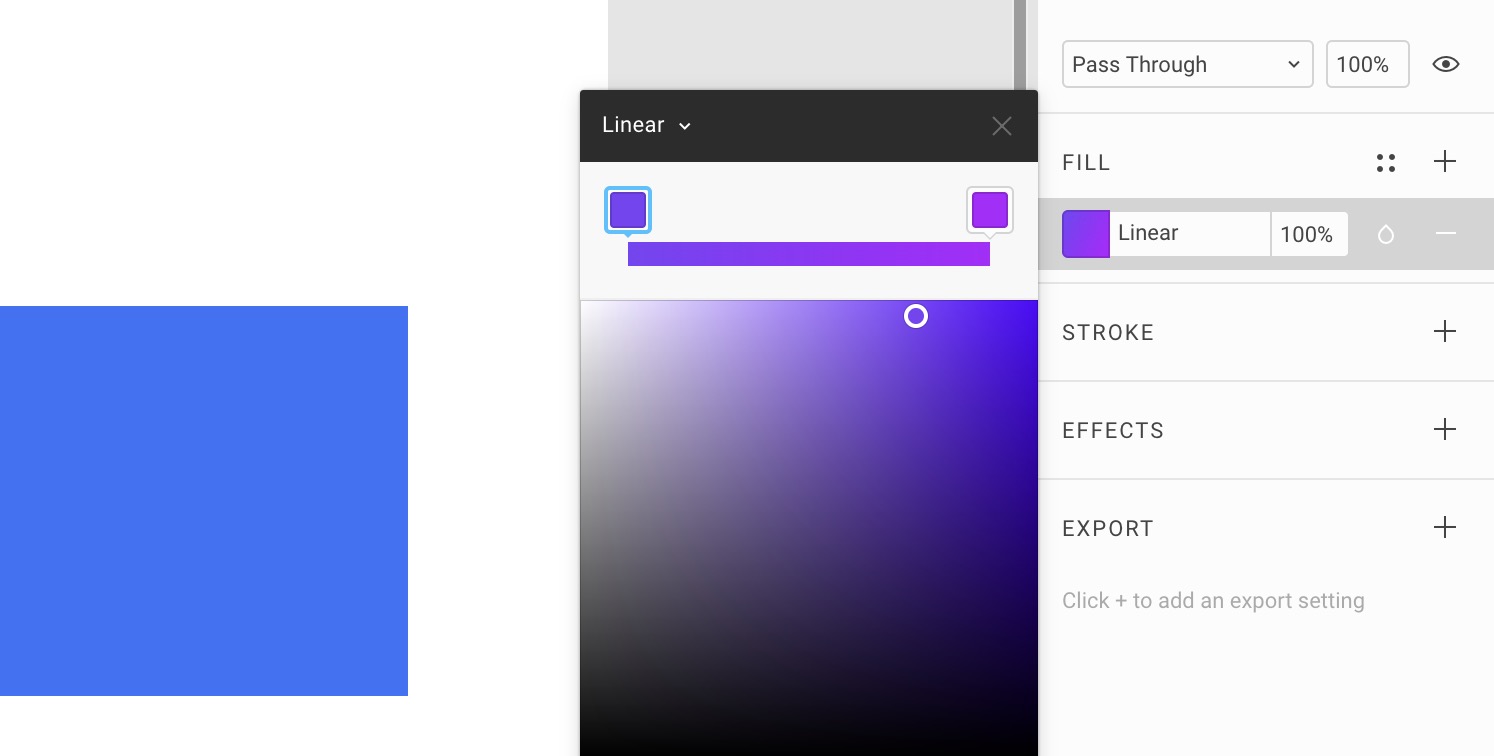
For our design system, we’ll use Purple Violet #7B42F6 to #B01EFF, Violet Pink #B01EFF to #E1467C, Blue Violet #3672F8 to #B01EFF, Blue Marine #14F1D9 to #3672F8.
Saving Color Styles
Now that we have all our colors, we can select each one and click on the Styles icon next to Fill to create a new Style. This will be added to your Local Styles. Do the same for Gradients. Figma will treat them the same.
Your Styles
If you have nothing selected, you’ll see your global settings, which includes your local styles. You’ll see that you have saved the Color Styles and Grid Styles. Nice!
Header
We can already start using our new Color styles on the Header! Create a Rectangle at 1440 x 240px. As a Fill, click on the 4-dot icon and select Purple.
Title
Make a Text layer with a font size of 80px, bold, white, 100px from left and centered vertically. We’ll use SF Pro Display and write Colors.
Typography
Let’s duplicate the Colors frame and change the Title to Typography. You can delete the color layers.
We’ll create roughly 13 different text layers divided into 2 types: Headings and Body Texts.
Headings
Headings are for large titles and will use SF Pro Display, which has the letter less spaced out. The font is bold and as a result, extremely easy to scan as you scroll the screen. As recommended by Apple, when the font size is more 20pt or more, SF Pro Display should be used. For the line-height, set to 120%.
Headings Text Styles
Create 4 text layers at 80px, 60px, 30px and 24px respectively. Set them all to Bold. For each, create a new Text Style based on their names.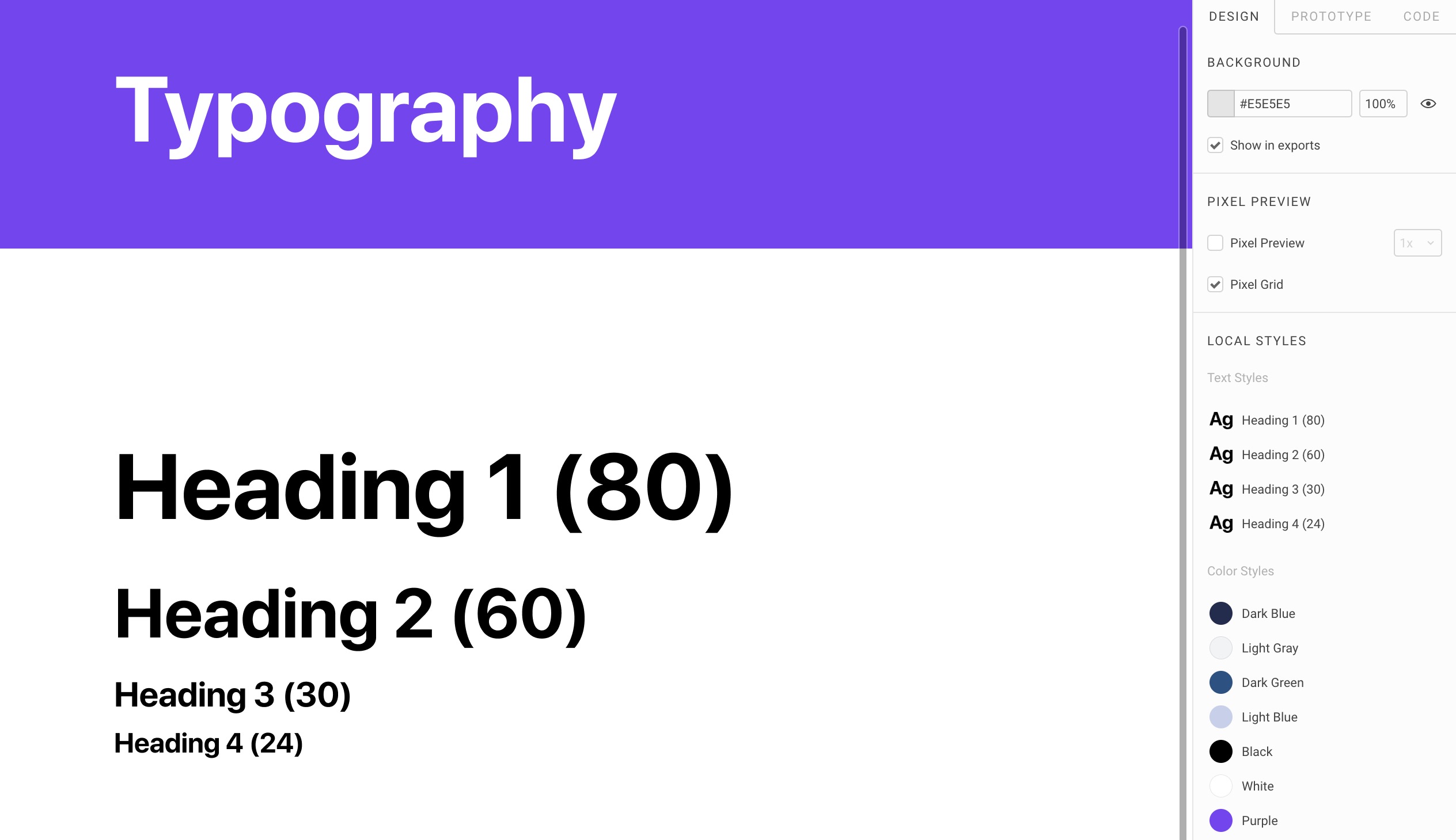
Body Texts
Body texts are for reading a large amount of text content, typically for more than one line of text. We’ll have Large, Medium, Normal and Small. For each, we’ll need the Regular weight and Semibold. For Design+Code, we’ll have a special one called Caption set in Semibold.
Create the text layers at 24px, 20px, 18px, 16px and 12px. Line-height should be set to 130%. For each, except for Caption, duplicate to create the Semibold version.
Advanced Type
You can have access to more options for your text layers if you click on the triple dots icon. You can change the Resizing, Transform, and some advanced features.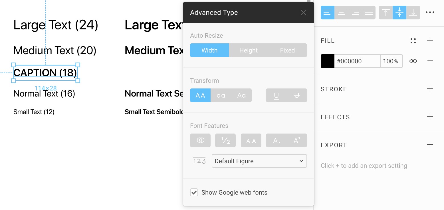 For the Caption, set it to Transform: Uppercase.
Body Text Styles
Again, for each text layer, create a Text Style.
Shadows
Duplicate the Typography frame to create the Shadows frame. Delete the content.
Effects
A feature unique to Figma is the ability to store Effects, like drop shadows, stroke, blur and even images as Styles. This is insanely useful for creating button shadows, blur settings and even preset content like avatars and backgrounds. You can store UI faces, images for others to use as long as they have this Library enabled.
Button Drop Shadow
Create a white Rectangle with 10px corner radius. Click on the + next to Effects. Set the drop shadows to 20px Blur, 10px Y, 15% black. Typically, I set the Blur to be 2x the Y position. The X position is almost always at 0. We’ll use this for the Button.
Drop Shadow State
We’ll create a drop shadow that seems to be floating away further from the ground. This will serve as the end state for our drop shadow animation from the first state. Duplicate the first Rectangle and set the drop shadow to 30px Blur, 15px Y.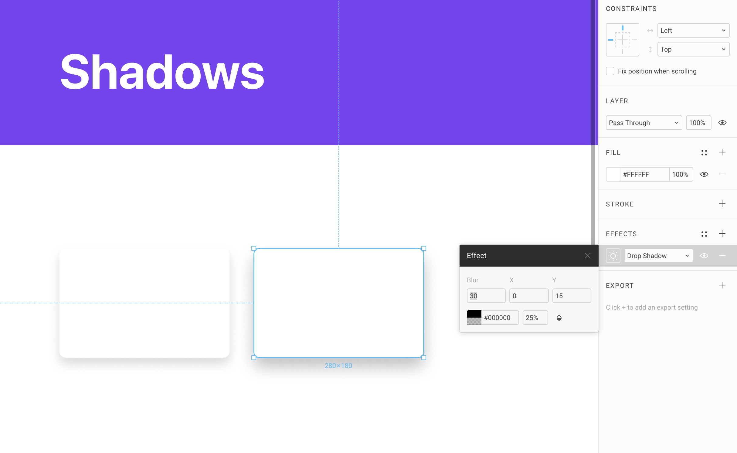
Card Drop Shadow
Let’s duplicate the Rectangles to create one at 40px Blur, 20px Y and another one at 60px Blur, 30px Y.
Save Effects
Let’s save all 4 drop shadow effects.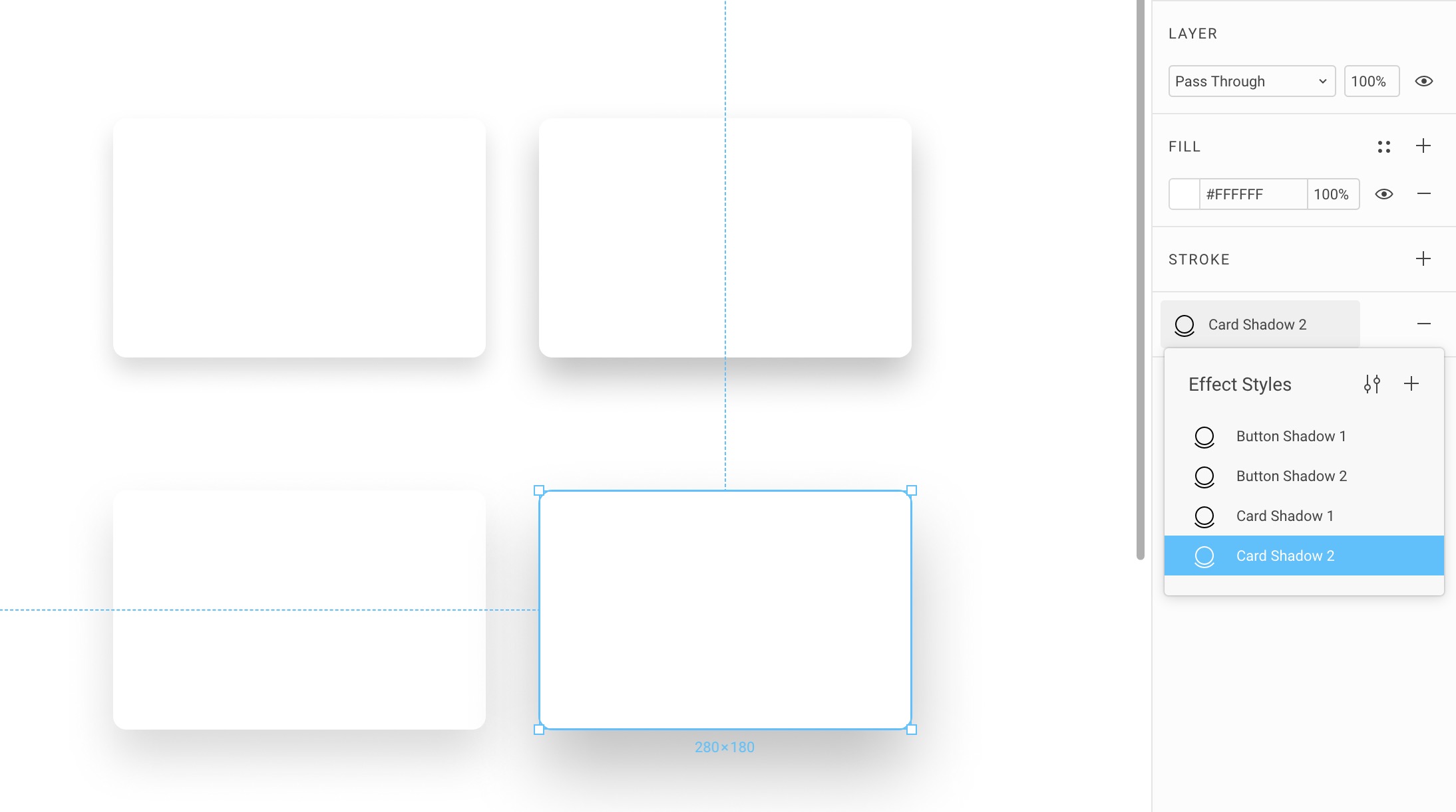
Assets
Let’s duplicate again a Frame to rename to Assets. Divide the content into 2 sections: Avatar and Background. Create text layers for both titles. We can already use our Styles.
Set the Text Style to Heading 2 (60) and the Fill to Dark Green.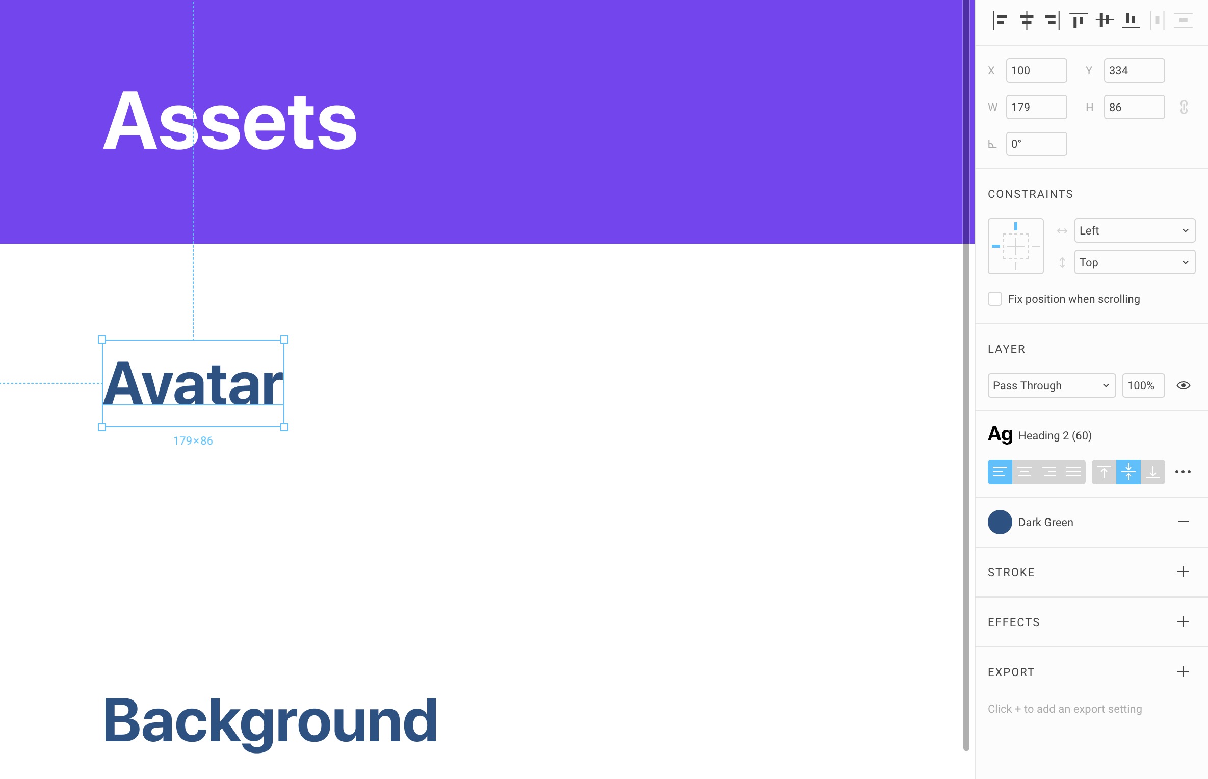
Avatars
Press O to create an Oval at 60x60. Change the image to any avatar provided in the assets. You can find more avatars on UINames.
Option-Drag to the right with a distance of 30px and press Command + D to do it multiple times. Make about 4. Then, change the images for the rest of the avatars.
Create a Style for each and simply title them by their full names. This will be useful when you design.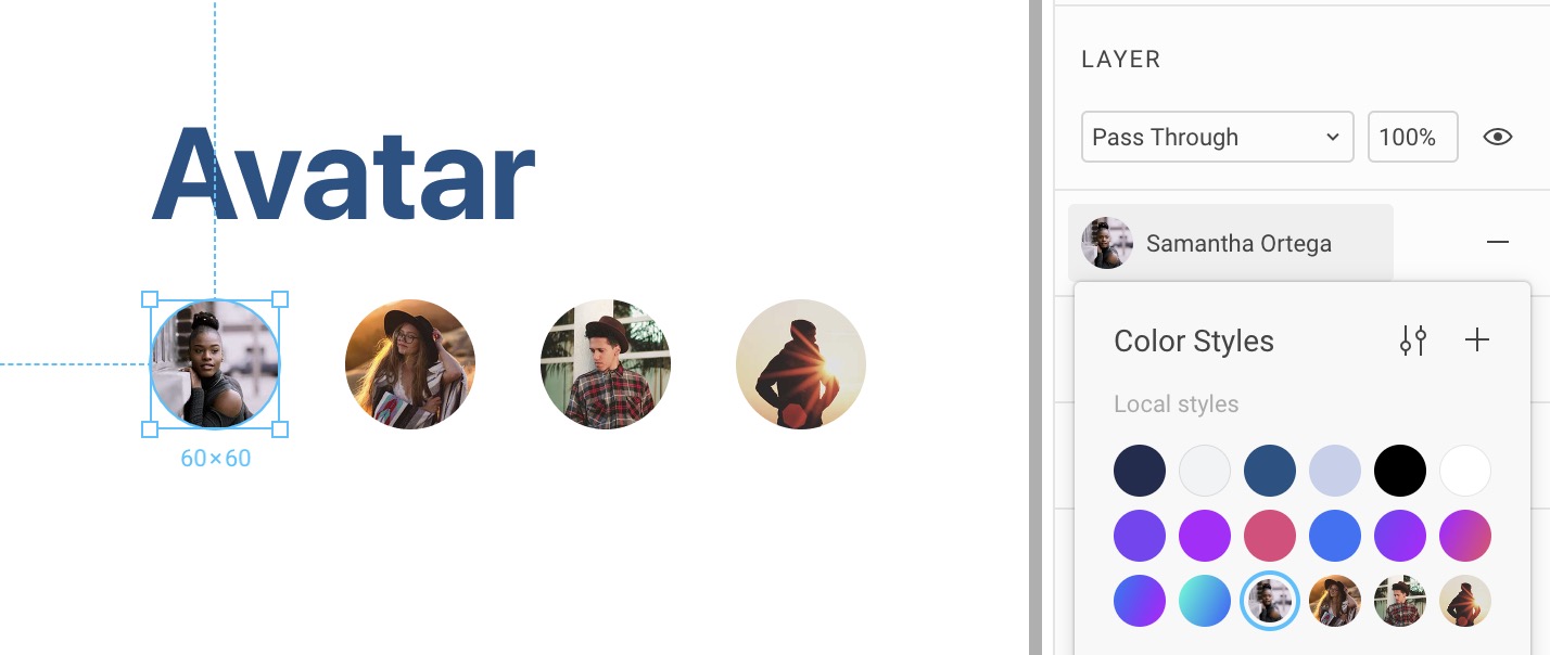
Backgrounds
Press R to create a Rectangle 380x225 with a corner radius of 20. Change the image to any of the backgrounds provided. More can be found on the downloads page. Option-Drag to duplicate to the right with a distance of 50px. Command + D to make another copy. Duplicate for a second row. Change to the other backgrounds provided.
Create a Style for each background and simply name them Background 1, Background 2, etc. Of course, you can decide to create more of these for your own Design System.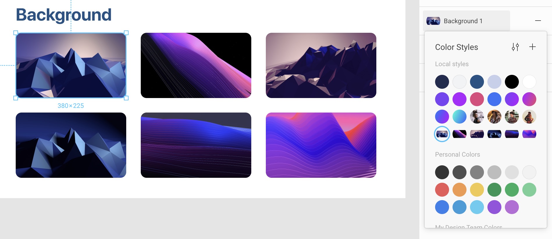
Team Library
Now that you have your Styles saved, you can Publish them for your team to use. Click on the Library icon in the top right and click on Publish. Voila! Anyone in your team can use turn on and off the Library and have access to all the styles you’ve just created!
Enabling a Library
You can enable the Design+Code icons library in order to use its Components. This will be useful for later.
Components and Nesting
Design powerful and reusable elements for your site

Design powerful and reusable elements for your site
Download Assets
To follow this course, you’ll need to download the assets. You can also get the Figma source files to compare your progress against mine.
Creating a Component
Before creating a Component, you need at least 2 layers. You can decide to select multiple layers to create a Component, or you can select an existing Group and turn it into a Component.
Let’s duplicate another Design System frame for Buttons. Create a Rectangle at 260x60 with a corner radius of 30. Set a Fill Style to Purple Violet. Add an Effect Style to Button Shadow 1. Press T and write Primary Button. Set the Text Style to Heading 4 with a Fill Style to White, aligned center. Select both the Text and Rectangle and align center horizontally and vertically. Finally, with both layers still selected, do Command + Option + K to create a Component.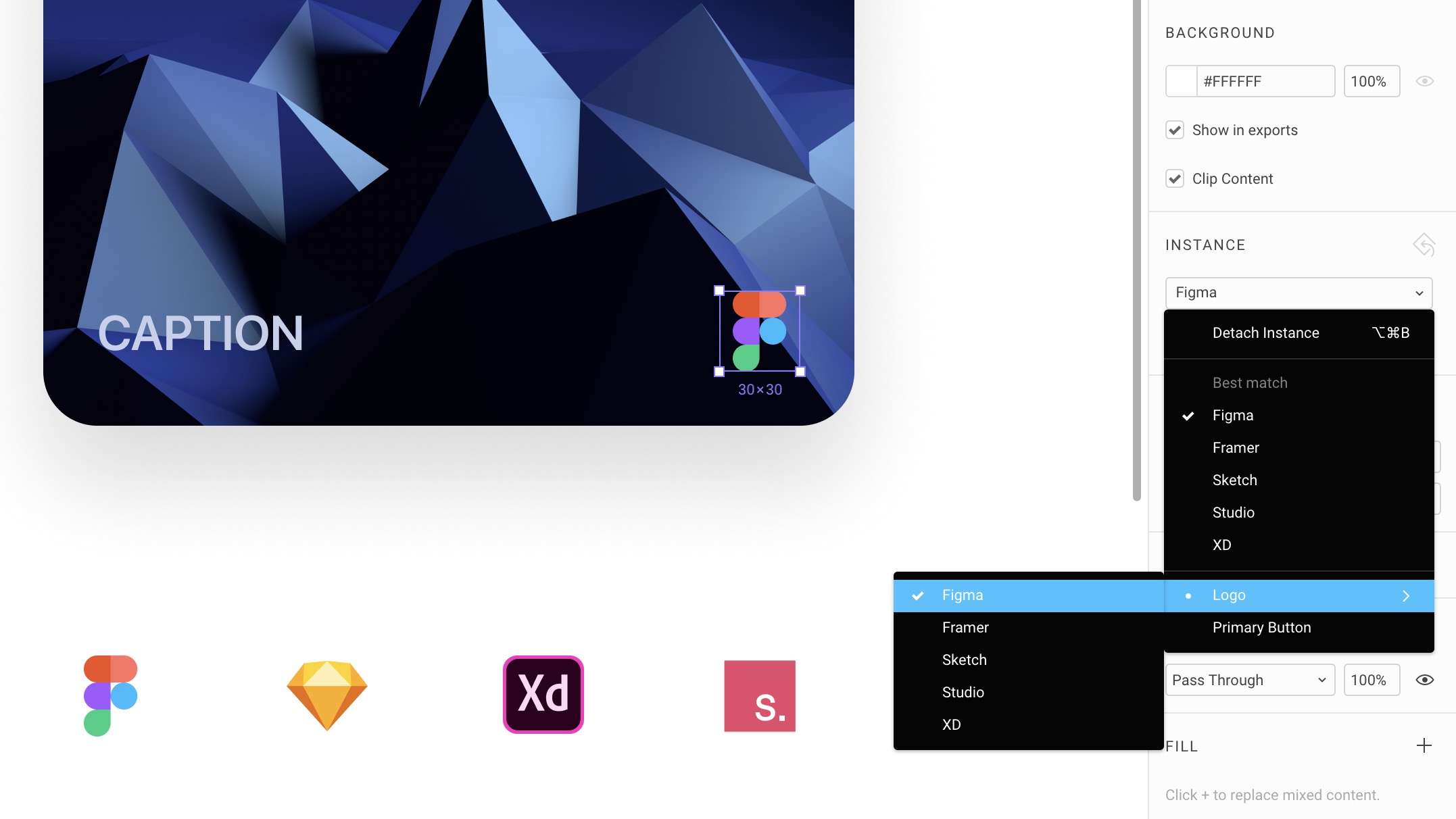
Master Component
The first time you create a Component, it becomes a Master Component. Unlike Sketch, it doesn’t reside in a separate Page. It’s directly available for edit right in the current document. You can edit on the fly just as you would edit any other elements.
The Master Component can be distinguished by an icon with 4 diamonds while copies of the Component will have a single diamond icon.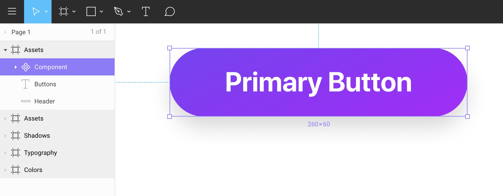
Any structural change, such as position and the actual composition of the layers will affect copies of that Component.
Property Overrides
Editing the contents of the copies won’t affect the Master Component. Overrides can affect text, images, colors, shadows, and even styles.
Let’s Option-Drag the Master Component to create a Copy. Edit the text to Primary Hover. You can even change the Effect Style to Button Shadow 2 and it won’t affect the Master Component. That’s powerful and so simple to use.
Duplicate to create a third button. Change text to Primary Disabled, the Fill to Light Blue and remove the Drop Shadow.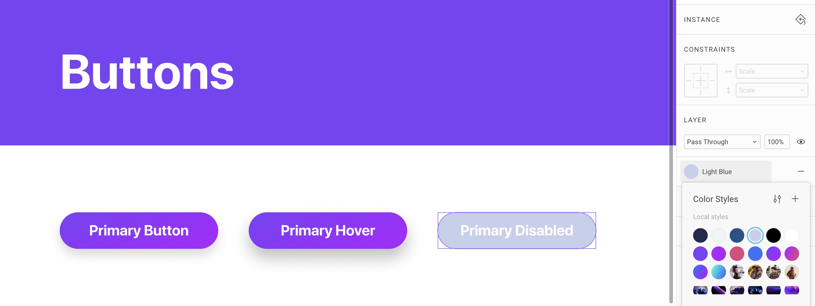
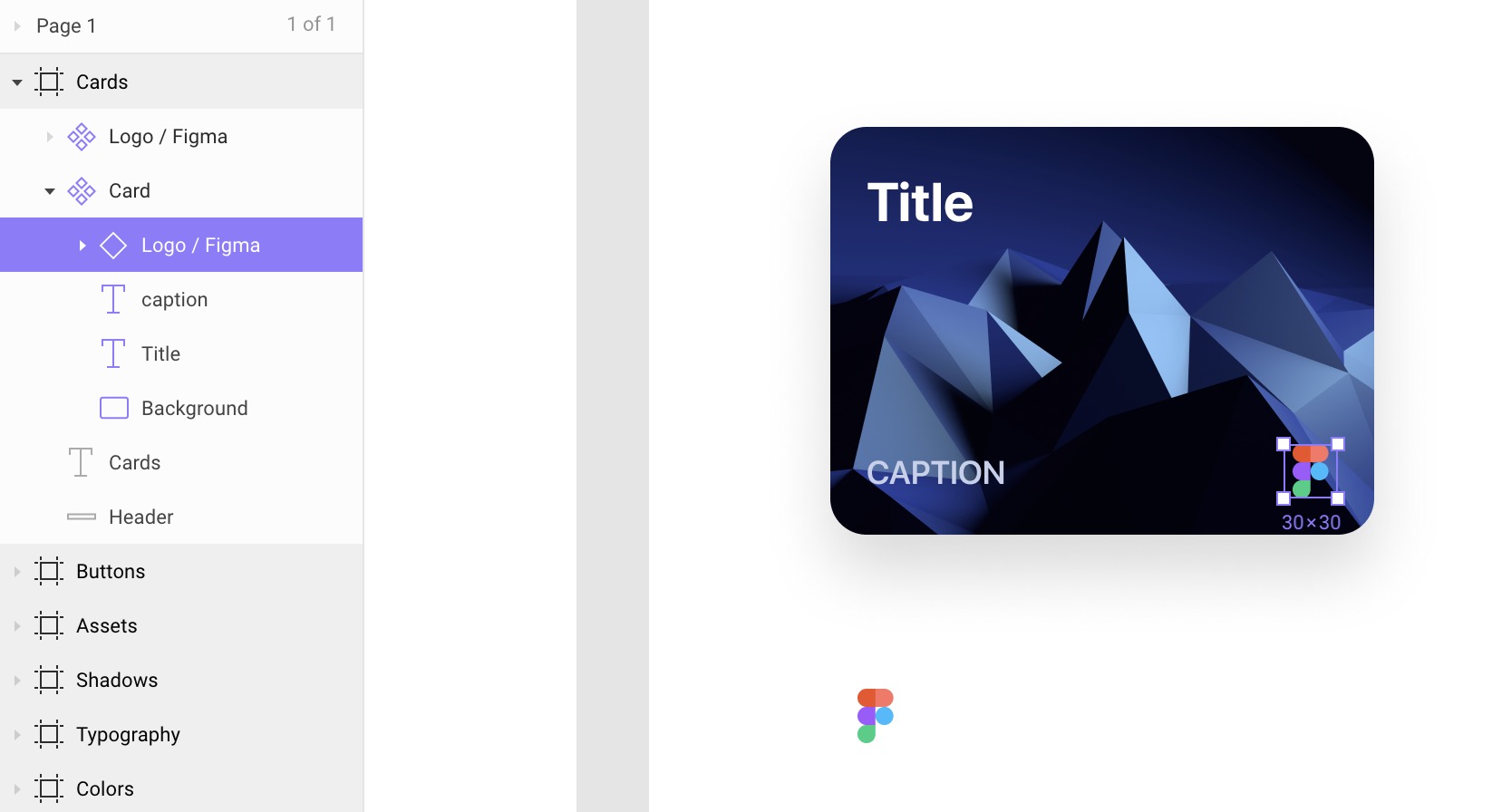
Nested Components
A Component can exist inside another Component. This is a powerful workflow because you want to be able to reduce the size fo your Component as much as you can. There are small Components, such as Buttons and Icons, and there are big components like Cards, Overlays, and Modals. For example, the Card Component can contain Button and Icon Components. This thinking is very much in line with how React works.
Let’s duplicate a Frame to create one for Cards. Create a Rectangle 300x225 with a corner radius of 20. Set the Effect Style to Card Shadow 1.
Add a text layer with a Style to Heading 3 (30) and color to white. Since the text can be spread over multiple lines, we should add a Fixed width of 175. Distance 20 from top and left. Add a new text layer with Caption text and Light Blue.
Select all the layers and create a Component. Name it Card.
Now, let’s create a Frame that’s 30x30. Put any number of layers in there, like the Figma logo in vector and center it. Rename the Frame to Logo / Figma and create a Component (Command + Option + K). Hide the white background.
You can’t put a Master Component inside another Component, so it’s best to create a copy first (Command + D). Move the Copy to be inside the Card Group, and 20 from the right and bottom.
Component Overrides
Changing the content of your Component is crucial to creating reusable elements. At the basic level, you can only change properties in the Inspectors. However, sometimes, you want to be able to change groups of elements, such as icons. The only way to do this is to create multiple duplicates of a Component.
For example, you’d have an icon inside a Frame. Then, you’d create multiple duplicates of that Frame. For each of them, you’d create a Component (Command + K). Make sure that these Frames have the exact same sizes.
The next time you use this Icon Component, you’ll be able to see a drop-down in the inspector which would allow you to switch between the numerous icons you’ve created.
Let’s duplicate the Logo / Figma Component 4 times. For all the copies, right-click to Detach Instance. Now, for each Frame, you can import a new logo and create a Component with their respective names.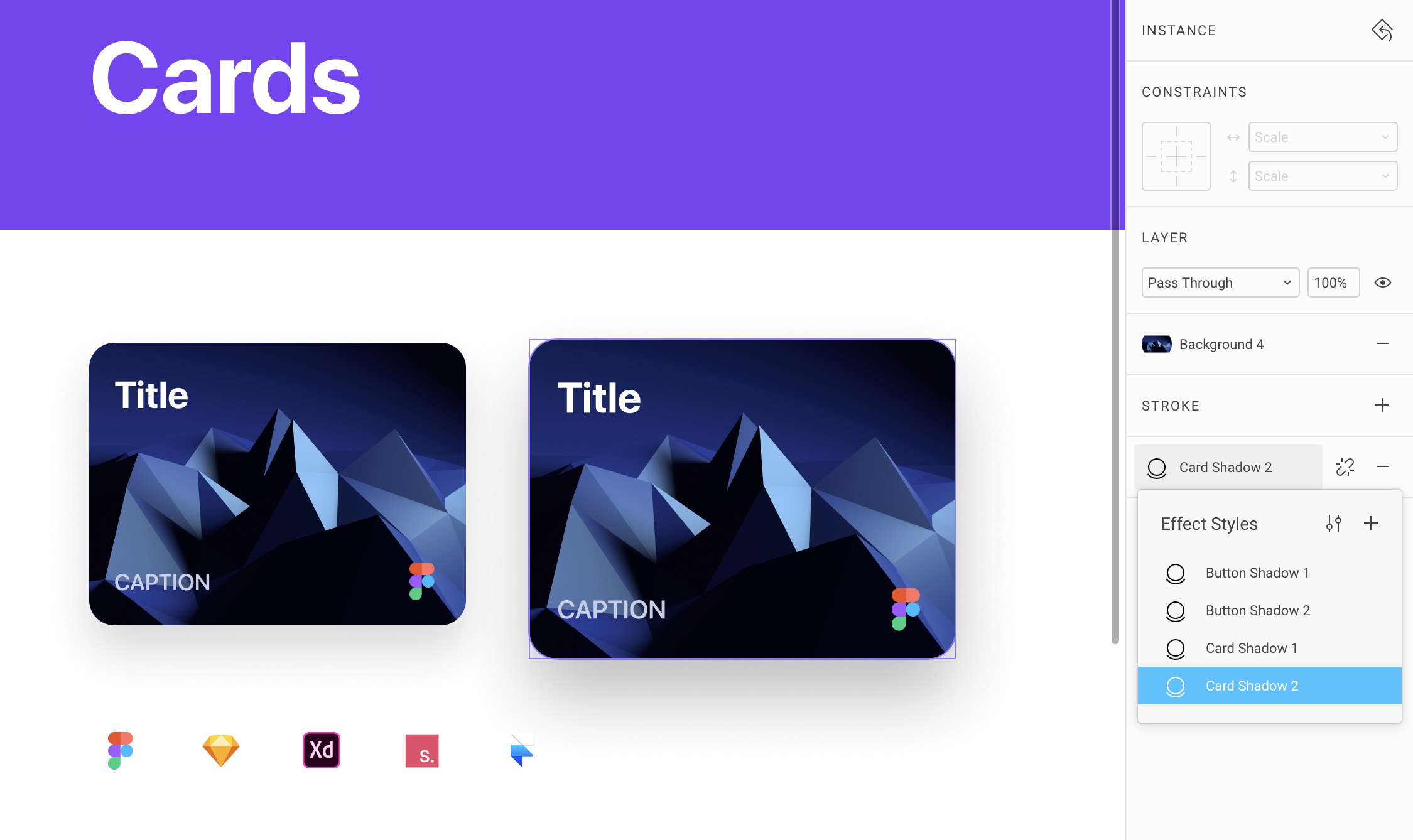
Component Naming
Notice that we added a Slash to the name to group component overrides. This allows us to put similar Components together and easily find them in the drop-down menu.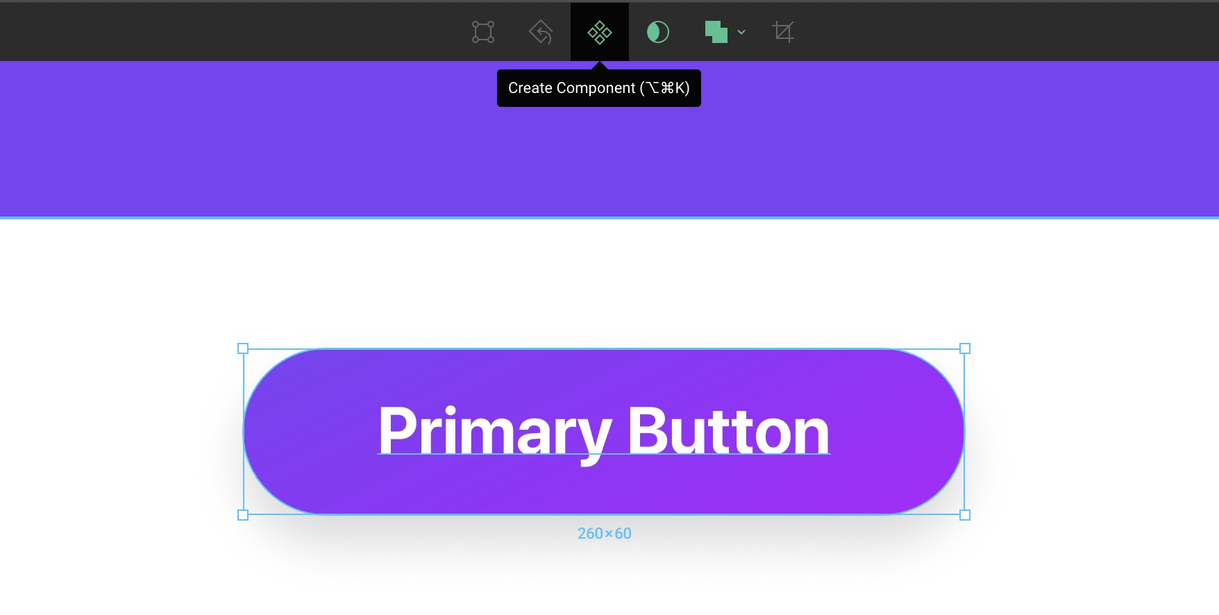
Component Resizing
You can resize your Component by changing its width and height, but you can also use the Scale tool.
Let’s duplicate the Card component 50px to the right and press K to resize it to 340x255. Notice that every layer has also changed its size! This will be the Hover state for our Card. Let’s also change the Effect Style to Card Shadow 2.
Publish Changes
Every time you make changes to your Design System library, you will be asked to Publish so that other members in your team may get the same updates. Let’s Publish.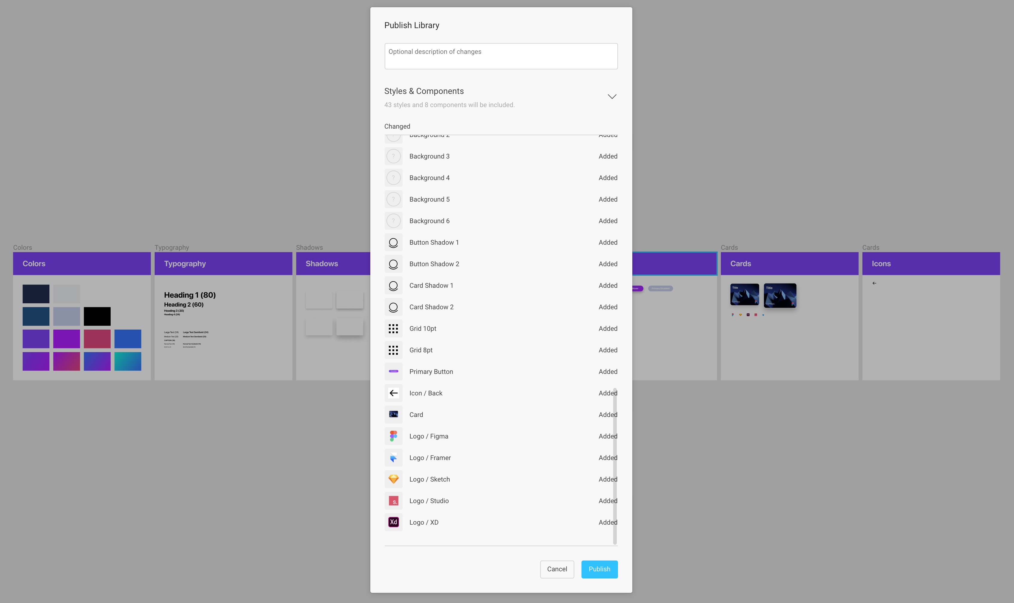
Organizing Projects
To create a new Project, go back to the main space in Figma and click on New Project. Name it Design+Code 3. Go back to Drafts and drag and drop the Design System and Design+Code 3 files to the new Project.
Team Library Components
In addition to sharing Styles, you can also share your Components, but this needs a Professional account.
Back to our Design+Code 3 design file, click on the Library icon in the top right and click on the Toggle to start using that Library.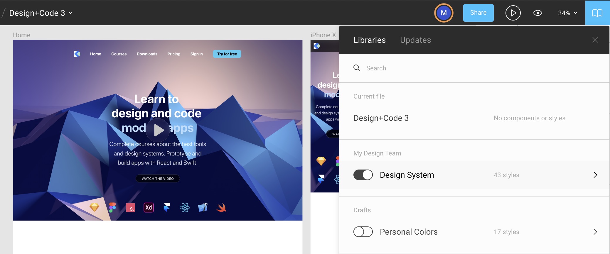
Switch to Pro Account
In order to be able to share Components in the Library, I’ll switch to my Pro account.
Back to Design+Code 3
Let’s head back to the design file and start using the new Components.
Try for free Button
Let’s drag and drop a Button component and change the text to Try for free.
Caption
Create a text set to Caption Semibold.
Title
Set a title with Heading 2 using one of the gradients.
Cards
Drag and drop a card and duplicate to get 4 cards.
Publish Library
Whenever you make a change to your Library, you can publish the changes so that your team can get those updates.
Update Library
Once the changes have been pushed, your team must review them and make sure that they make sense.
Booleans and Shapes
Collaborate with your team with shared components

Collaborate with your team with shared components
Download Assets
To follow this course, you’ll need to download the assets. You can also get the Figma source files to compare your progress against mines.
Union
Union will merge multiple shapes together. You’ll be surprised to see that most icons use this technique. For example, when you combine to have 3 lines, you get a Hamburger menu.
Close Icon
Create two rectangles that’s 30x2 and rotate one to 45deg and the other to -45deg. Align them to center against each other, both horizontally and vertically. Select both lines and go to Boolean / Union.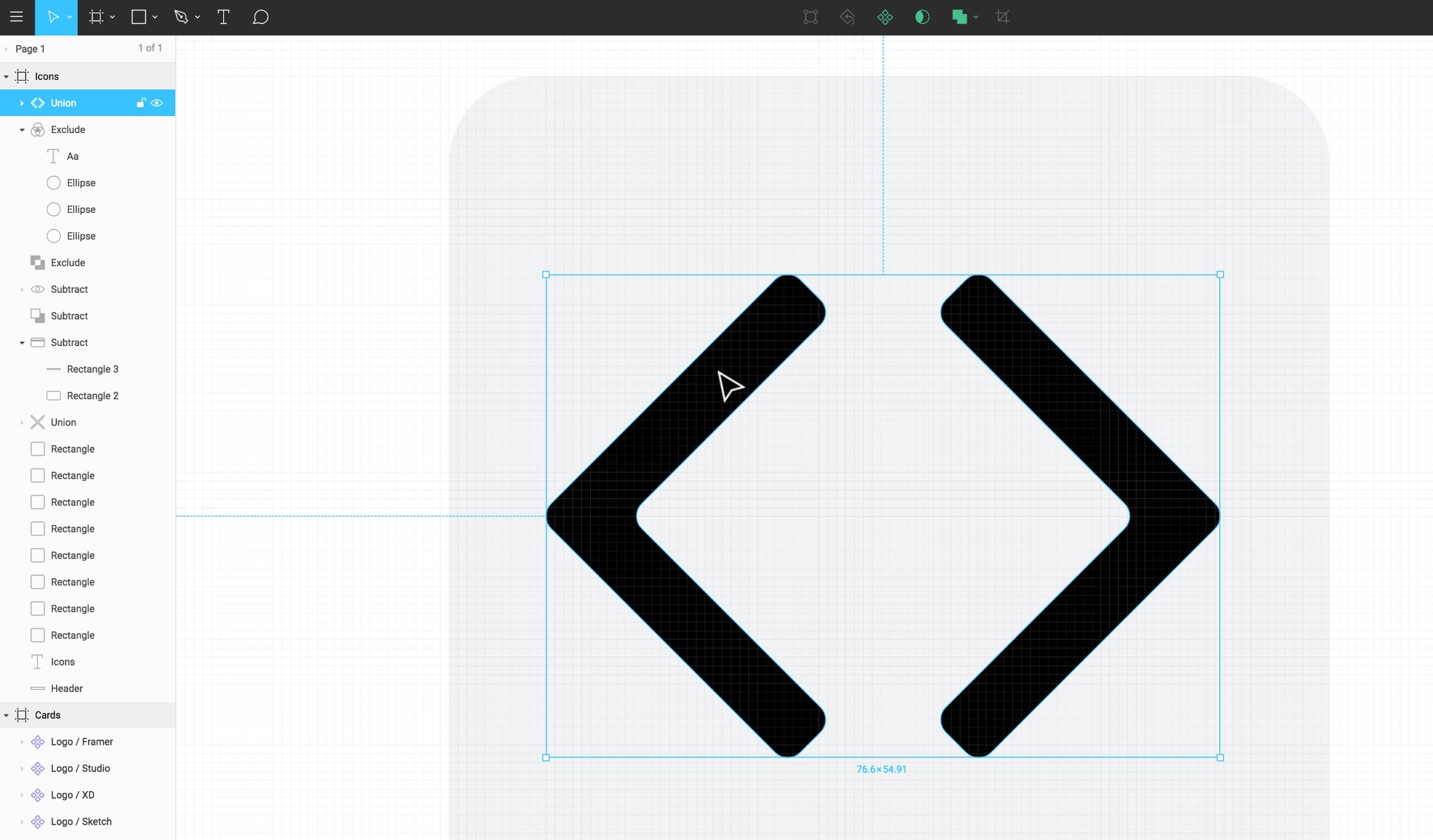
Subtract
Subtract will subtract a single shape or multiple shapes from the main shape (the one at the bottom). It’s important to note that all subsequent shapes will always be subtracted from the main shape.
Card Icon
Create a 28x18 rectangle with a rounded corner of 2. Then, create a rectangle that’s 26x2 and place it 4px from the top, 2px from left. Select both layers and go to Booleon / Subtract.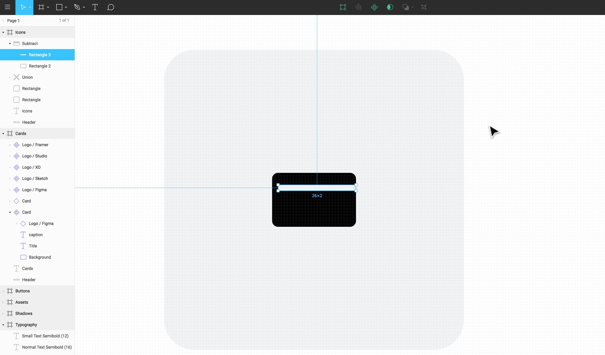
Intersect
Intersect will show the space where 2 shapes meet. While this is not a popular technique compared to Union and Subtract, this is a good way to experiment with new shapes.
Eye Icon
Create 2 circles that are 40x40. Place one above the other with 30 distance from the bottom. Go to Boolean / Intersect. Then select the Boolean group and go to Boolean / Flatten. Create a circle that’s 12x12 and select Subtract.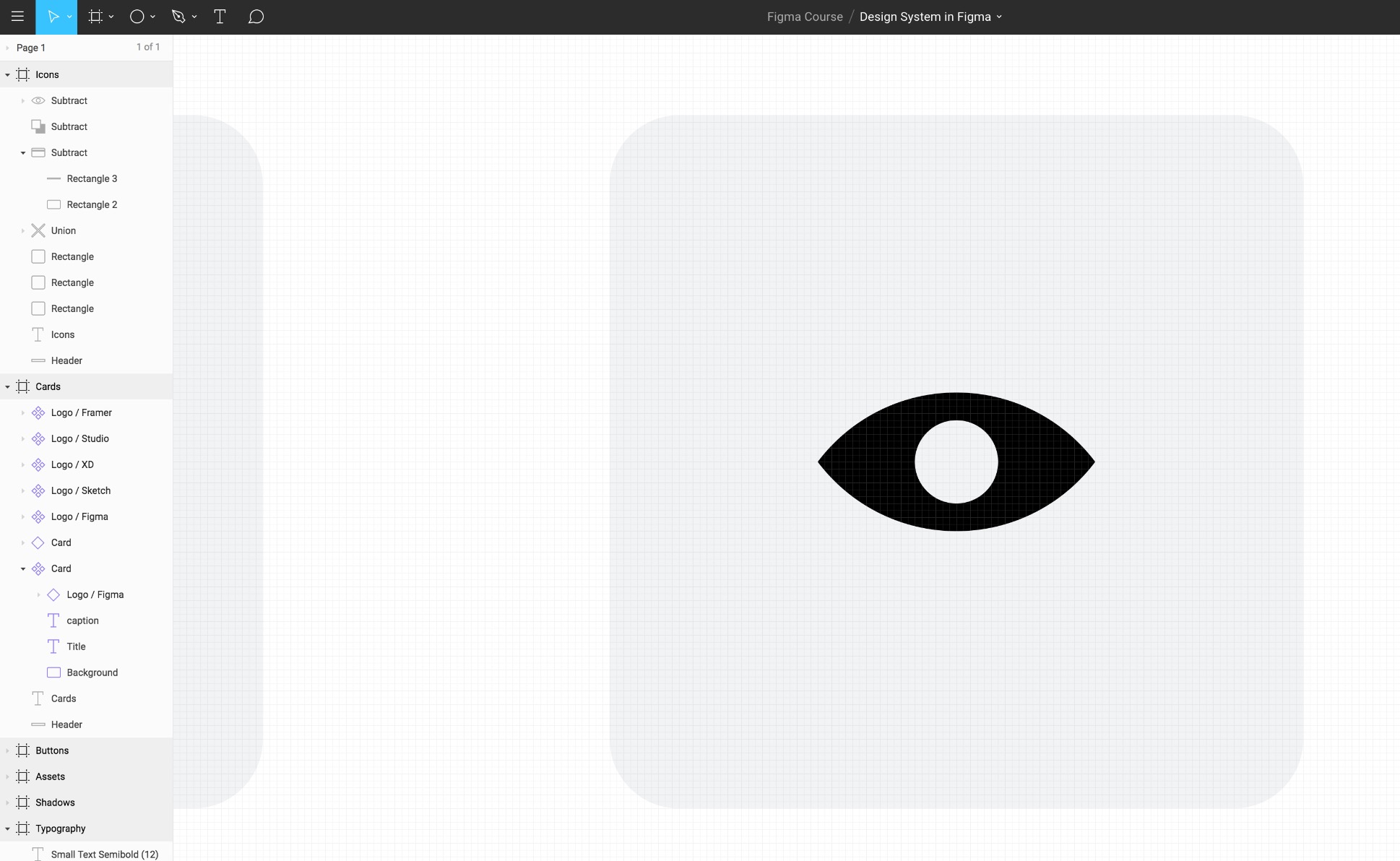
Exclude
Exclude will show the space where 2 shapes don’t meet.
Text Icon
Create a circle that is 40x40. Duplicate and place it 20 from top and 10 from the right against the first one. Duplicate again and place 20 from left, from the second circle. Select Boolean / Intersect. Create a Text layer that’s about 12pt and place it in the middle. Drag the text layer to be inside the Boolean group.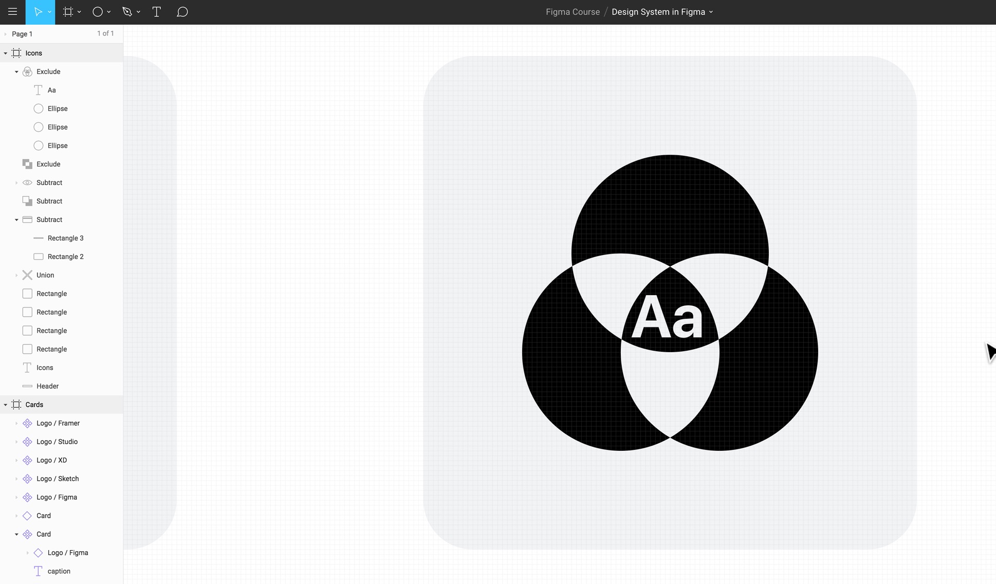
Flatten Shape
Using booleans with multiple shapes can really make your icon complex and multi-layered. One of the ways to simplify is to flatten everything as a new shape and work from that.
Set Default Properties
The default light gray color may not be the best color to use for our icons. Every time we create new shapes, we have to change the Fill and that can be tiresome. Let’s change the Fill to black. Then, go to the menu / Edit/ Set Default Properties. Now, the next time you create a shape, it’ll be black.
Brackets
Create a square that’s 40x40. Rotate by 45 degrees. Duplicate and push it by 10 to the right. Select both shapes and do Subtract. Then do Flatten. Press Enter to get into edit mode. Select vector points and set the corner radius to 2. Duplicate and rotate 180deg.
Star
The star can have infinite counts, ratio, and radius, which can allow you to create pretty interesting shapes, like the Cog icon.
Cog
Create a Star polygon that’s 50x50 with 12 count, radius 3 and angle 60%. Then create a circle 24x24 and use Subtract.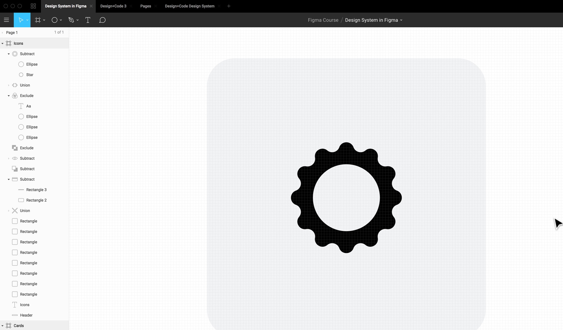
Polygon
The Polygon can have a corner radius and count, so you can create any polygon counts you want, from the triangle to the hexagon and more.
Play
Create a Polygon 32x32 with 2 radius with a count of 3. Rotate -90 degrees. Then, create a circle that’s 50x50. Use Subtract.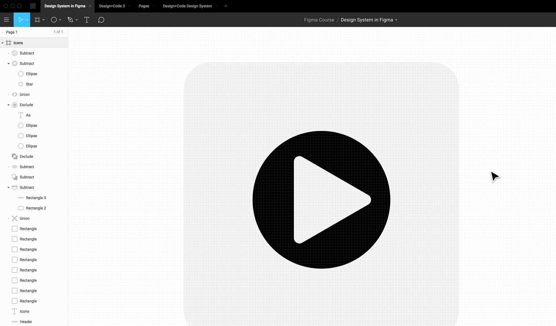
Arrow
The Arrow is insanely useful for creating flows or for simply designing an arrow icon. You can customize the stroke width.
Create an Arrow line (Shift + L) 50x0. Set the Stroke width to 5. Select one of the vector points and set go to Advanced Stroke and set the Cap to Round.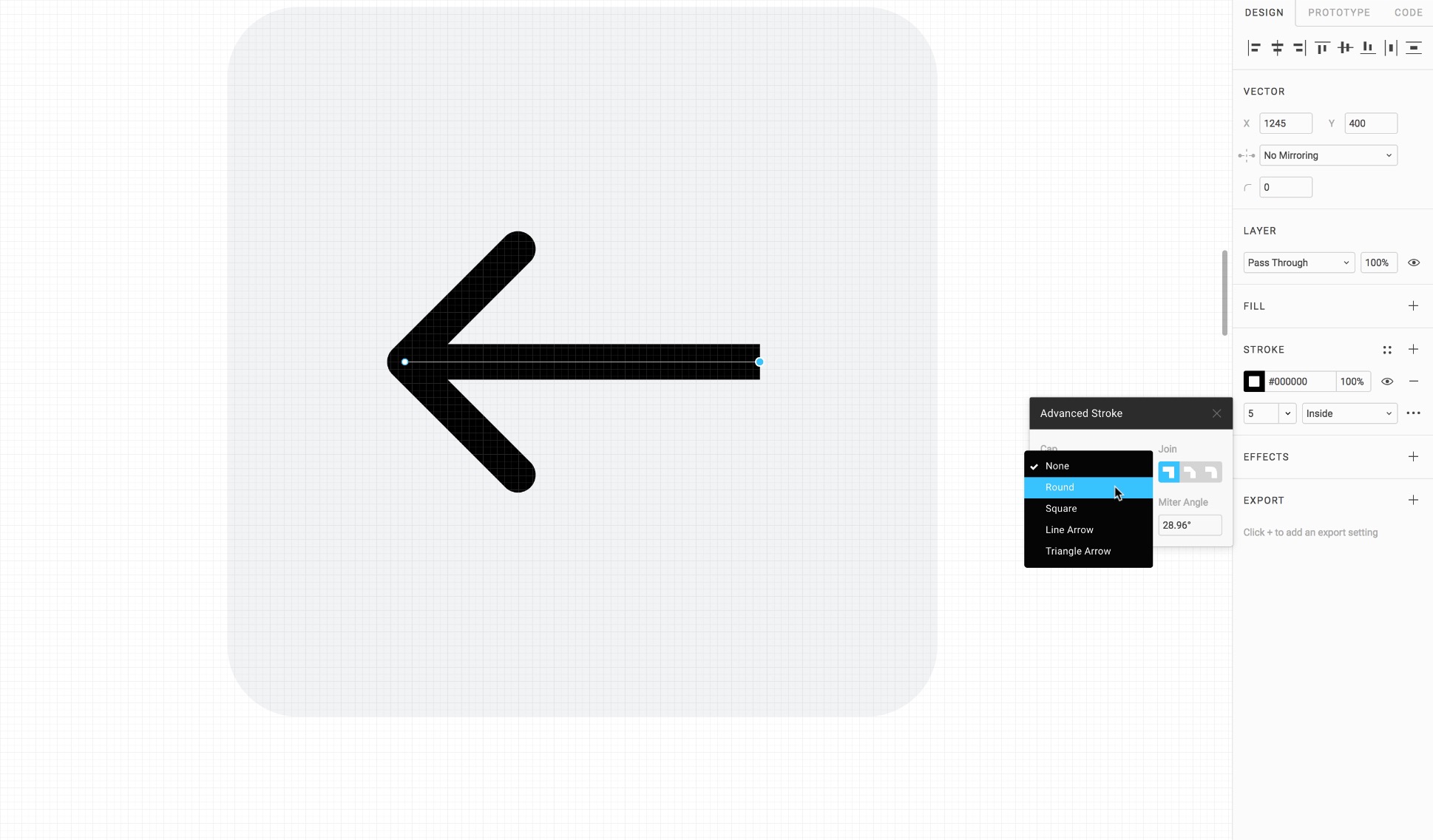
Icons and Vector Network
Create your own vector illustrations from scratch in Figma
Create your own vector illustrations from scratch in Figma
Download Assets
To follow this course, you’ll need to download the assets. You can also get the Figma source files to compare your progress against mine.
Instead of connecting paths one to one, you can create web-like connections. Like this, you don’t need to always continue your vector points, you can just draw new ones from any existing ones and connect them to others.
Create a rectangle 24x24 and rotate 45 degrees. Press enter to edit and select the Pen tool. Create a new vector point from the bottom point, and click at the nearest pixel. Press Shift and down arrow twice to move by 20 downwards. Repeat the same steps for the other 2 points. Then, close the bottom points from each side. Voila, you have a 3D-like cube.
You can customize the perspective by moving the top point down by 5, and the bottom point upwards by 5.
Paint Bucket Tool
As you Flatten shapes, Figma does shapes separation, which can be useful to divide into areas. The Paint Bucket will allow you to enable or disable Fill.
In the Cube, press Enter to go into Edit mode. Go to the Paint Bucket tool and click on each face of the Cube. After that, set the a 1px Stroke to black. Also, change the Fill to one of the Gradients.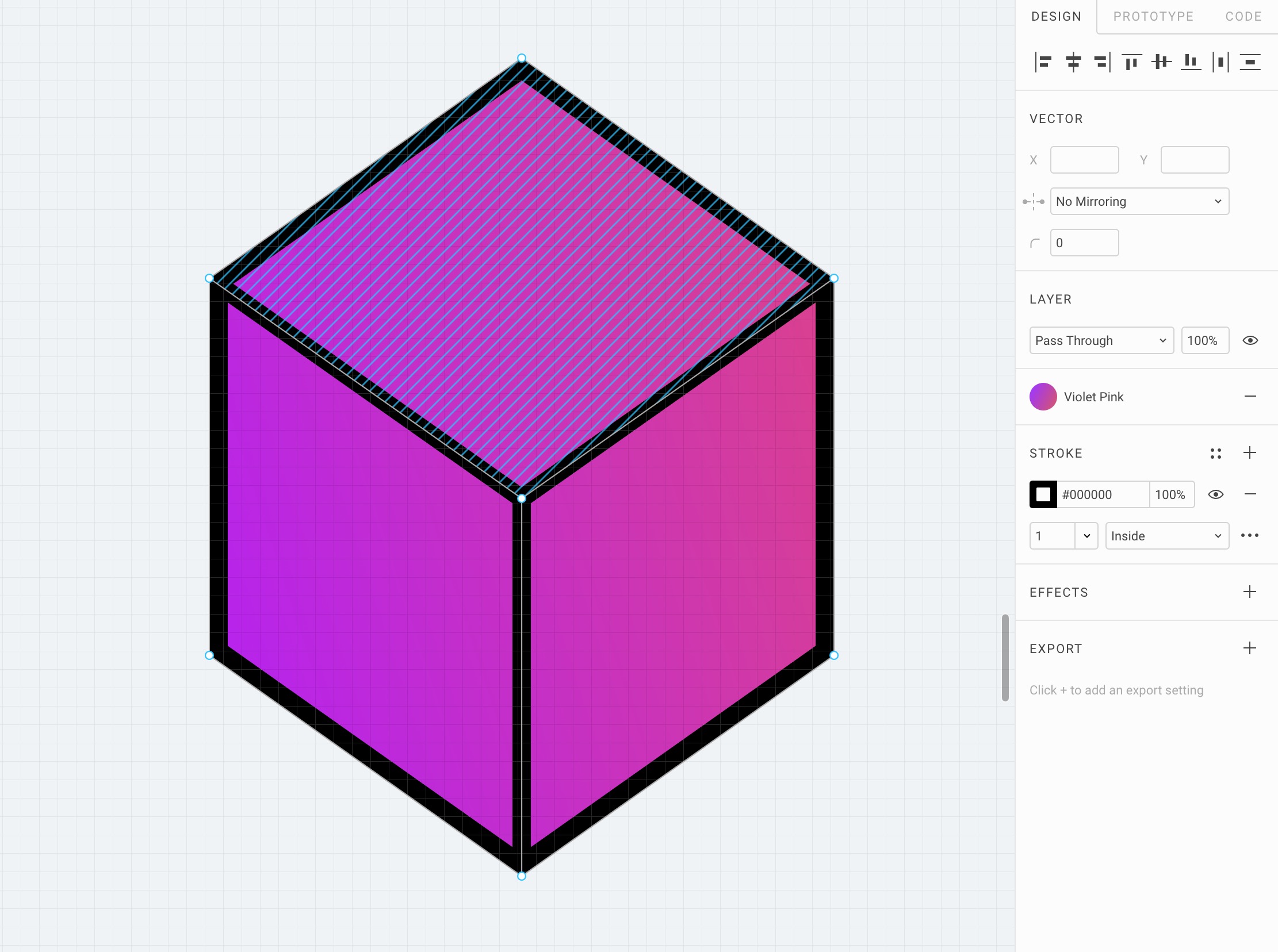
Pen Tool
The Pen tool allows you to create new vector points or the edit existing points. You can hold click while creating a new vector point by curve your vector lines.
Bézier Curve
Vectors are composed of points, which can be curved using the Bezier Curve. At any point, you can select a vector point and edit the Bezier Curve by clicking on the endpoints.
Select the Pen tool and long click 20px down while pressing Shift. While holding Shift and mouse click, move the cursor to 10px left. This creates a drop! You can edit the Mirroring option and set to Mirror Angle and Length. Then, you can press Shift and move the Bezier Curve left and right.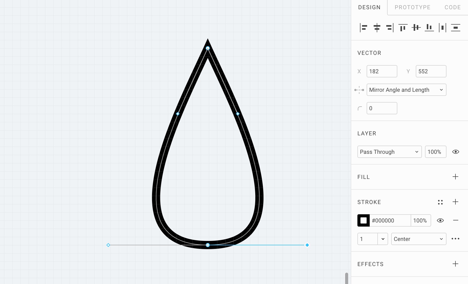
Pencil Tool
The Pencil is useful for quick drawing or hand-writing, like a signature. If you combine that with Real-time collaboration, this can be a powerful meeting tool.
Path Icon
Draw a curved path with the Pencil tool. The drawing will smooth out and become vector. Then, you can start editing the vector points. Select the endpoints and set the Advanced Stroke Cap to Line Arrow. You can set the stroke width to 2 and only have one of the vector endpoints to have Line Arrow, and the other to have Round.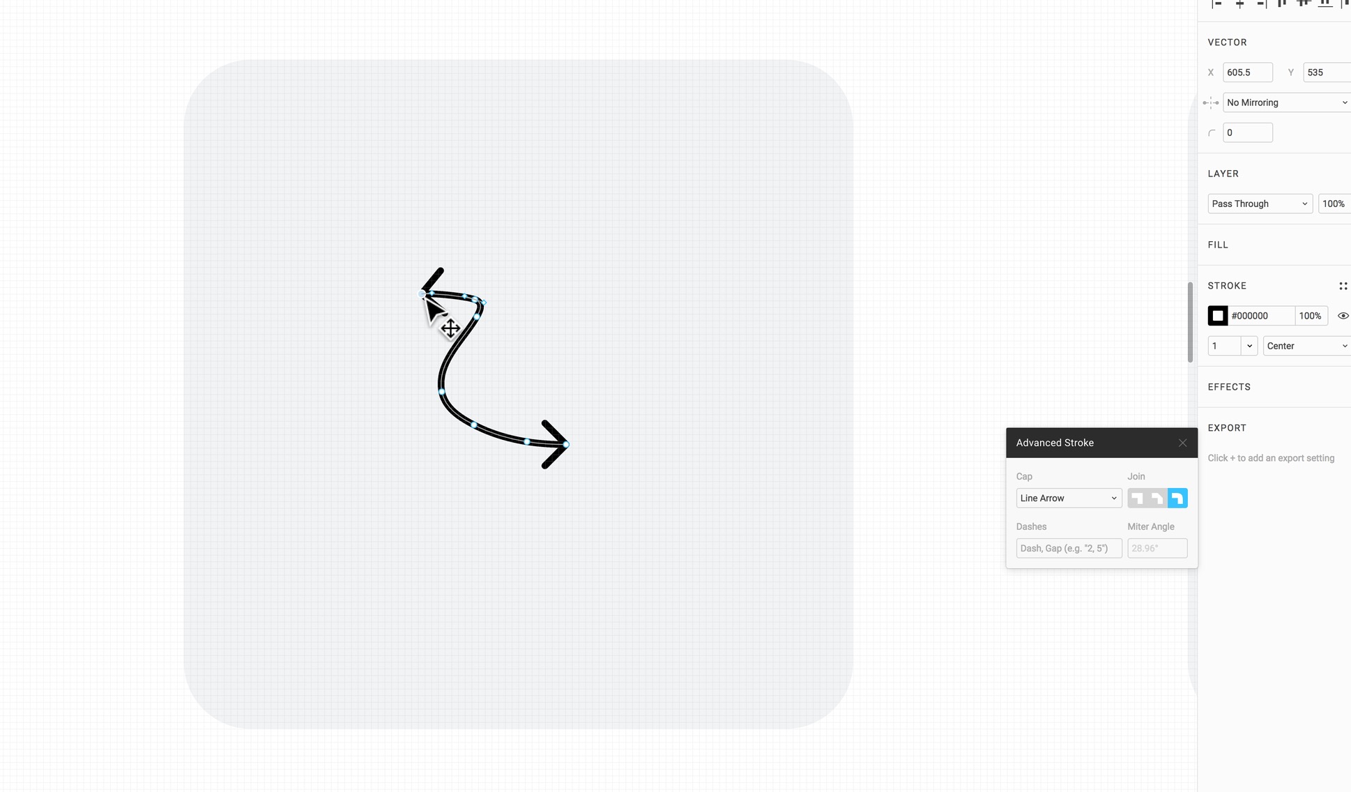
Download Icon
Create a 12x12 circle first. Then, create a 10x10 circle and place it right on the top right of the first one. Create a bigger 18x18 third circle and place it on the right of the second. The fourth circle of 12x12 should be placed on the same level as the first circle. Finally, draw a rectangle to cover the empty space.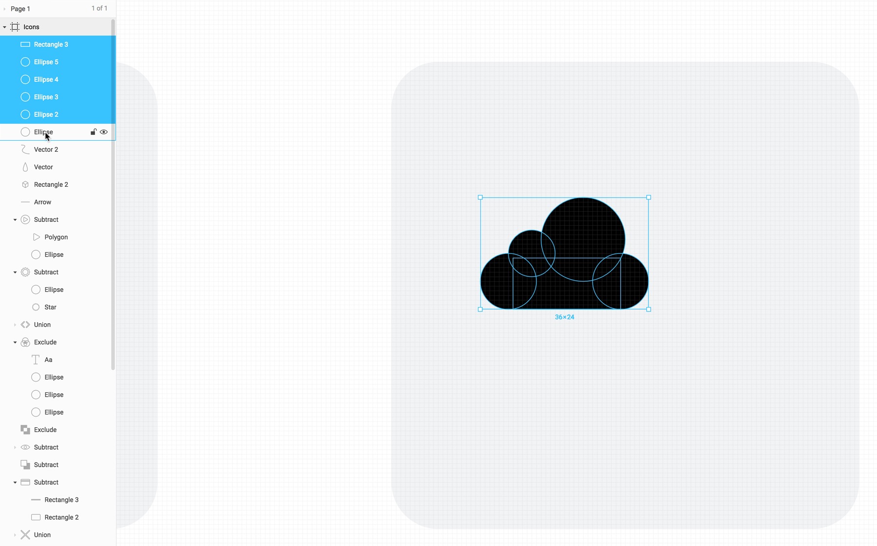
Select all circles and select Boolean / Union. Remove the Fill and set the Stroke width to 2. Then, Flatten the whole thing. Go to edit mode by pressing enter and use the Pen tool to place 2 points, one on each end. From there, you can delete the line between those 2 points.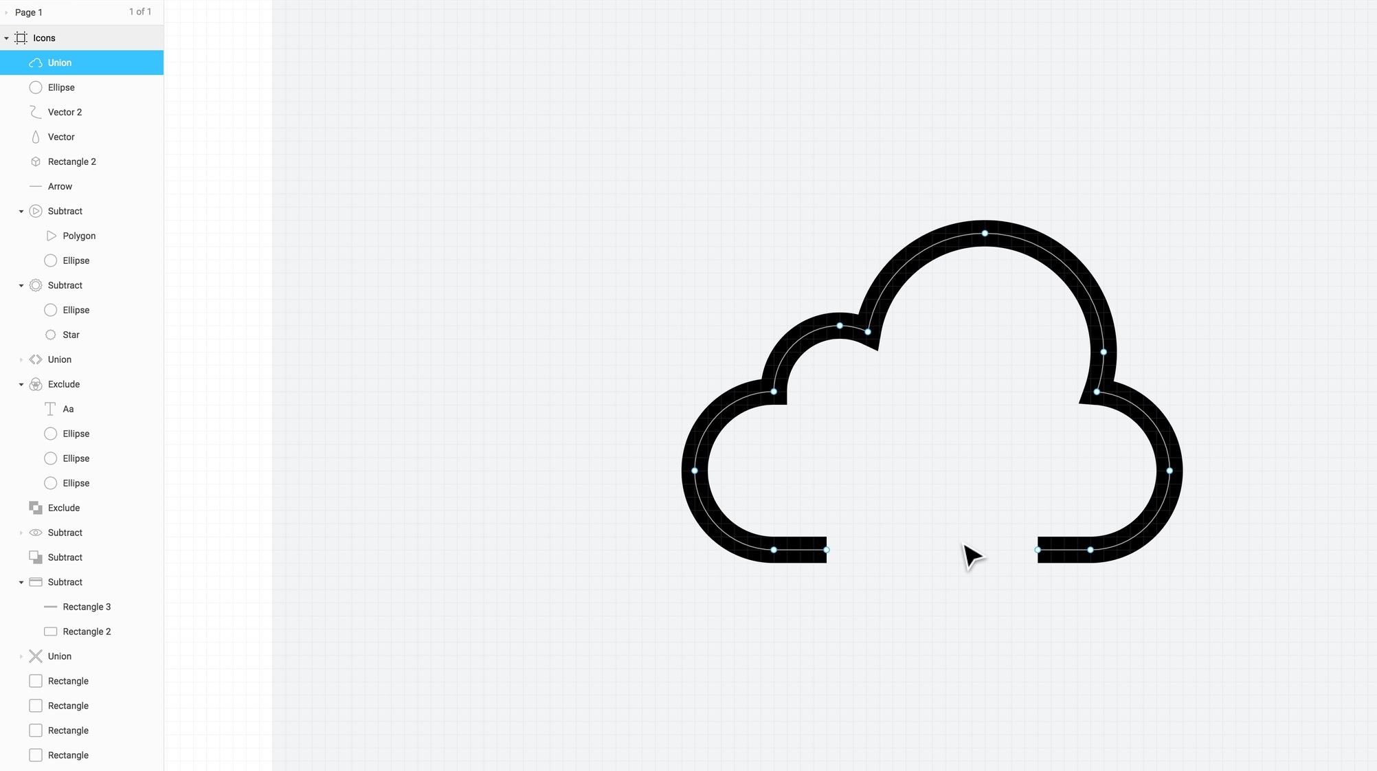
Create the arrow by drawing a line first and deviate by 45 degrees by holding Shift to place a point to the left side. Using the Vector Network, place another point from the bottom point to the right point, again at 45 degrees. Finally, set the Advanced Stroke cap to Round.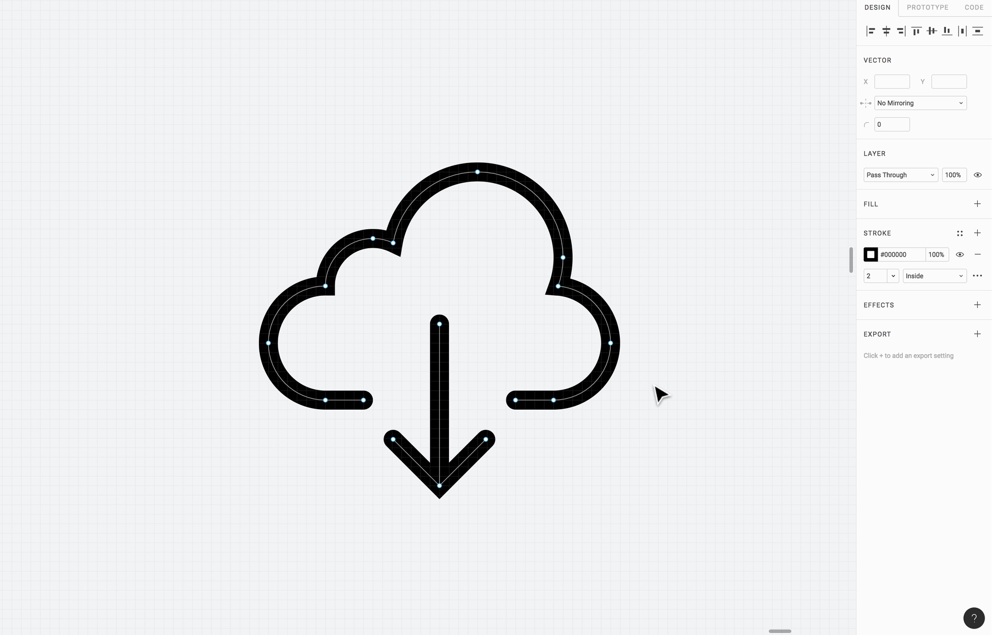
Check Icon
Use the Pen tool to draw check icon using the Shift key to ensure that you draw at a 45 degrees angle.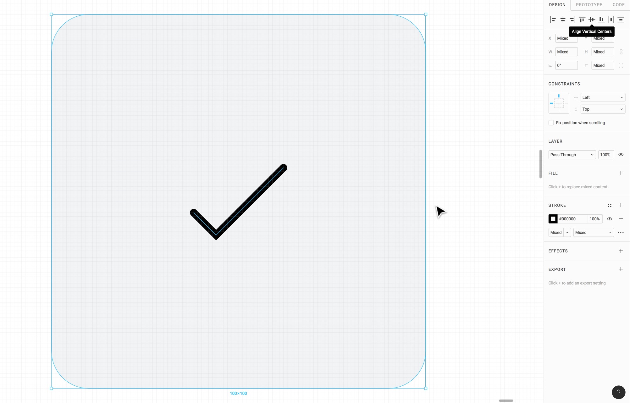
Turn Icons to Components
First, select all icons and set the constraints to Center/Center. You can select an icon and embed it into a Frame (Options + Command + G) to make it easier for alignment. Set the frame to 50x50 or 100x100 depending on icon size. Then, turn the Frame into a Component and rename. Do the same for all icons.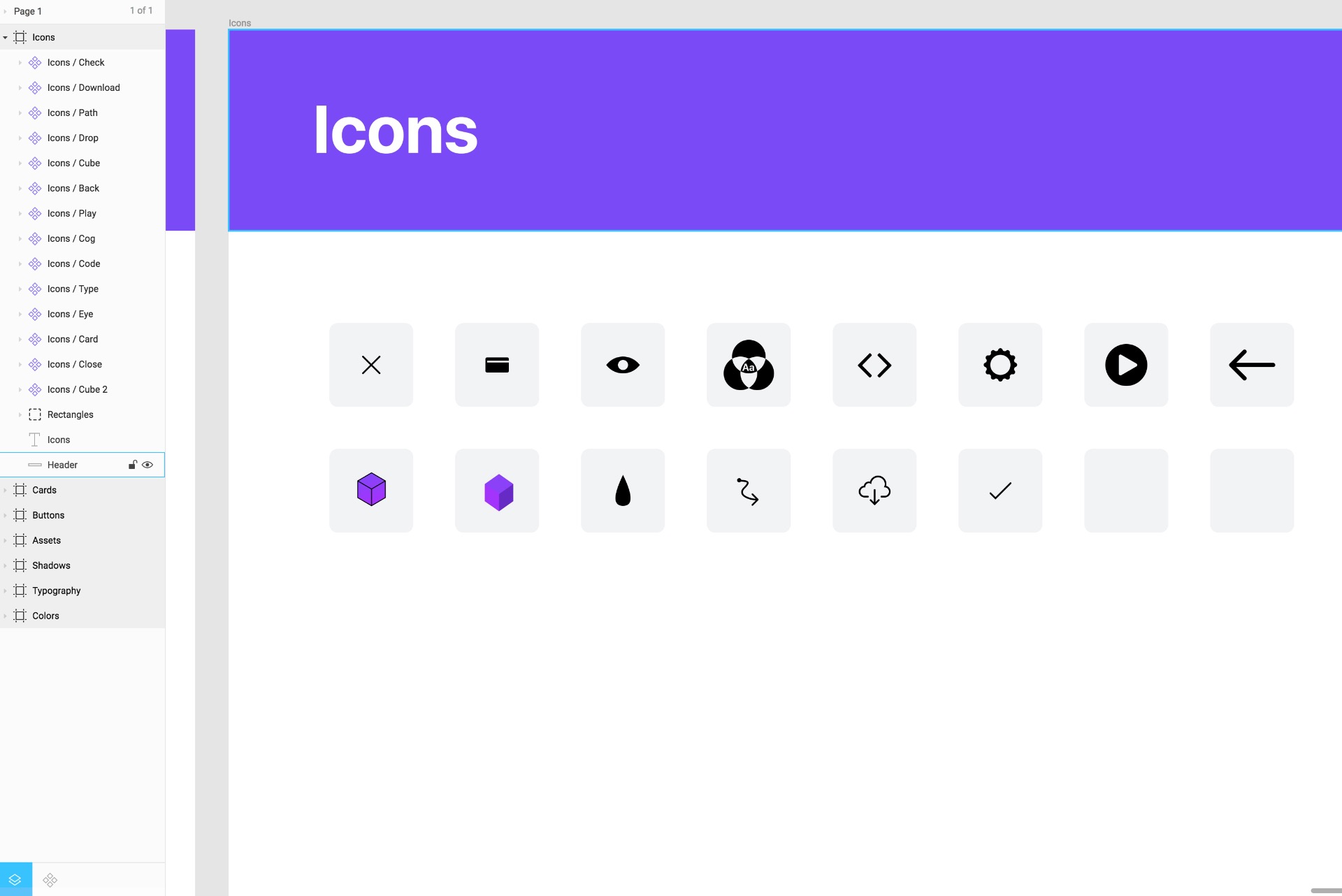
Article Page
Let’s duplicate a frame and create the Article page using the Background and Header bar.
Bend Tool
Instead of editing the bezier curves of vectors, which can be an arduous process that can require a lot of patience, the Bend tool simplifies the process of morphing your shape into something interesting. For example, we used it for the Waves for Design+Code 3.
Create a Rectangle 1440x350. Make it white. Go to vector edit mode and select the Bend Tool. On the top left of the line, start dragging that region to get a curvy shape. Then, you can edit the Bezier curves to your liking.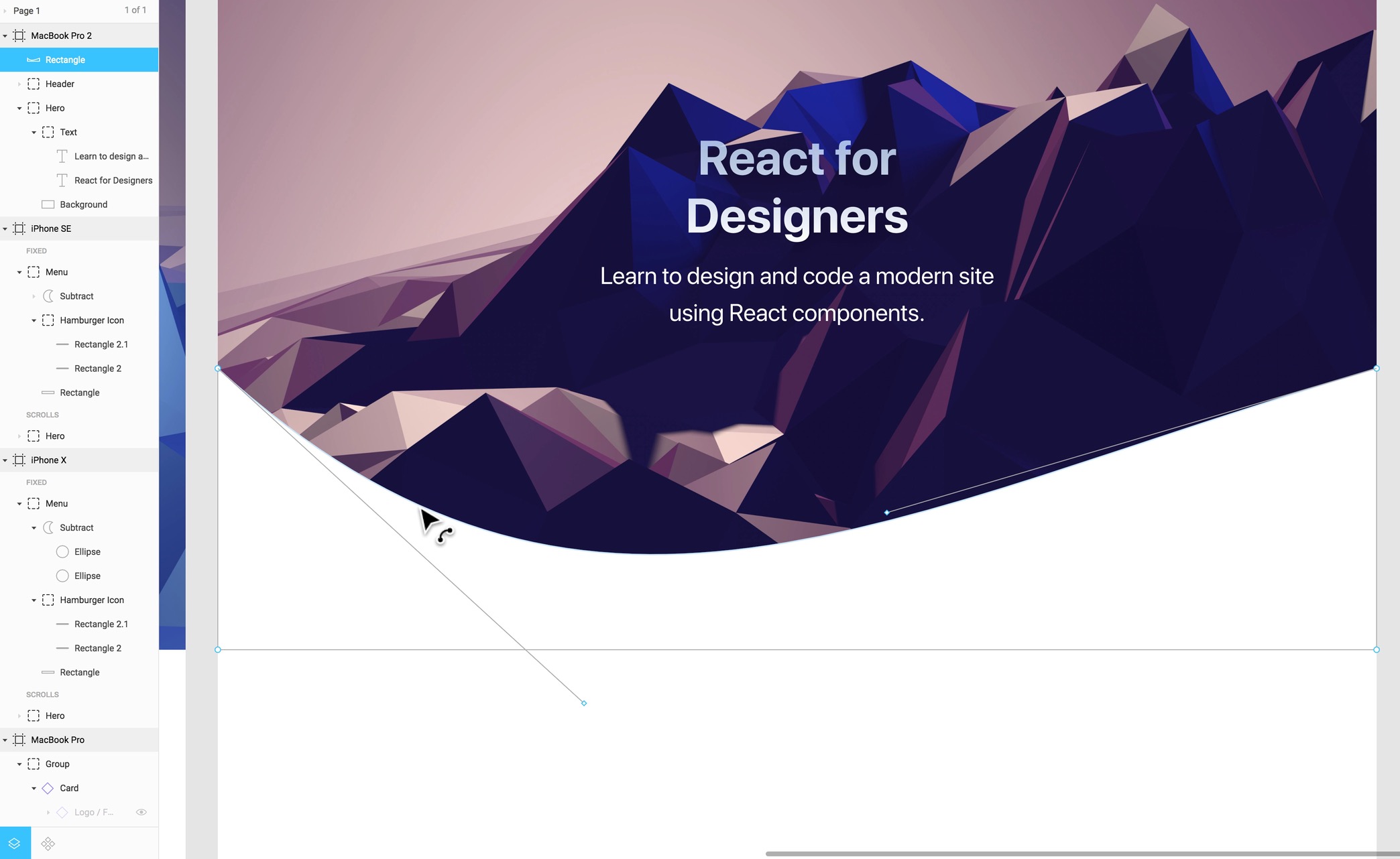
Close Button
We need to draw a circle that’s 60x60 and apply a gradient. Set an outline of 2px. Bring a Close icon component and center. You can add a Fill to a group to apply to its inner vectors.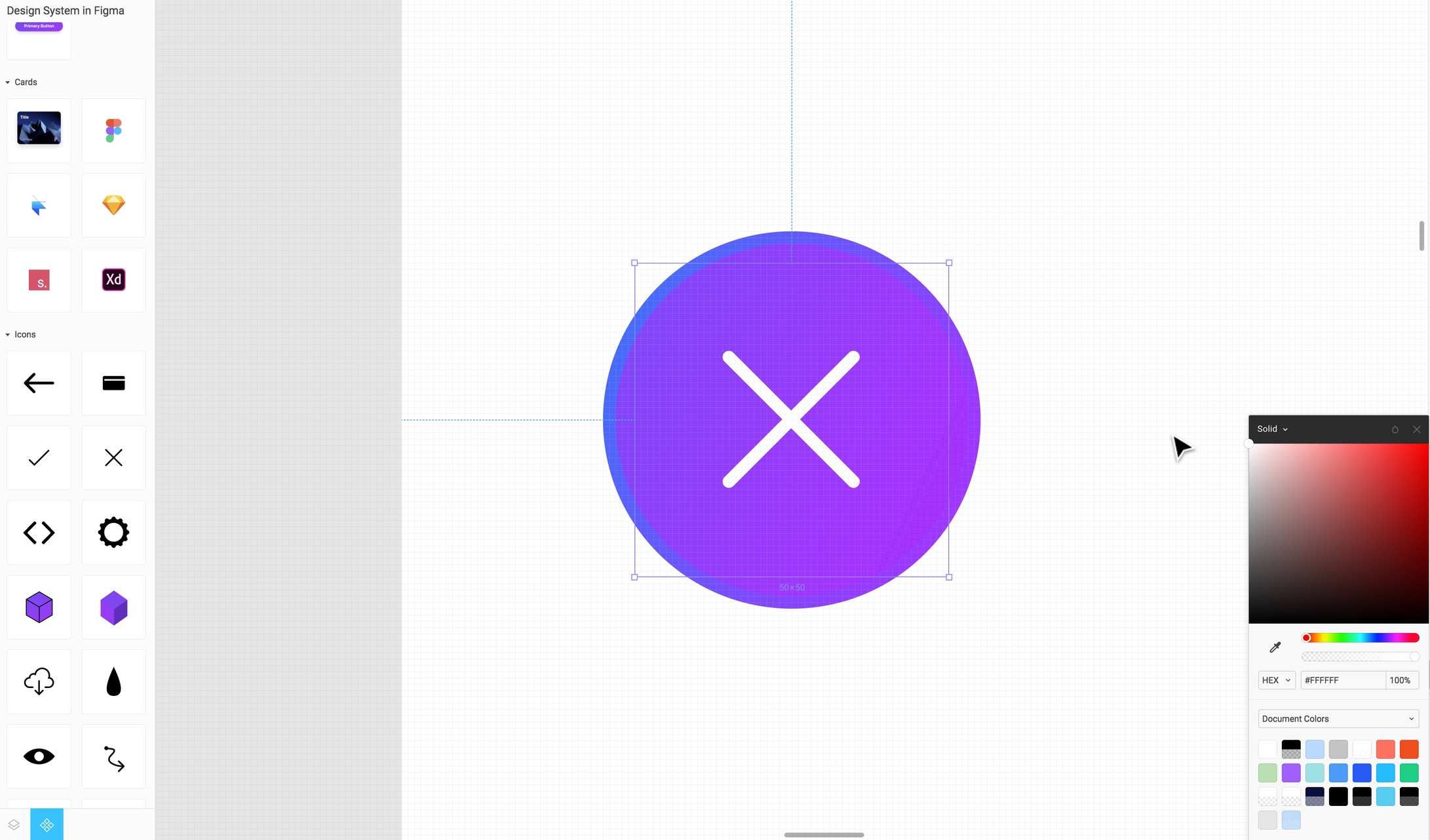
Tooltip
Create a rectangle that’s 420x500, corner radius 20. Create another rectangle that’s 32x32. Union the two and set the background to #040825.
Boolean Corner Radius
When you Union the 2 rectangles, you can change the corner radius for the entire shape to 20.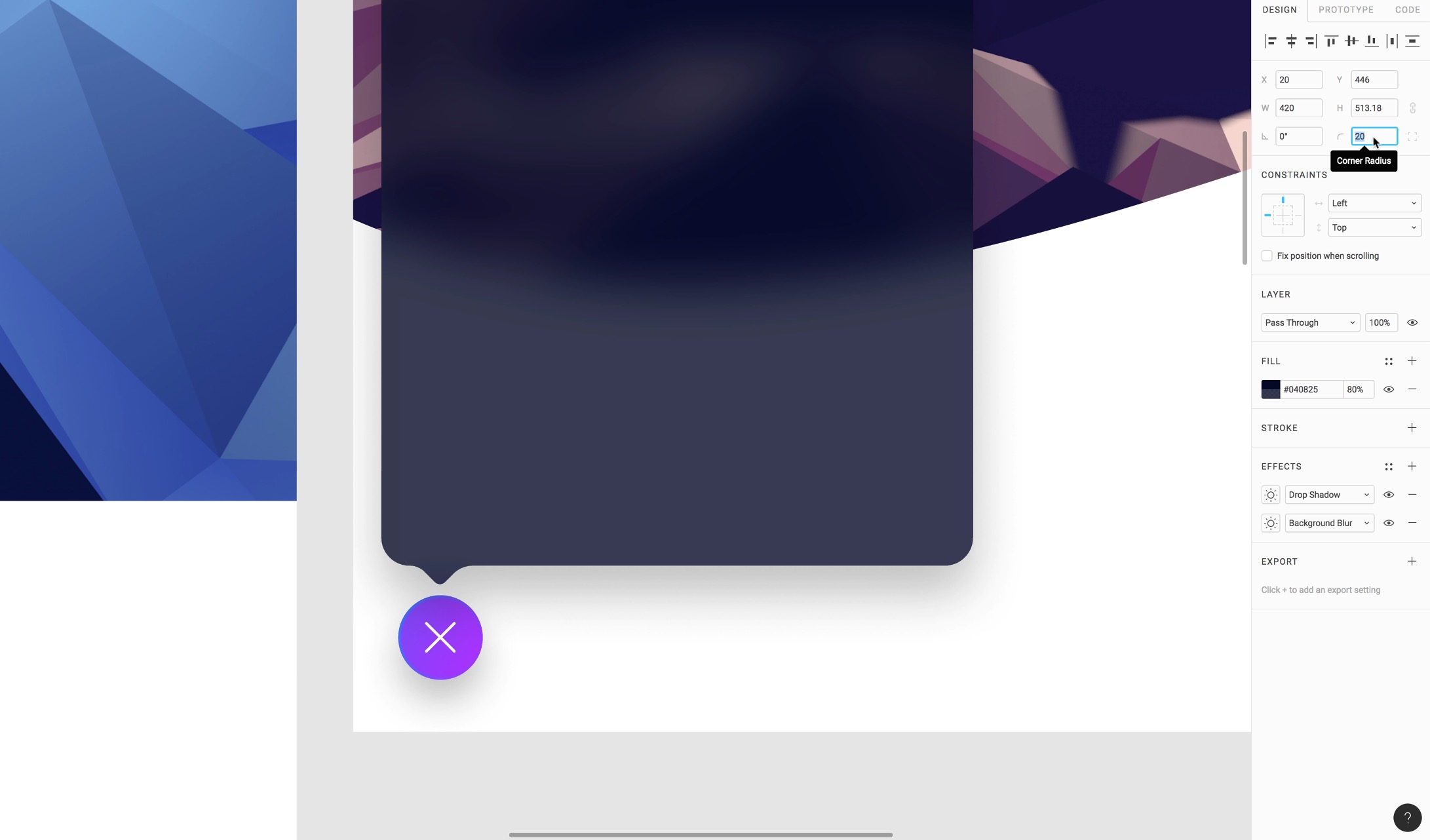
Then, create Heading 3 and Caption text layers to use as titles.
Cell Component
Let’s create a repeated Cell Component for each section of the tooltip. Create a Frame that’s 420x44. Inside it, add a Normal Text white and a Line that’s 380 and 20% white at the bottom of the frame. Place the Check icon Blue on the left and a Download icon 80% white on the right.
Move to Design System
The Cell should exist in the Design system so that anyone can take advantage of it. Create a new Frame for cells and place the cell there. Publish the change and start using it back in the design file.
Drag and drop the cell and duplicate many times for each section and fill their respective content. For some of the cells, you can press Delete on the Line and Check icon to hide them. It won’t actually delete them.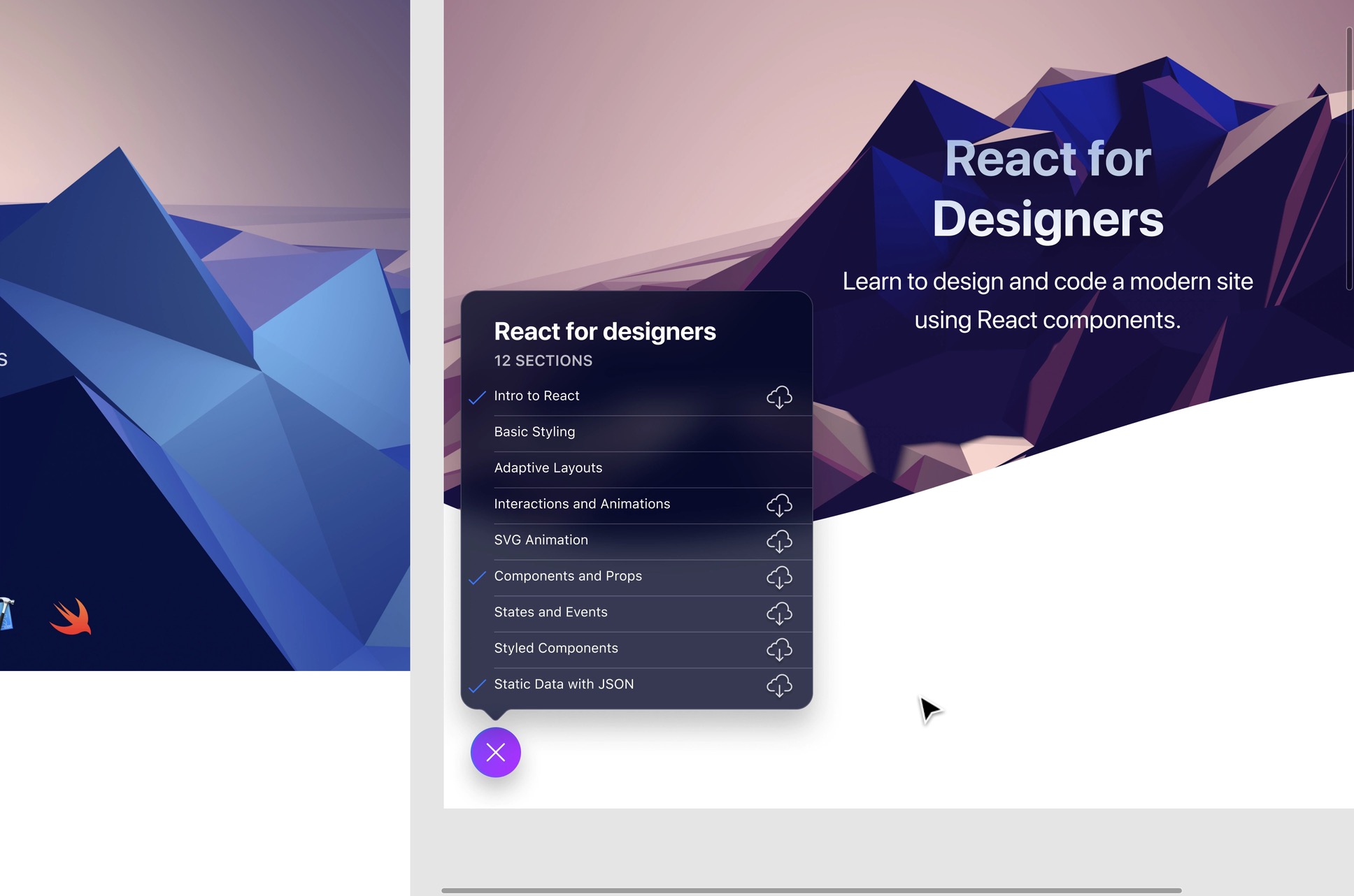
Export, Inspect and Code in Figma
Communicating the design system to your developers

Communicating the design system to your developers
Download Assets
To follow this course, you’ll need to download the assets. You can also get the Figma source files to compare your progress against mine.
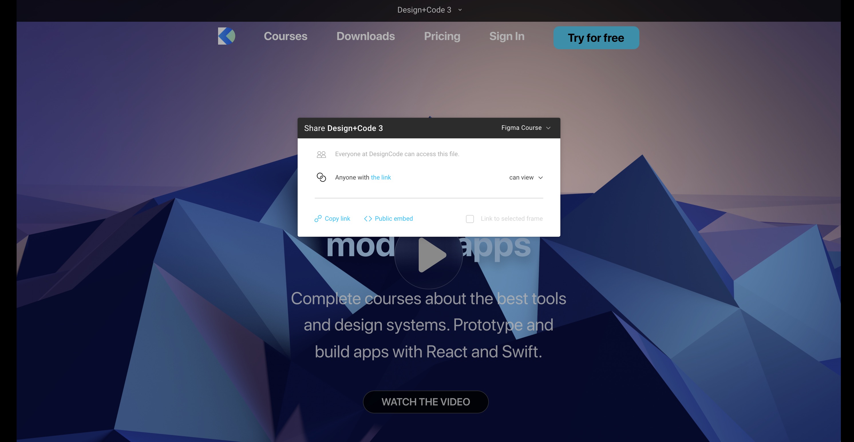
Sharing
You can share your design file to clients, co-workers or just about anyone with a public link. Once they receive the link, they can see a preview. But if they have an account, they can inspect the properties and sizes. Also, with an account, you can give them permissions to edit.
Inspect Properties
People with accounts who receive your invitation or link can inspect properties, sizes, and even code and assets. This is a very similar experience to Zeplin, Abstract or Sympli.
Export
You can click on the Export button for each layer of your design and decide to export as a PNG, JPG or SVG. Once you set it up, during Inspect, people can automatically save the file.
Copy as SVG Code
The SVG Code from Figma has improved a lot over the past year. This works great with icons and shapes. You can simply select any Icon and right-click on it, then go to Copy as - Copy as SVG. Once that’s done, you can paste the SVG code in your favorite code editor.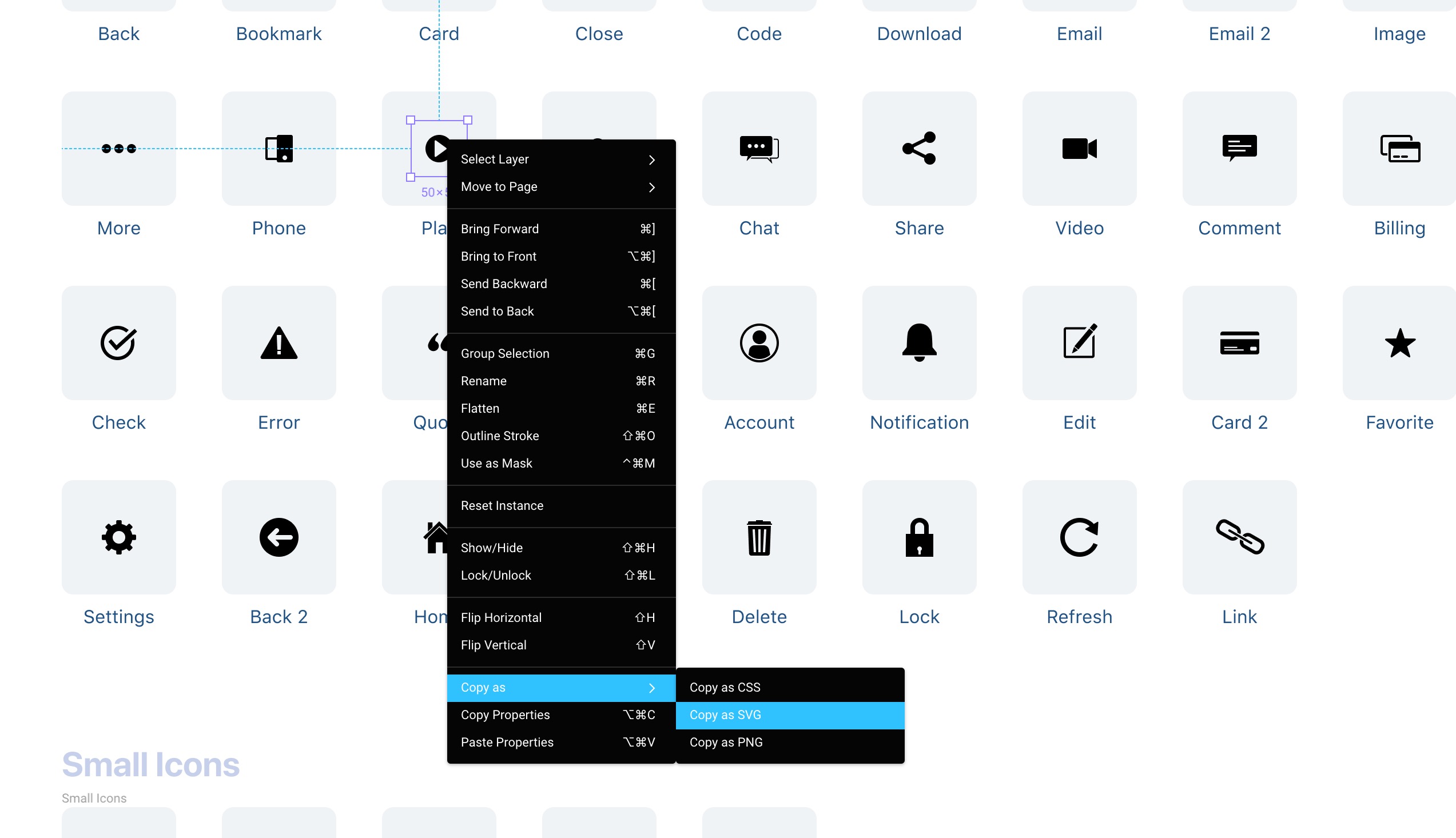
Coding Tab
The Code tab can be found in the Inspector, next to Design and Prototype. You can find all the properties written in plain code (Table), or in actual languages such as CSS, Swift, Android.
Slices
In addition to the Export button, you can also create a custom Slice if you need to create a zone where you want to capture an image, with everything merge. This is a very similar experience to creating a screenshot on the Mac.
Courses Page
Let’s create the Courses page by duplicating the Article frame. Keep the Background and Header.
Save to Version History
At any time, you can create a version of your design so that it’s kept in history. This is recommended whenever you need to save a bulk of changes, similarly to how you’d use Git.
Show Version History
Also, you can see the history of all the “commits” you did previously. You can switch back and forth between those versions to see the changes.
Downloads Page
Duplicate the Courses frame and delete the content. Create a rectangle that’s 1000x500, set a corner radius of 14. Bring the Downloads-Files.png and rotate it to -15 degrees.
Masking
Duplicate the Card rectangle and right-click on the above layer to select Use as Mask. This will ensure that the image doesn’t exceed the bounding box of the rectangle. The card rectangle below will be used for background and styles since a Mask can’t hold those properties.
Gradient with 3 colors
Select the image and add a new Fill. Here’s you can create a third gradient point to offer more readability to the text.
Congrats
Let’s create the Congrats page by duplicating the Downloads frame. Create a rectangle that’s 600x550 with a rounded corner of 20.
Copy Properties
You can copy the styles and properties from the tooltip we created earlier by right-clicking on the Union layer and select Copy Properties. Then back to the Congrats frame, we can use Paste Properties.
Multiplayer and Commenting in Figma
Iterate designs and explore new ideas in a multiplayer environment

Iterate designs and explore new ideas in a multiplayer environment
The Culture of Sharing
When the culture of sharing is encouraged from the start, and when you see that people share on a daily basis, you are stripped down of that fear and you gain humility as well as a desire to collaborate more. The whole weight of the project no longer rests only on your shoulders and you start to rely on teammates to bring about other facets of the work. A content writer can come in and edit the texts, an icon designer can start drawing new shapes, an engineer can drop in to inspect the elements, etc. All that happens while you’re creating new elements and layouts. “Please don’t look at my design” becomes “drop in anytime to edit”. The experience is magical.
Collaboration Techniques
One powerful concept in Figma is to bring in 2-10 designers solving the same problem and give a 10 minutes deadline. What you’ll notice is that after a few minutes, some will be blocked. At that point, they will look at others and duplicate the work to branch out and start from others ideas. That’s a powerful way to solve problems.
Download Assets
To follow this course, you’ll need to download the assets. You can also get the Figma source files to compare your progress against mine.
Commenting
In Figma, you can comment in any specific portion of the page and start a thread. Like this, the team receives notifications and can start acting on that feedback.
Live Embeds
You can share Live Embeds by simply going to the Share button and click on Public embed. Before doing that, it’s important to allow public access to your file. If done right, it’s going to give you an iFrame HTML code that can be pasted into your Website or even on platforms such as Slack.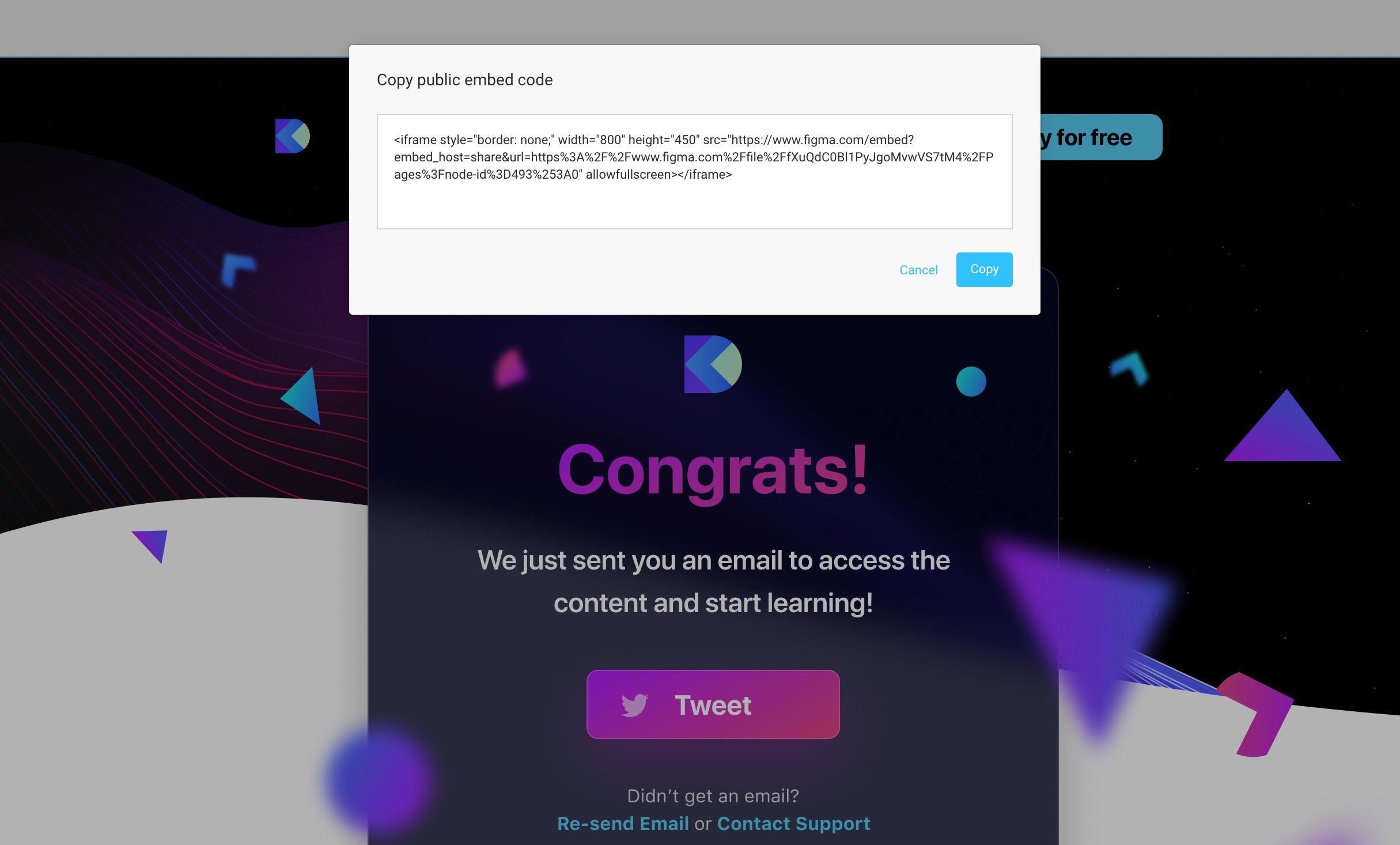
Prototyping and Interaction
Quickly create an entire flow for your app design in Figma

Quickly create an entire flow for your app design in Figma
Download Assets
To follow this course, you’ll need to download the assets. You can also get the Figma source files to compare your progress against mine.
Any layer or group can have a connection to another Frame. If you go to the Prototype Tab, you’ll see a blue circle that allows you to connect to something. This will create an interaction during the Prototype viewing.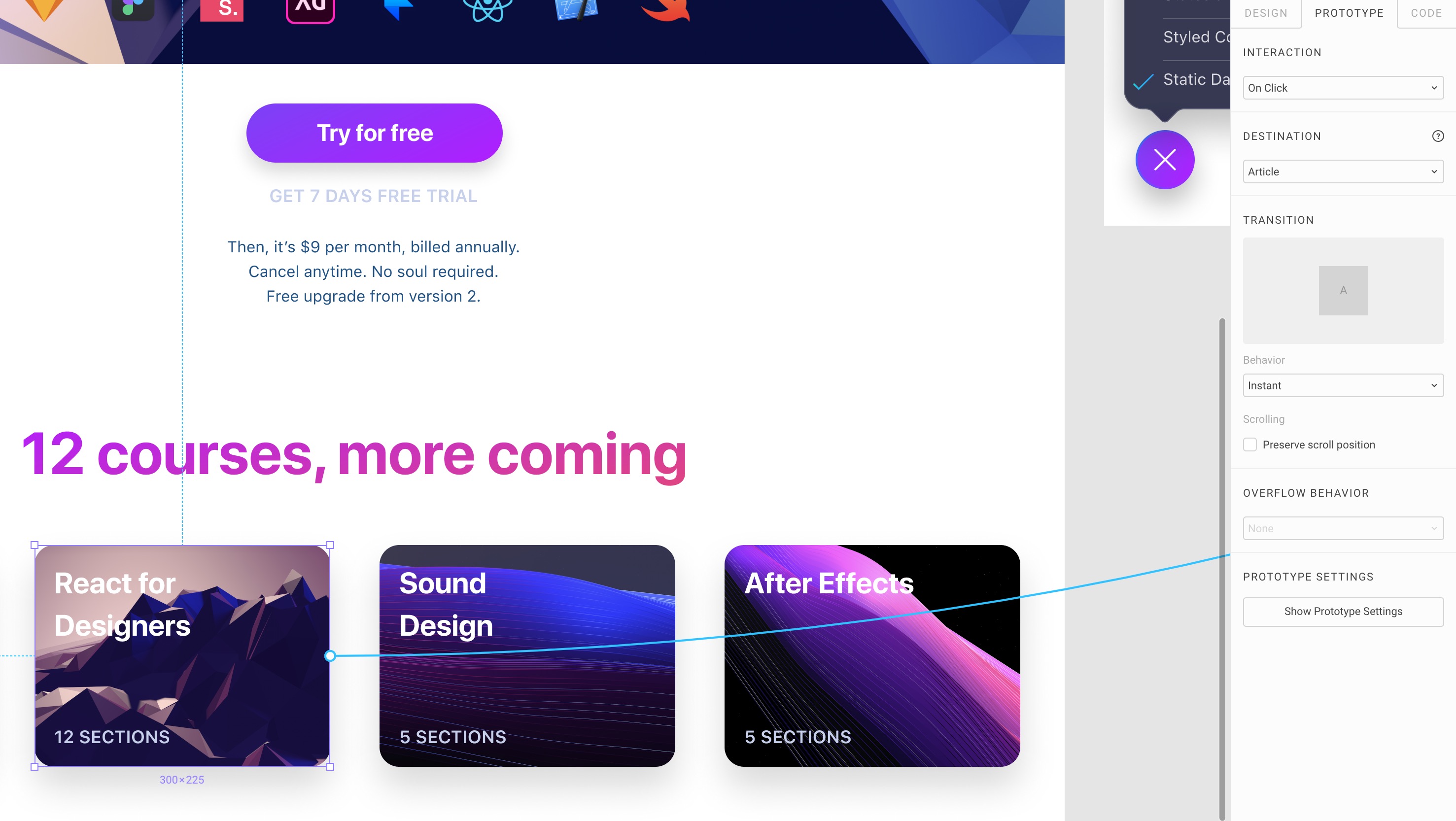
Copy and Paste Connections
Connections present in a Group can be copied over to other Frames with all the destinations intact.
Transition Animation
You set a Home screen, then connect to new screens using a string. Transition animations can be set between Instant, Dissolve, Move, Slide and Push.
Prototype Settings
You can configure the starting screen, the background color and device size of your prototype.
Scroll Frame
You can turn any Frame to Scrollable by going to the Prototype Tab and select Vertical Scrolling in the Overflow Behavior option. This will show a neat icon. When you Present, you’ll be able to scroll the entire frame.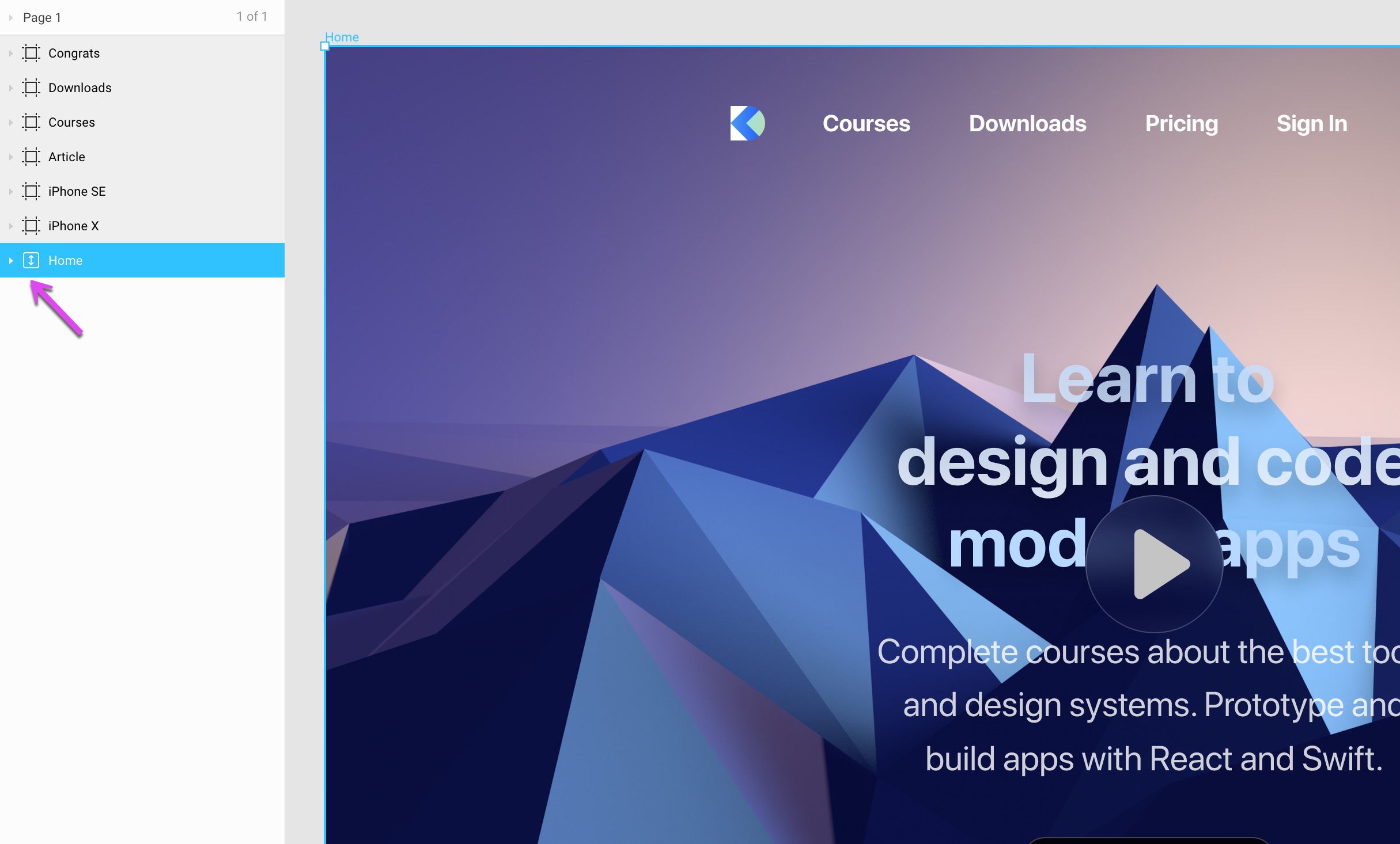
Fixed Element During Scroll
As mentioned in the Constraints section, you can set a floating menu for the Header navigation for the phone design. This will allow you to have an element that’s fixed when you scroll.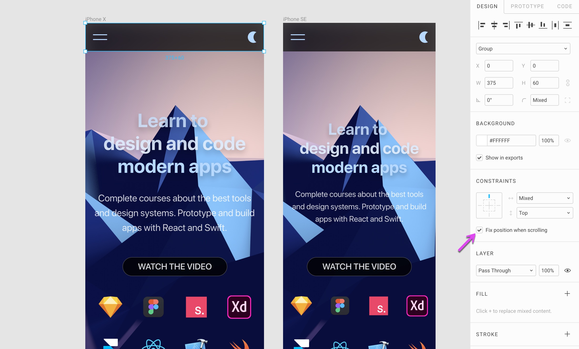
Interactions
Figma also allows you to create interactions states, such as on Hover or on mouse events. This works the same way as normal connections, except that you’ll have to create a duplicate of your current Frame and just enable the parts that need to appear during Hover, for example.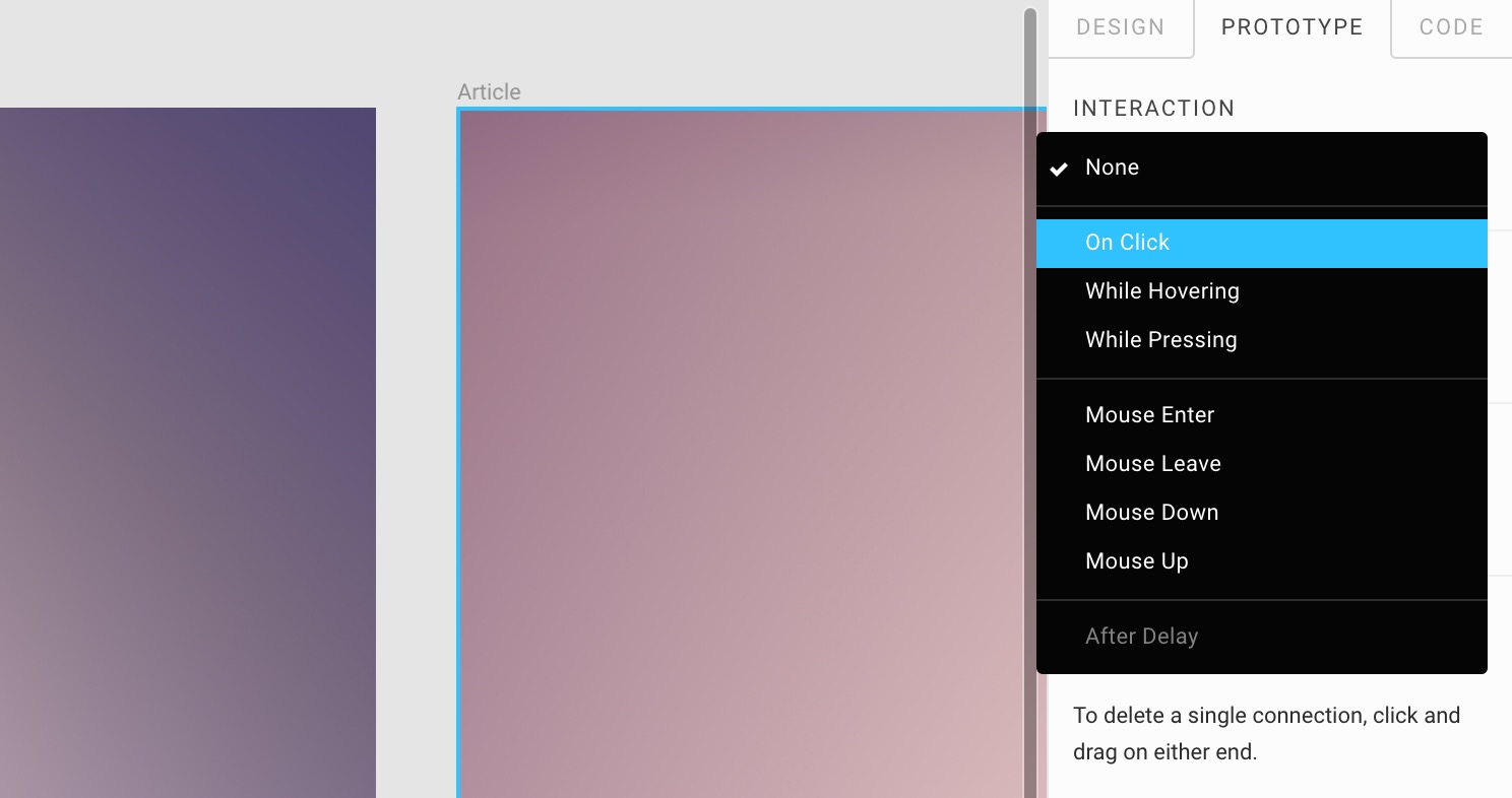
Preview
You can preview your prototype at any moment by pressing the Play button at the top right of the Figma UI. The prototype itself can be shared just like a design file. You can click connected elements, scroll the content with fixed elements and do mouse hover interactions. This is extremely useful for creating an entire experience for your app and show it to the world!