UI Design for Developers
Learn just enough visual design to be dangerous as a developer

Learn just enough visual design to be dangerous as a developer
This Course
As a developer, your goal should be to create designs that are as objectively good as possible, using design systems, well-established principles and techniques that translate well to code. You should work on your speed, since you don’t want to steal away from your coding time. My goal is to get you to be satisfied with your designs and to find a system to consistently improve over time by not only explaining the foundations of UI design, but my personal insights on how it’s feasible to divide your time between design and code. We’ll be using free icons and illustrations from shape.so and mockups from angle.sh.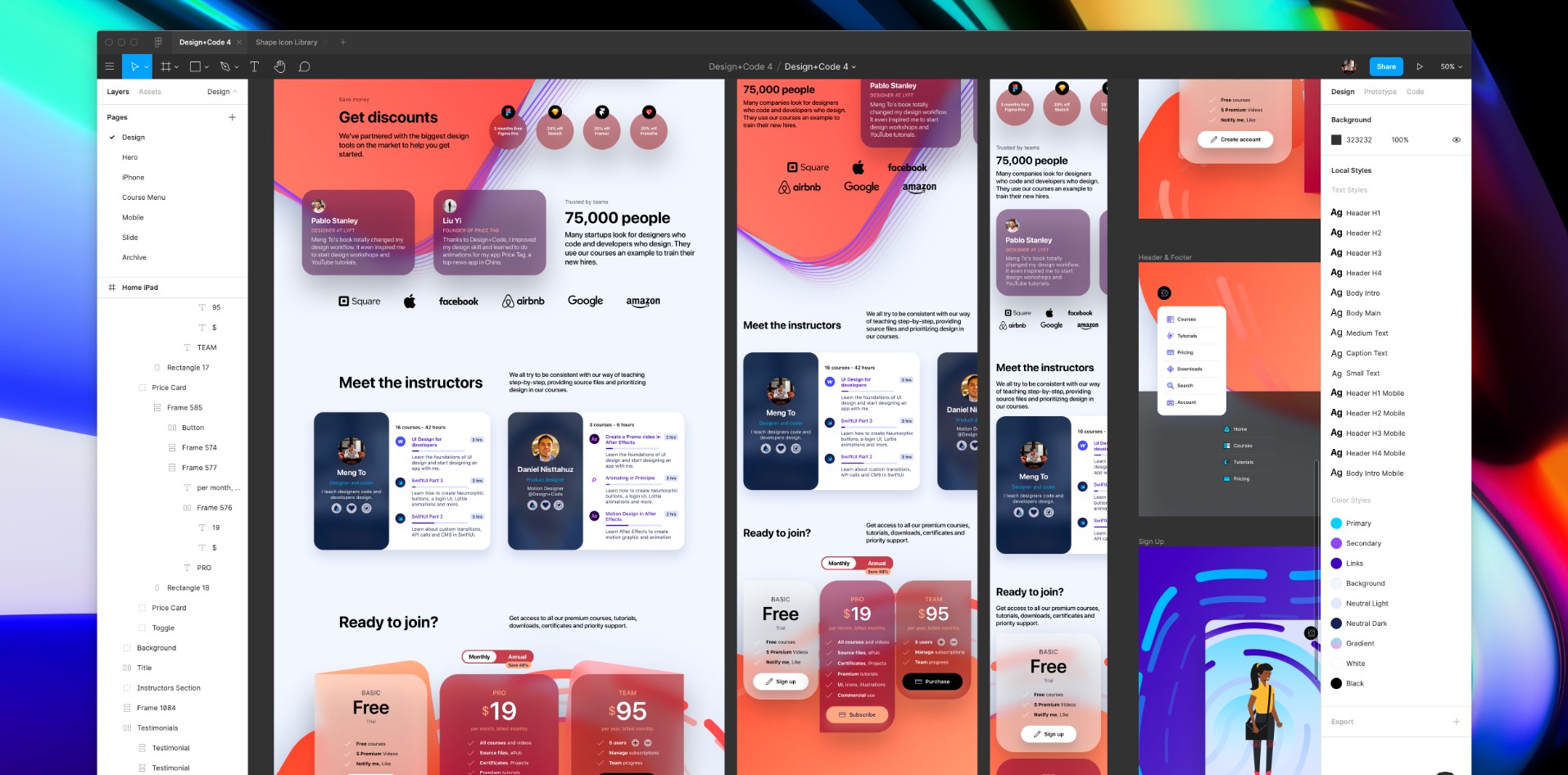
What you’ll design
Starting from the dreaded blank page, we’ll work our way through UI patterns, inspiration, colors, typography and practice in the design tool for every step. In this course, you’ll design an entire app from scratch, from the landing page to the mobile version and we’ll create a design system that will bring everything together.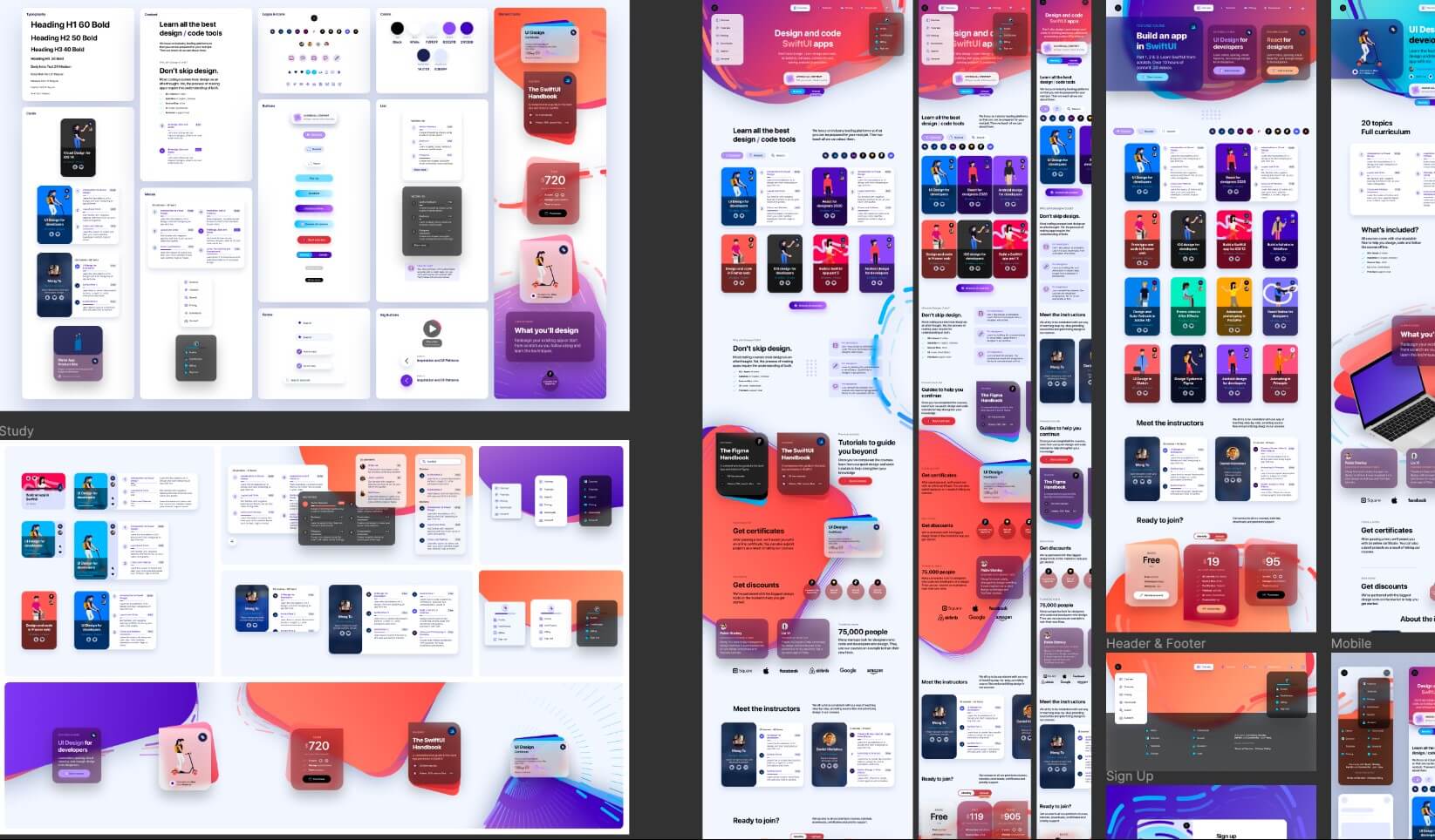
Design System
Ultimately, at the end of this course, we’ll build a design system that connects designers, coders and stakeholders. This is an effort that have become increasingly popular in teams for the past few years. A design system is a language that bridges design and code, and is a perfect starting point for developers learning more about design and vice versa.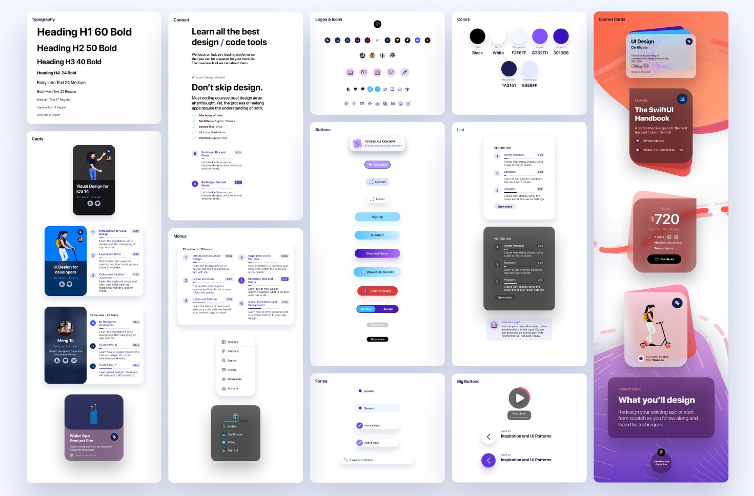
Adapting for iPad and Mobile
We’ll learn how to set up break points and typography, spacing, navigation and size rules for adapting to the iPad and mobile web versions.
Figma Design Tool
I believe that practice is key and it’s important to get context from the current state of design tools. While the techniques will be performed in Figma, most of the steps can translate to other design tools like Sketch, XD and Framer. Figma has a bunch of really useful resources, plugins and Auto Layout techniques that will make your experience designing extremely efficient. On top of that, you’ll have access to all the design files to compare your progress, downloadable from section 2.
Wireframe and UI Patterns
Starting a design from scratch is one of the most daunting things for developers. But just like code, you don’t have to think of it like an art canvas. Rather, you can use known patterns to solve user experience problems. I will be sharing my own process for searching for the right inspiration and designing user interfaces in a pragmatic way.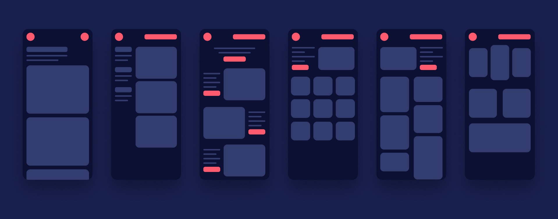
Icons and Illustrations
Often times, teams have to rely on pre-made icon sets and illustrations to speed up the design process. As developers, this is key for starting on the right foot and build on top of the expertise of designers. It’s important to learn how to customize the icons, illustrations and mockups properly to fit your product. We’ll be using a free version of Shape.so — you won’t need to purchase anything and it’s all in this course’s source files.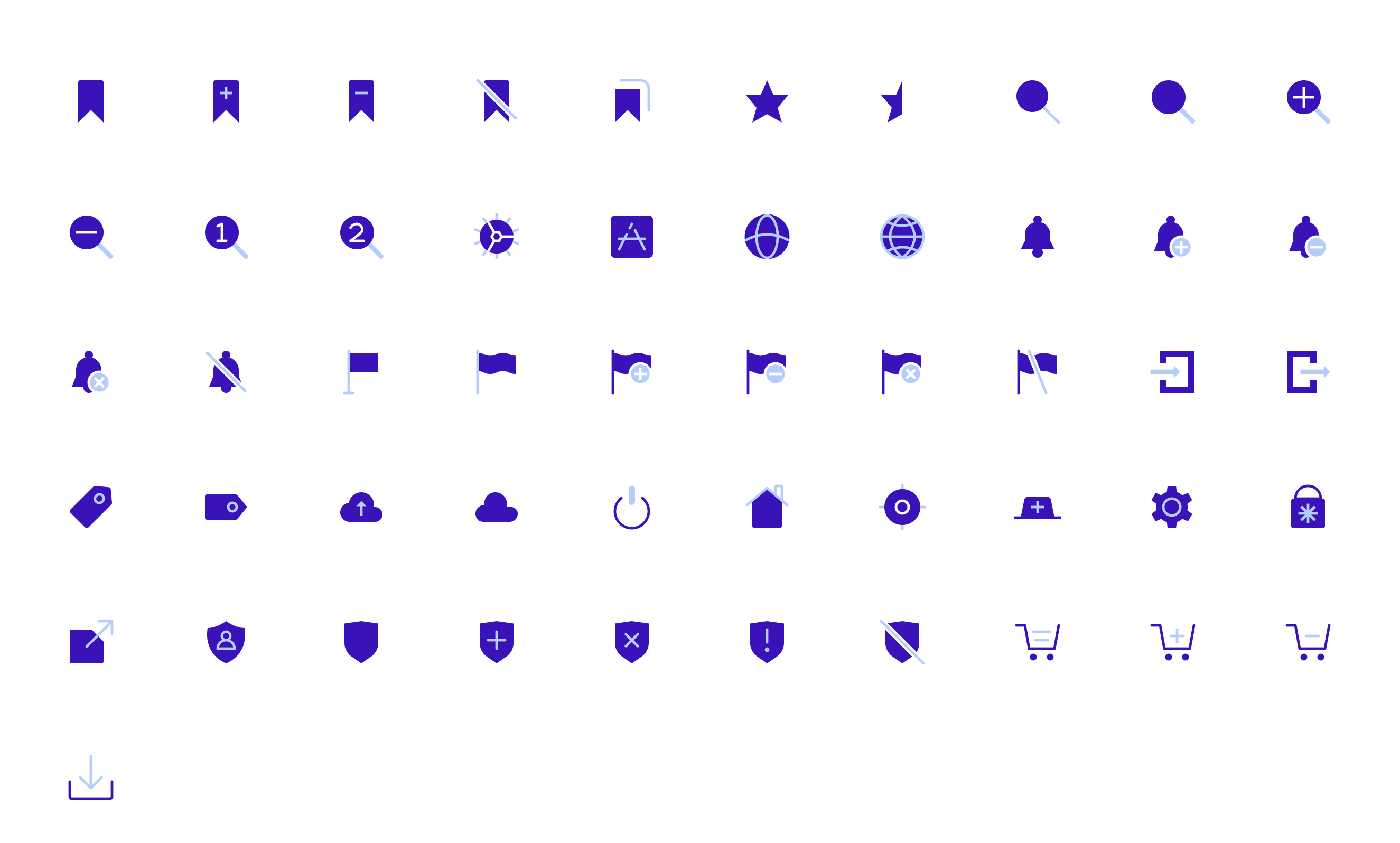
App Mockups
One of the sure way to get your audience excited is to show your product in action, or in a context. App screenshots can be useful for landing pages, submitting to the app store, keynote presentations and promotional materials. We’ll use a free version of Angle.sh, included in the asset files.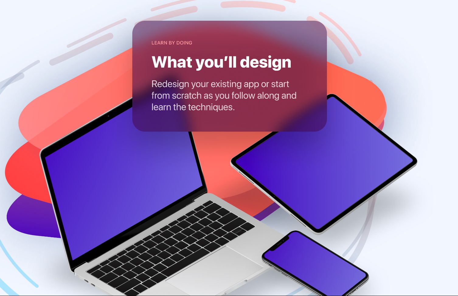
App Flow and Prototyping
In the design tool, you can quickly prototype app flow and interactions in minutes. Before even getting into the code, I’ll show you how to you can set things up and to avoid complicating your design file.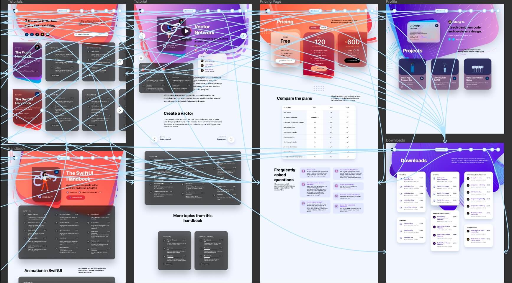
UI Patterns and Inspiration
Design from scratch using known patterns and create wireframes

Design from scratch using known patterns and create wireframes
Downloads
To follow this course, you need to download the Figma files which contains the icons, logos, illustrations and the final design to help you explore and compare against your progress.
Suggested Reading
As you follow the course, we recommend you to do the following resources for more reading:
- Read the guidelines available on these sites - iOS Guidelines, Material.io
- You can also visit the following websites for inspiration - Apple.com, Dribbble, Mobbin.design
- Download the UI kit provided here - iOS GUI by Apple (Download for Sketch)
- Download the following fonts - https://developer.apple.com/fonts/ (SF Pro and SF Compact)
Getting Started
Now, we’re ready to get started!
- Install the fonts by double clicking the package files
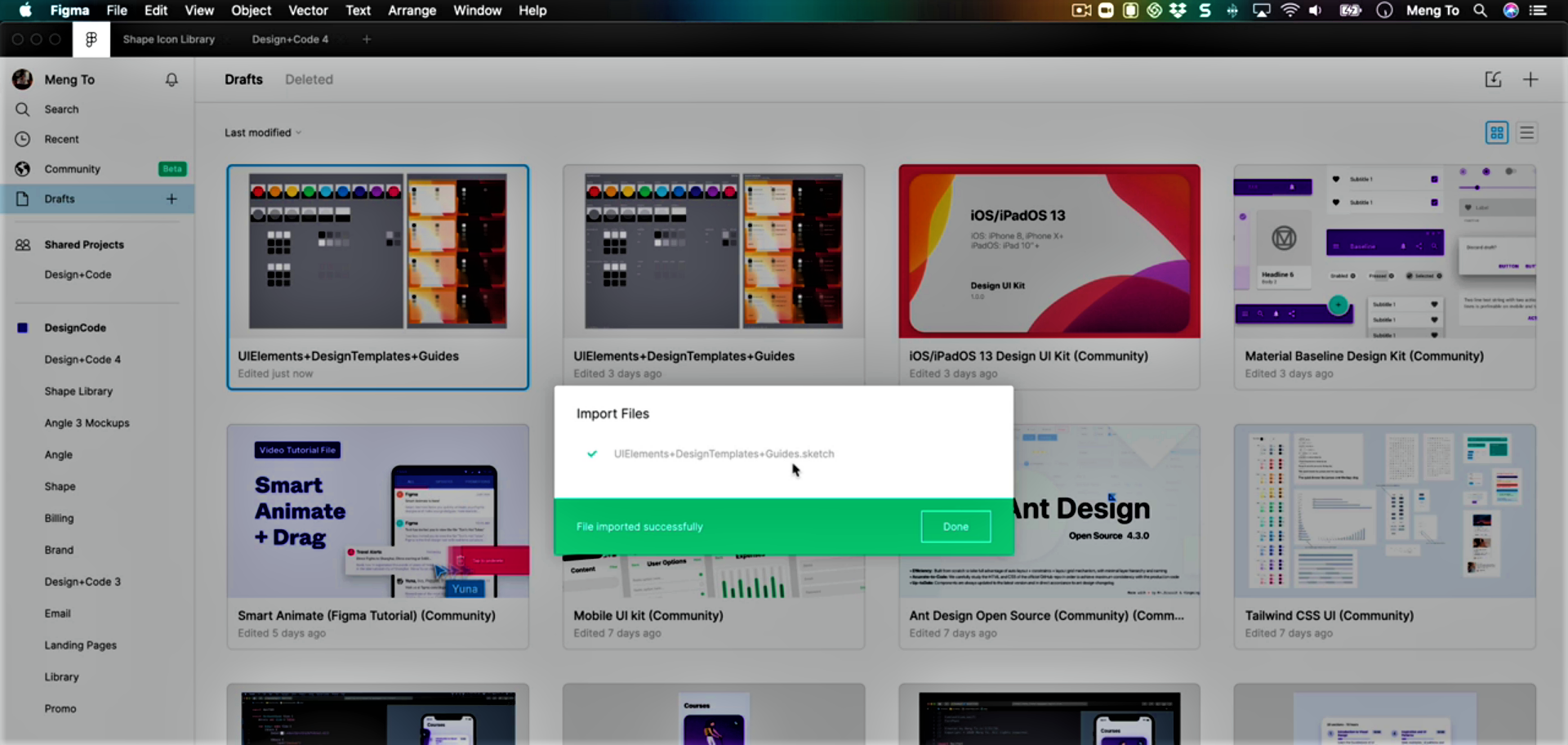
- Open the Sketch file we downloaded and head to the ‘UIElements…’ folder
- Here, drag and drop the Sketch file titled ‘UIElements…’ to Drafts in Figma
UI Kit for Android
We’ll also need to add in a UI kit for Android. To do so:
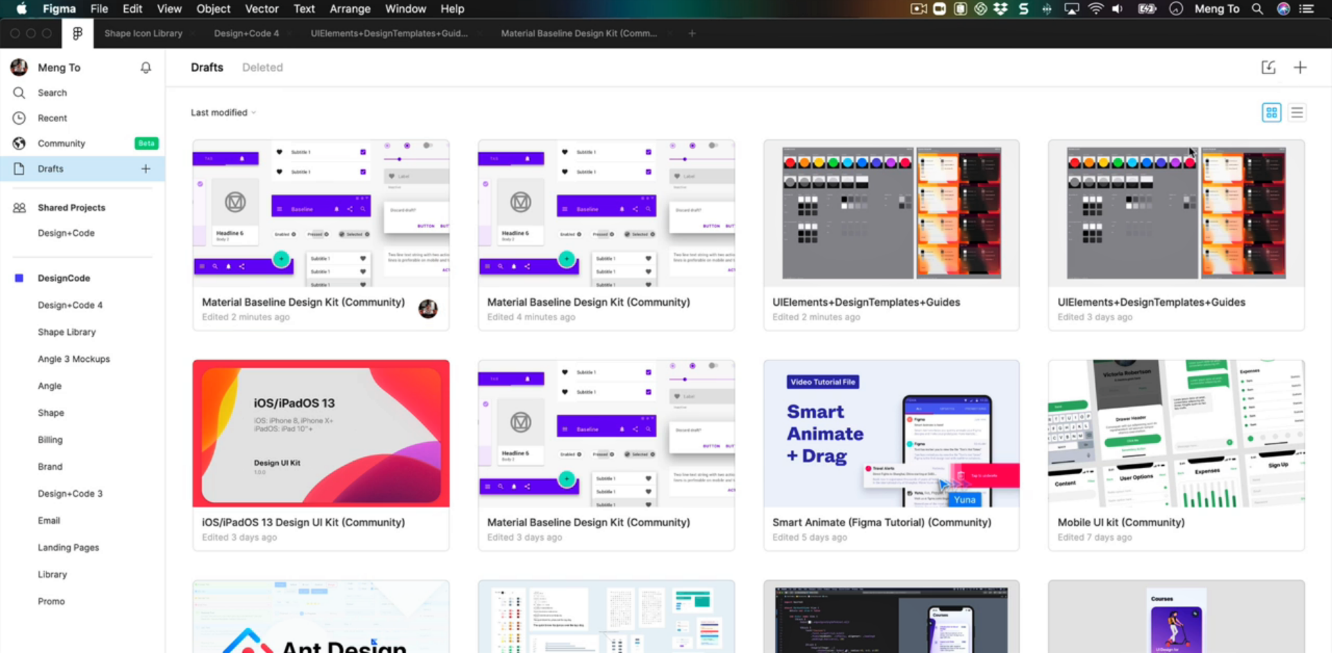
- Head back to the dashboard in Figma and click on ‘Community’
- Download the Material Baseline Design Kit
- You’ll find the file in Drafts and can explore it by simply double-clicking it
Frames
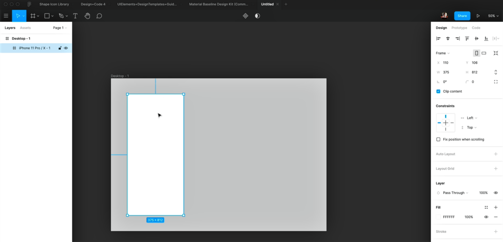
To create a new file, click on the ‘+’ sign on the right in the dashboard.
- Firstly, press A to create a new frame and select the first option under Desktop
- You can change the color of the background to #333333
- Since we’ll also be designing for small screens, add in another frame by pressing A. Choose iPhone 11 Pro / X this time. Drag this on top of the desktop frame
- Set the background color of the Desktop frame to #CCCCCC
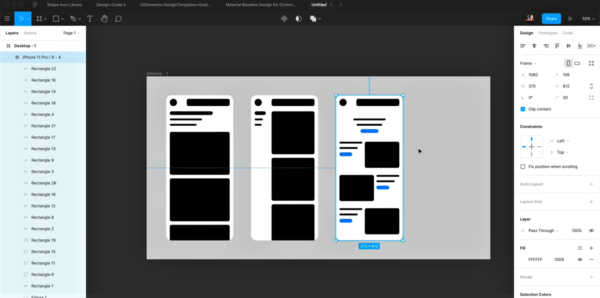
Wireframes
Let’s start with wireframing now!
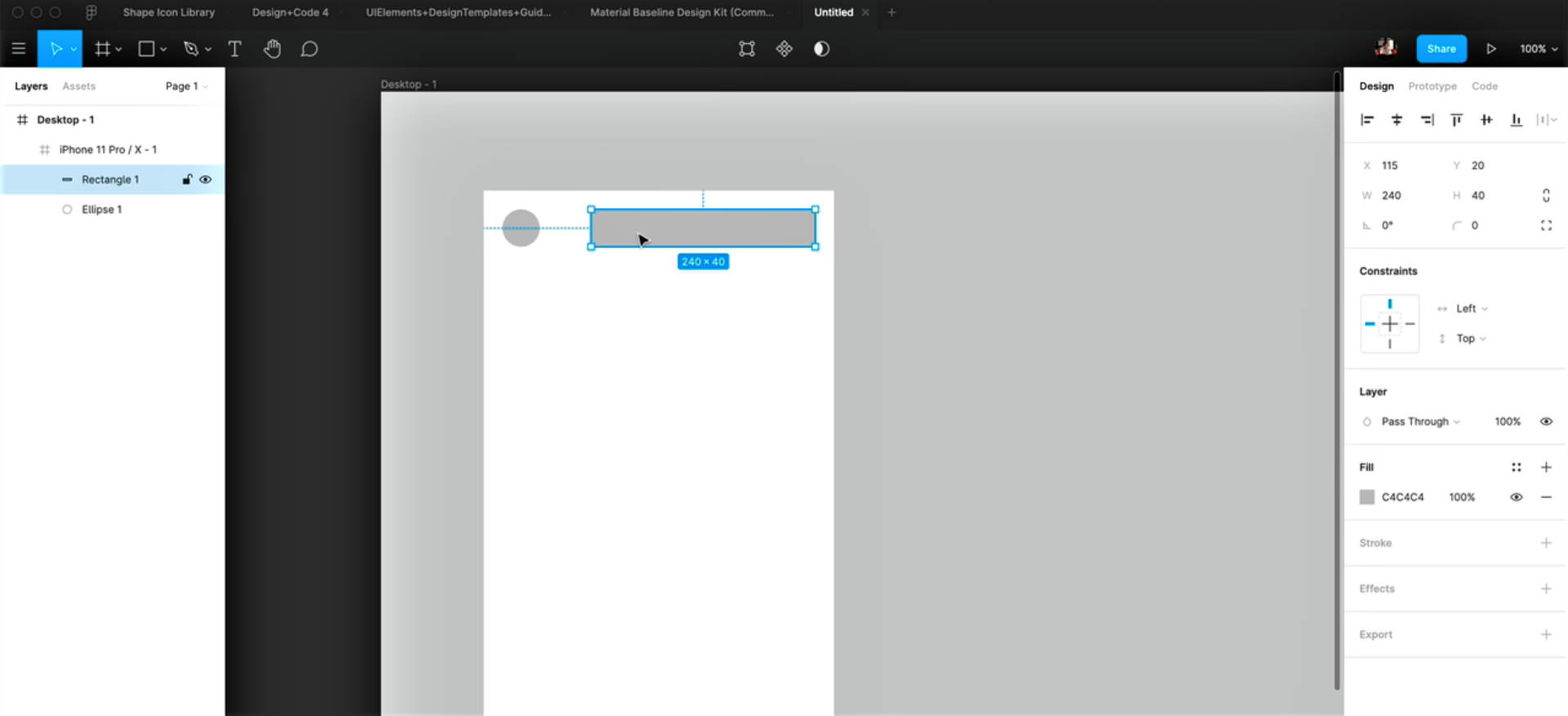
- Press O and draw a circle on the left of the iPhone frame. Set its size to 40 * 40
- Press R and draw a rectangle next to the circle. Set its size to 240 * 40
- To find the distance, you can use the option key. Here, to maintain consistency, we’ll set the x as well as y values for both the shapes to 20
Text
We’ll continue with wireframing. In this step, we’ll add text elements.
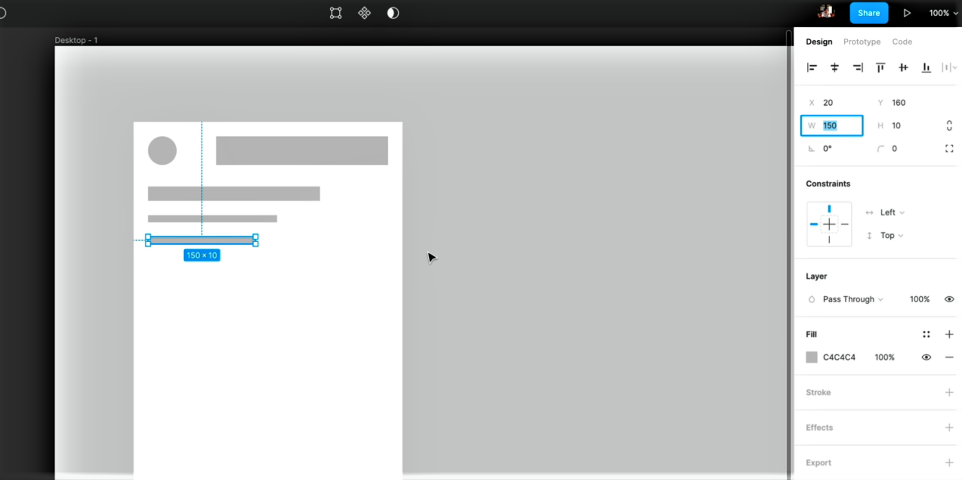
- Select the rectangle layer and press Cmd + D to duplicate it. Drag the new layer downwards and resize the height from 40 to 20. This will be the heading
- You can also duplicate a layer by pressing the option key and dragging it. This newly created layer would be the subheading. Set its size to 180 * 10
- Duplicate the subheading as well and set its width to 150 and height to 10
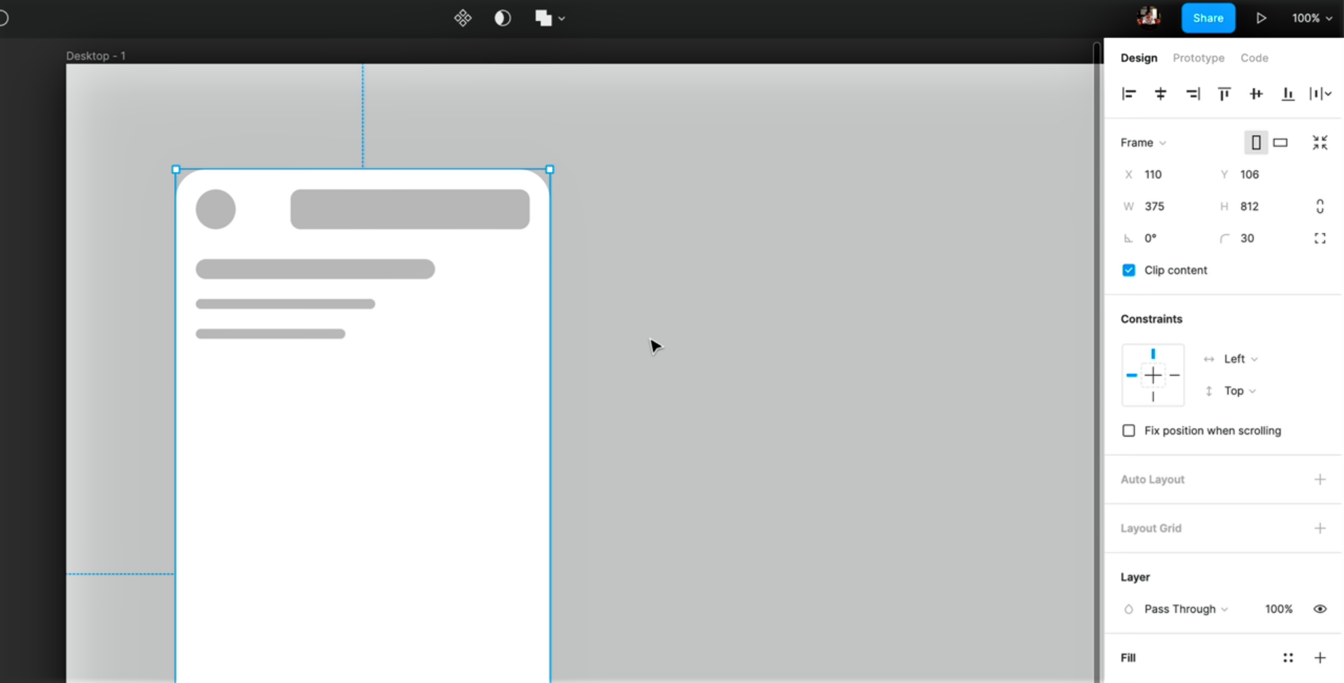
Rounded Corners
- Select all the layers we created. You can do so by pressing the Shift key and clicking on the layers. In the Inspector, set the Corner Radius value to 10
- Next, select the iPhone frame and set its Corner Radius to 30
Content
Let’s add in a few more elements to the wireframe.
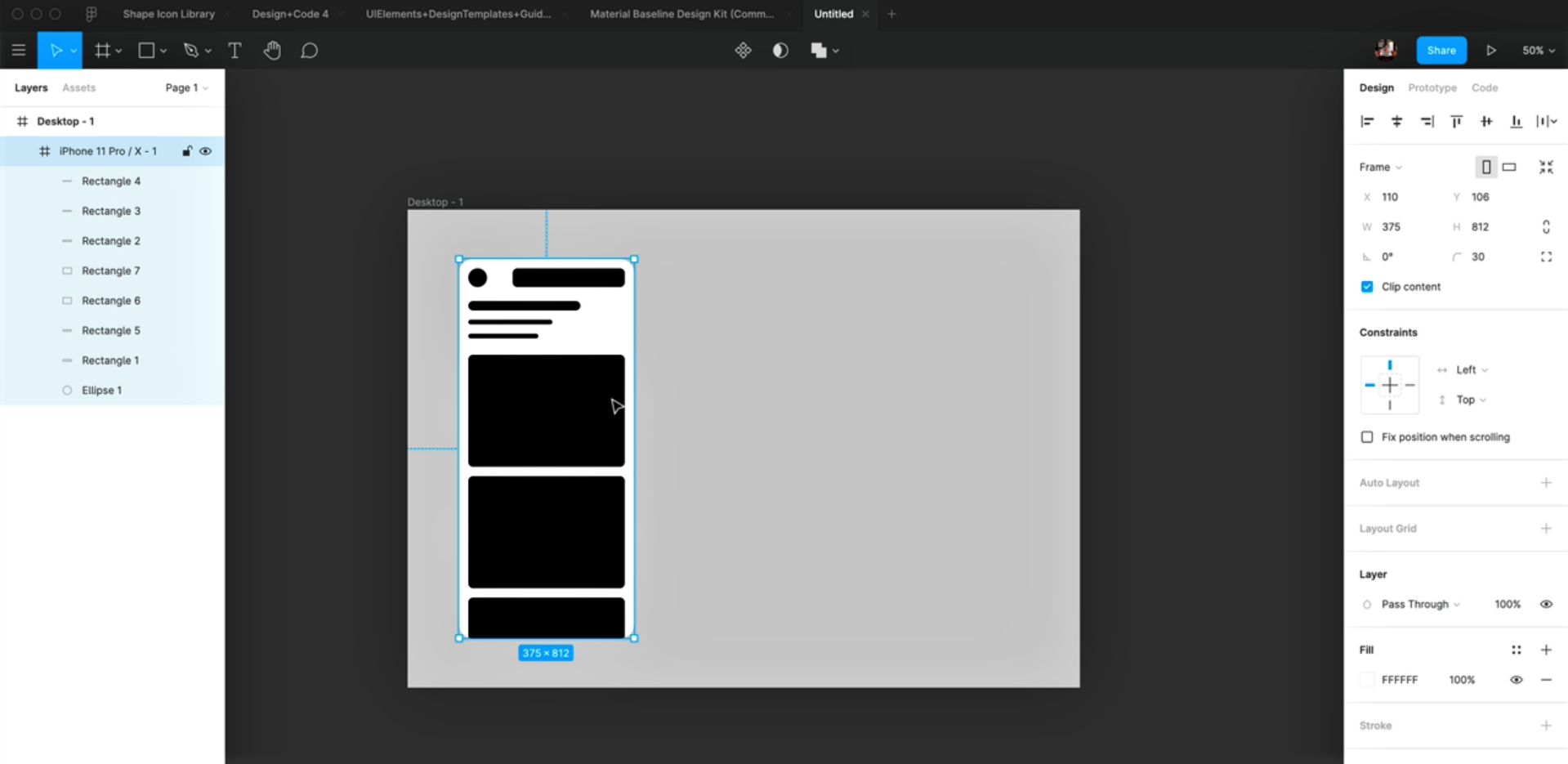
- Firstly, let’s add color to the previously added elements. Select the iPhone frame and in Selection Colors, set the color value to black
- Now, copy the topmost rectangle layer and paste it below the text layers. Set its height to 240 and width to 335. Copy and paste this layer two more times
Multiple Patterns
In this step, we’ll be creating more patterns. Let’s do this by duplicating the iPhone frame first.
- Change the layout by resizing the text layers and aligning these to the left. Then, resize the bigger rectangles and drag them up, right next to the text layers
- Duplicate the recently edited iPhone frame. Resize the bottom-most text layer to 100 * 20
- Align it to the center by clicking on the 2nd icon in the Inspector and set its fill to #007AFF
- Align the remaining text layers to the center as well. Resize the first one to 180 * 10 and second to 143 * 10
- Next, resize the bigger rectangle to 193 * 146 and align it to the right. Copy the text layers, align those to the left, resize and then, paste these next to Rectangle 6. Delete the remaining layers
- Paste the layers we recently edited twice. You can switch positions for the text and the rectangle layer for the 2nd row